
Website Design Standards: From Simple Personal Pages to Large e‑Commerce Platforms
Key Takeaways
- Remember that ease of use, navigation, and functionality are just as (if not more) necessary to your website’s design than beauty or aesthetics.
- Simplicity is important to visual design, webpage purpose, navigation, and promotional content.
- Visual hierarchies, breadcrumbs, colour theory, CTAs, buttons, and fonts are all fundamental aspects of web design you’ll encounter and should be considered for all websites.
The design of your website can influence users’ opinion of your company and services. WebEX research shows that 75% of website credibility comes from its design.Your company’s website is like the storefront of your shop. When a potential customer visits your website, they form a first impression of your business.
Your audience needs a few seconds on your website to decide whether to keep scrolling or press the back button in their browser.
If your website is outdated or unappealing, or if people do not discover proof that they’ll find whatever they’re looking for, they’ll leave.
These are potential lost leads, purely due to the look of your website.
Table of content:
1.Common website design standards
1.1. Simplicity
1.2. Functional navigation
1.3. Visual hierarchy
1.4. Web content
1.5. Graphics and images
1.6. Responsive design
2. Importance of colour, fonts, and CTAs in your design
2.1. Colour usage and best practices
2.2. Font usage and best practices
2.3. CTA usage and best practices
3. The secret sauce to success
4. Web Design Process Checklist
5. 2021 Web Design Trends
Common website design standards
Every website has a purpose. Whether that is to bring brand awareness, sell a product or a service, or provide valuable information.
You need to focus on much more than just how good your website looks. You need to focus on usability. You need to focus on how easy your website is to navigate and make sure it fulfills the purpose for which it was created.
Your web pages need to be obvious and self-explanatory, whether you’re creating a simple portfolio website or a huge e‑Commerce project.
To make that possible, there are UI design standards that are used by web designers to make sure users’ expectations are met. These standards, also known as web conventions, are industry-defined rules that can help when designing your website.
Simplicity
Don’t overcomplicate your website design. No matter how beautiful you want it to be, don’t forget that people enter it to perform a certain action — to find information, to buy a product, to register for a service.
Minimalism can give your website a clean and elegant look. Less is often more.
An overwhelming amount of elements will only confuse your customers.
Constantly evaluate each element throughout your webpages. Are there any design elements that don’t serve a purpose? If the answer is yes, remove them from the page.
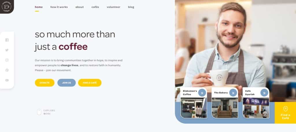
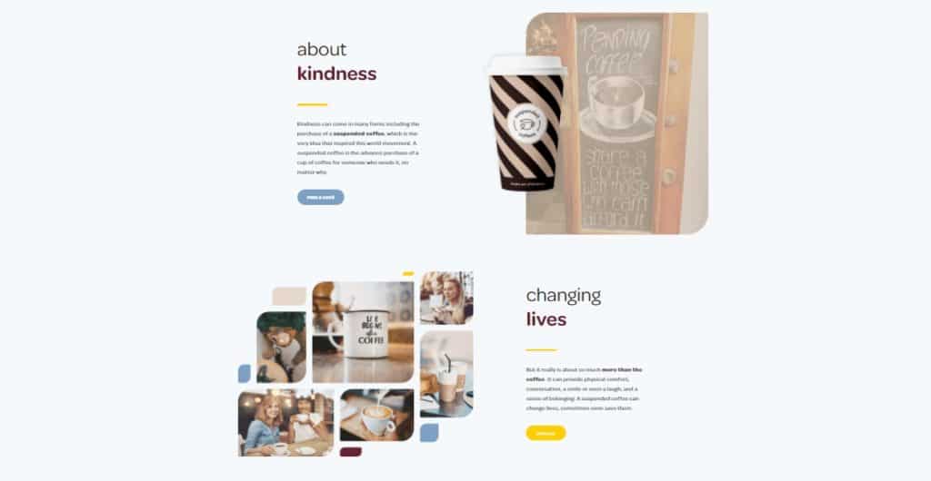
Here is a great example of a simple, effective, and beautiful homepage design for Suspended Coffees.
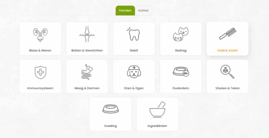
Functional navigation
Navigation is one of the main elements to pay attention to. Unnecessary clicks, complicated menus, or missing navigation buttons can hurt the conversion rate of a website.
Your goal is to make the navigation intuitive and as simple as possible, without oversimplifying it. If the site is e‑Commerce, with many categories and subcategories,focus on intuitivenessand ease of use, not on simplifying, or you’ll risk removing important elements of your users’ journey.
Here are some practical tips for successful navigation:
- Use navigation labels.
Firstly, use no more than 1–2 simple words that are descriptive enough. It’s tempting to use fun and modern words, but you’re more likely to confuse your users. Make navigation simple, and engage your users with clever wording in the content.
- Use breadcrumbs effectively on web pages.
Breadcrumbs help users keep track of their path and take steps back when necessary.
- Use navigation in the footer of your website.
By adding a navigation on the footer of your website, you make it easy for your website visitors to continue exploring other pages without making them scroll all the way up to the top of the page.
- Use simple primary navigation.
If you have sub-categories and product pages you can add drop-down menus to better organise your pages. In the primary navigation add the most important links — no more than 5–6 pages.
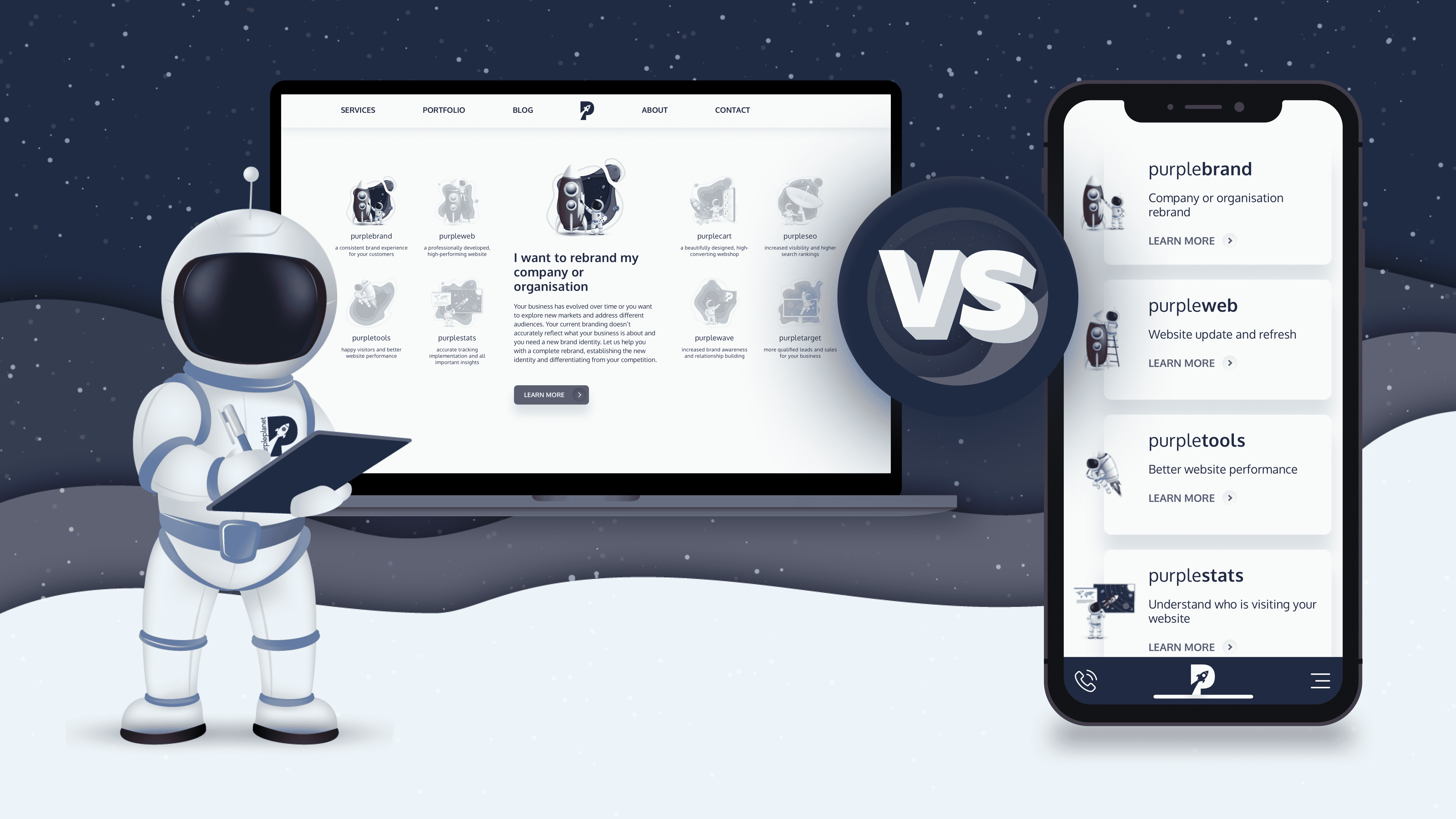
Here is an example of our own navigation.
As you can see, we provide a lot of services. We want people to easily navigate around. We want them to be able to learn a bit more about each service before even clicking to assure them they’re heading to the page that offers them the right solution.
Visual hierarchy
We use visual hierarchy to better organise and arrange website elements. Visitors will be able to better navigate around a website with ease, and focus their attention on the most important elements first.
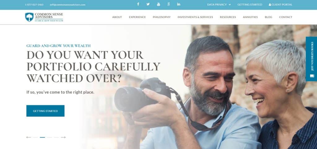
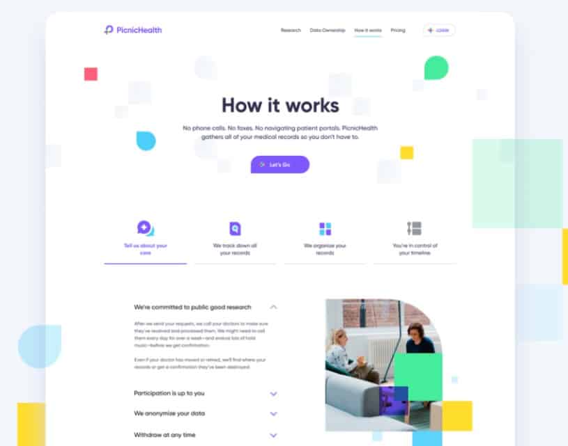
The best way to achieve visual hierarchy is to consider adding descriptive titles, headings, and buttons. Make sure that they reflect the information that the users are going to read on the web page. Add a table of content in the sidebar or on top of your articles to help users navigate easily and find whatever they are looking for. Take a look at an example from theCommon Sense Advisors website. You can see that the main heading is the most important element on the page and it’s quite large compared to the other elements. It draws the eye there followed by the call-to-action button “Getting Started”.
Web content
Content is the most important element of every website. As already mentioned, every website has a reason for existing. The content of the website includes all the necessary information to convince users to take action.
Readers may leave your website if there is too much information, or there are no answers to important questions. You have to make sure that each paragraph of text has a function. Unnecessary design elements and irrelevant text frustrates users.
When working on the content creation of your website, it’s important to always have your target audience in mind. Use words and phrases that will resonate with them and that they’ll understand.
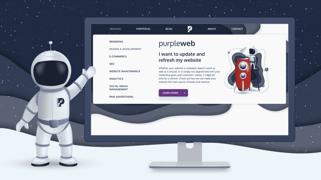
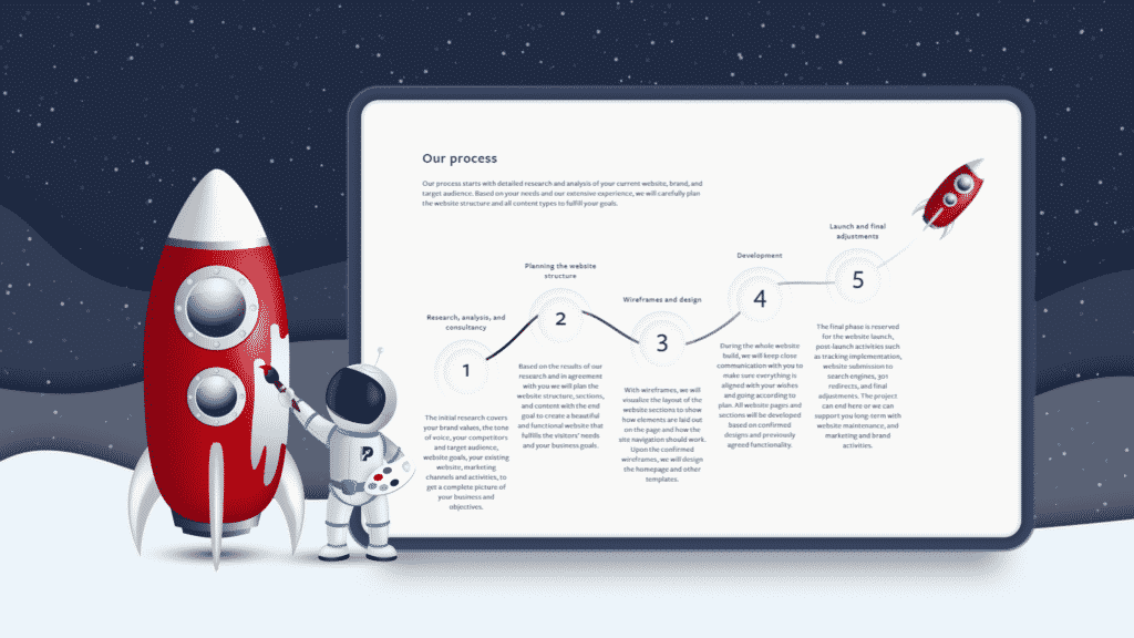
Here is an example from our design service page.
We use a language that speaks directly to our target audience. We visualise the content as steps to make it more engaging and easier to read. Imagine if all this content was just large blocks of text.
In that case, it would be difficult and quite boring to read. By segmenting the information into simple steps, and adding the visualisations, we made the process clearer and easier to understand.
Graphics and images
Graphics, images, and multimedia are also important aspects of UI design. When it comes to using graphic elements on your website the same rules apply.
- They should be consistent throughout all of your pages
- You should be careful not to overwhelm users with too many graphical elements.
- Images can only help the user’s journey if they convey the right message.
Place your company’s logo on the top of all your pages. Place it on the left side or in the middle of your navigation. Keep in mind that too many images will take longer to load, and risk visitors leaving before the site is fully displayed.
Take a look at this example from the Suspended Coffees website.
The images are complementing the website’s aesthetics and are conveying emotions. They support the message that is written in the text — that leaving a suspended coffee can literally change someone’s life. It’s inspiring.
Responsive design
Statista’s research shows that 55.64% of internet users are coming from mobile devices. Most of these users will leave your website if itloads too slowly or if it’s not displaying properly.
To provide the best possible experience for your users, your site must be compatible with a variety of devices and resolutions:
- Desktop
- Tablet
- Mobile
This is called responsive design. The content of the website is automatically changed and resized for the specified resolution. To make this possible, a different design is usually created for mobile devices with shifted elements. Some sites turn off graphics on smaller screens to help them load faster or avoid endless scrolling.
It is more important to provide an excellent experience across all devices than to make the pages look identical.
Don’t forget to test the site, not only on different devices but also on different internet browsers. Some elements might not display the same way on Google Chrome, Firefox, or Safari.
Check out how we present our services section on desktop and mobile screens.
- We use simplified icons on mobile.
- The description of the services is also removed.
- There are “Learn More” buttons you need to click to read more about the services.
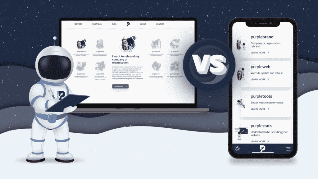
When on a desktop the design is more visually appealing, but this won’t work the same way on mobile devices.
Importance of colour, fonts, and CTAs in your design
Let’s dive deeper into the best practices of using elements such as colour, fonts and CTAs (calls to action).
Colour usage and best practices
Colour is one of the most important elements in website design. Colours increase your brand recognition and help highlight important elementson a website.
Let’s try a simple test.
Check out these colours:
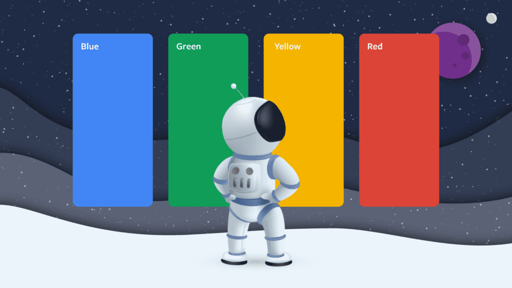
Can you recognize the brand? …If you guessed Google, you’re right!
Let’s try it again. Check out this colourful gradient:
Colours help define brand recognition.
That is why the use of consistent colours across all materials is important. People will associate certain colours with your brand without having to add a logo, company name, or a website link.
Using different colours in your design evokes different emotions. Here is a brief description for each colour:
Red: passion, love, active, strength
Orange: energy, happiness, success
Yellow: joy, hope, fresh, optimism
Pink: youthful, romantic, compassionate, soft
Green: new beginning, natural, peaceful
Blue: comfort, calm, trust, reliability
Purple: royal, wealth, creativity
White: cleanliness, purity, modern
Black: bold, powerful, serious, elegant
You can read more about the colours and the emotions they evoke here.
The colours you choose must represent the emotions you’re trying to convey to your audience. Base your brand colours on your target audience. What do they respond to? What do they like?
When coming up with a colour palette, think about the colour harmony. Start by choosing your dominant colour. For our brand, this is obviously purple. Then start layering your pallete. Choose secondary colours that correspond well with your main colour. Coolors is a great tool you can use to build beautiful colour palettes.
Read more on how to effectively use colours in your web design.
Font usage and best practices
Typography is the next important element on your website. Using fonts the right way can enhance the readability, accessibility and the visual hierarchy of your website.
Hierarchy in typography helps you improve the readability and the scannability of a webpage. Hierarchy highlights the most important pieces of text.
Use BIGGER, bolder text for your most important messages, value propositions and headlines. People’s eyes will be naturally drawn to them.
Check out the example below.
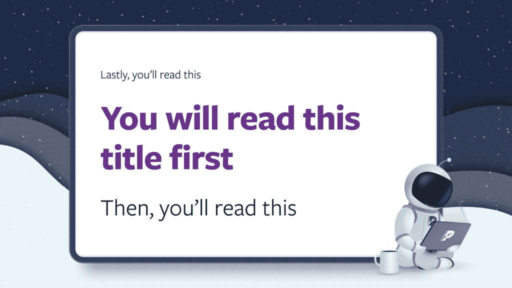
Which piece of text did you read first? Which one did you read last?
Hierarchy can help you focus your users on elements you want them to see.
Be careful when mixing different types of fonts. Best practice is to use a maximum of two fonts on your website. One for headers and larger elements and one for main content.
The font type you use for the main content of your website should be easy to read. Avoid using serif and decorative fonts.
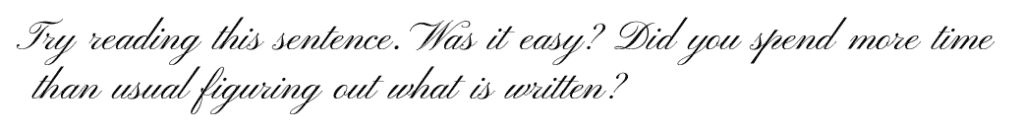
Now imagine reading a 2000-word blog post on a topic of your interest. You’ll quit before you reach the middle.

These decorative fonts are great for drawing attention to your headers, but just don’t work on big paragraphs of text. Use simpler and easier to read fonts on your main content, such as Arial, Open Sans or Lato.
Here are some simple guidelines you can follow to ensure your website is accessible and easy-to-read:
- The minimum text size on your website should be 16px, especially for text-heavy web pages.
- The text must be able to be resized up to 200% without losing the ability to read the content. That’s why it’s not recommended to use images that consist of a lot of text.
- There must be a colour contrast of at least 4.5:1 between your text and the background colours. You can use this tool to test your website contrast.
CTA usage and best practices
A call-to-action (CTA) button is an interactive element that aims to induce website visitors to take a step in their journey. For example subscribing to an email list, buying a product, or filling a booking form / contact us form.
Here are some practical tips to create appealing CTA buttons.
- Use buttons that look clickable
- Use contrasting colours
- Use bigger buttons
Use buttons that look clickable
The main function of a CTA button is to be clicked, so you need to make them look interactive.
You can add 3D effects to make them stand out from the rest of the page. This is what we do on our website.

You can also add a hover effect to your buttons to show your users that something will happen once they click. You can change their colours, add toggle effects, move the arrows inside, make them swell a bit once hovered and more.
Use contrasting colours
The buttons and the background should be contrasting enough so they can grab people’s attention. Check out this example from theHealthalytica’s website.
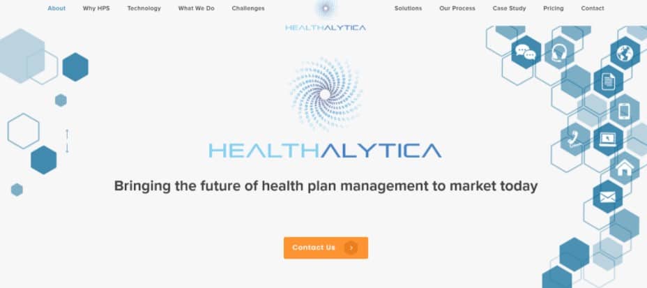
The only orange element in the hero section is the button, and it stands out from all the other UI elements.
Use bigger buttons
Make your CTAs bigger and distinguish them from other elements. Larger buttons have a better chance to be clicked than smaller ones.
The secret sauce to success
Now that we’ve discussed the basics, let’s review two different websites that incorporate these principles.
Let’s start with Courtyards on Fifth.
Courtyards on Fifth is a 27-unit residential apartment development in Downtown Bay Shore, New York.
The website consists of one landing page that allows potential buyers and renters to quickly reach the important parts of the website.
With simple navigation and simple CTAs, users are enticed to take tours around the apartments andfill in the contact form once they find something of interest.
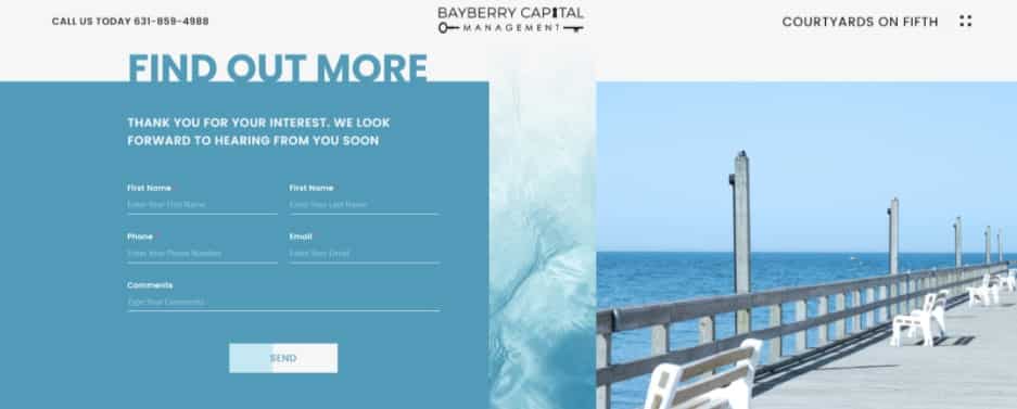
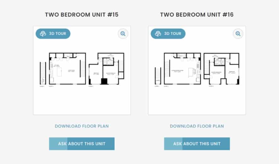
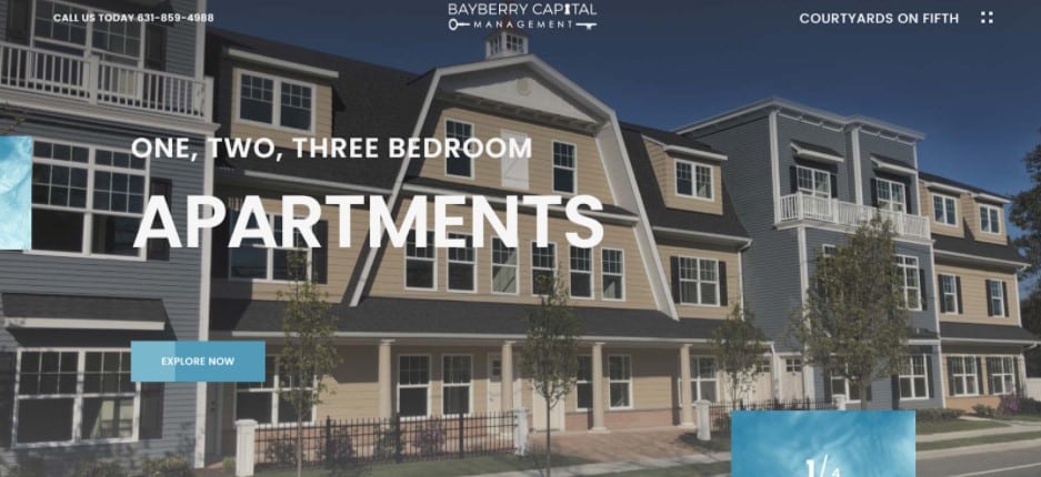
Popups are used to display floor plans and tour videos, allowing for minimal clutter on the site’s pages.
The website incorporates all elements of successful web design:
- visual hierarchy helps users navigate around easily;
- the website is not overly cluttered with unnecessary elements;
- colours, fonts and CTAs are used correctly.
The colours provide a “sea front” look and feel to the website — something airy, light, and water-related. The images convey emotions and help better convey the message.
Check out the full UI study here.
Let’s look at another website.
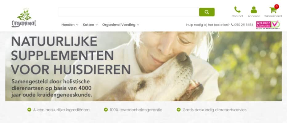

The e‑Commerce website is responsive on different devices. Clear calls-to-action and a well thought out architecture allow users to easily browse the products and make an order in no more than 3 clicks from the main page.
The breadcrumbs used on the product pages and the sidebar navigation help users go from one category to another with just a single click. This helps them find what they need faster and users are more likely to purchase a product.
To reflect Organimal’s love and care for animals and nature, the colour pallete is natural and bright — grass green, earthy grey and a warming sunshine orange.
The product pages are descriptive. Owners are very passionate about the health of their beloved pets, so they are really careful when choosing products for them. The product pages contain important information such as detailed descriptions, how they are best used, when they are used, ingredients, proof of quality production and reviews from other customers.
All this information helps users to make an informed decision whether to buy a particular product or not.
Check out the full UI study here.
UI design standards can be applied to all websites whether e‑commerce, service providers, or a blog. The secret sauce to success is the ability to combine these three elements together:
- Visually appealing UI design
- Functional design
- Great marketing strategy
These three things will struggle to be successful if used on their own.
A beautiful website is a waste if it is confusing and difficult to use.
A well-structured website that is theoretically easy to use is not effective without proper use of colours, elements, and visual hierarchy.
All the effort put into making a website is pointless if not combined with a good marketing strategy. After all, if no one knows about your website, it’s as if it doesn’t exist.
Web Design Process Checklist
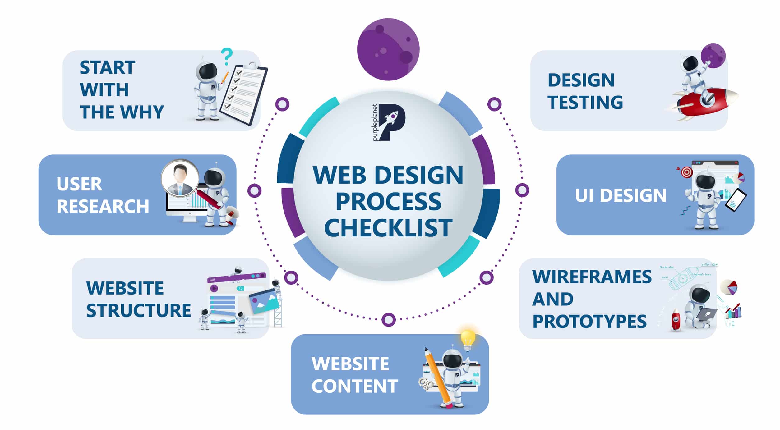
We have prepared a separate article with a detailed overview of each step. You can read it here.
2021 Web Design Trends
Here are the most popular trends in website design. We hope that this list will inspire you and help you approach your website design project more creatively.
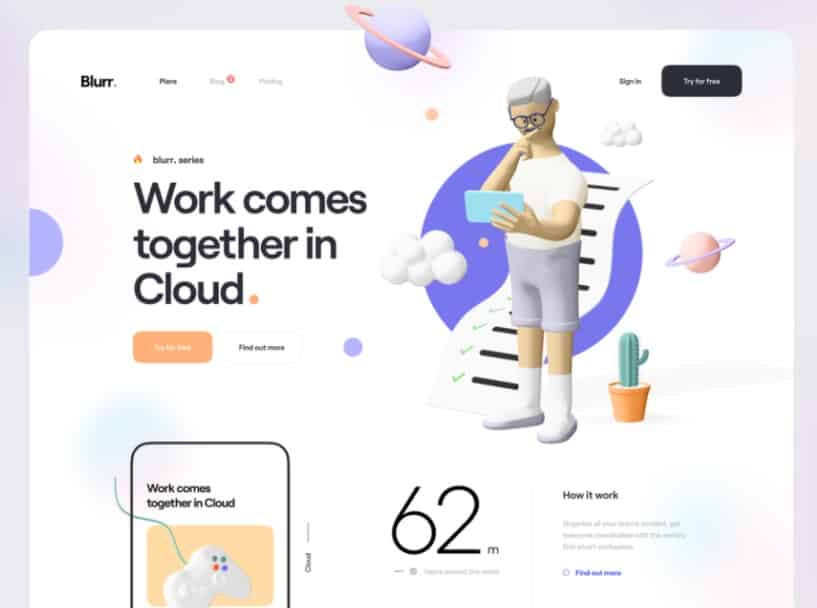
Use of 3D illustrations
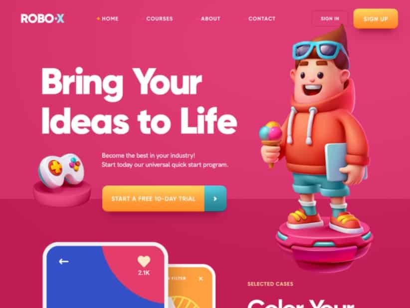
The use of illustrations in web design continues to rise. This year, the focus is more on colourful 3D illustrations rather than 2D.
Use of retro fonts
Retro fonts are reappearing in web design, but they are more stylised, bold, colourful, and artsy.
Use of dark mode
White backgrounds have been standard to ensure simple and clean websites and to maximize the readability of a website, but designers are starting to add dark mode to various apps and websites that enhance the contrast and make the neon colours pop.
Use of mixed media and collages
The combination of arranged photos, illustrations, and handwriting fonts is gaining in popularity. These collages help to communicate aesthetics and messages better. This cut-and-paste DIY look can be perfect for creating portfolio websites.
Minimalism
For another year, minimalism continues to be one of the most preferred methods of design. The use of simple shapes, uncluttered images, less text, and a lot of empty space is the recipe for a clean and minimal look.
And there you have it, the recipe for successful web design
In conclusion, think of your web design as the internet face of your business. When someone walks into the store, they expect to be greeted by a friendly person. A modern and relevant website will give you just that. Take advantage of that and look to stand out from the competition.
It’s always exciting to work on design on your own but if you need professional advice and assistance in designing and developing beautiful and functional websites, feel free to contact us.