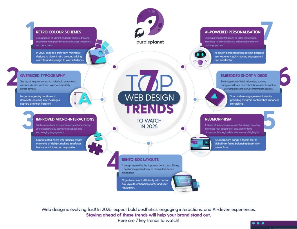
7 Web Design Trends to Watch in 2025
Key takeaways
Whilst this year’s web design trends have elements of being vibrant and bold, they predominantly indicate a big focus on user-centredness.
We’ll explore 7 web design trends you should watch out for in 2025. We hope you find some inspiration for your next redesign, and that we can help you make your site more intuitive for its visitors.
Let’s dive in:
1. Retro colour schemes
It’s evident from the worlds of fashion, interior design, and the internet itself, that people are bored of minimalism. The 2010s seemed to be obsessed with clean lines, decluttering, white, bright blue, IKEA furniture, and a single potted plant in the corner of a room.
Websites were no different. Particularly in the tech world, websites seemed to be exclusively ‘clean’ and minimal.
Finally, the world seems to be righting itself and moving towards bright and bold colours again. In web design, these colours are making a comeback, drawing inspiration from past decades to express uniqueness and personality.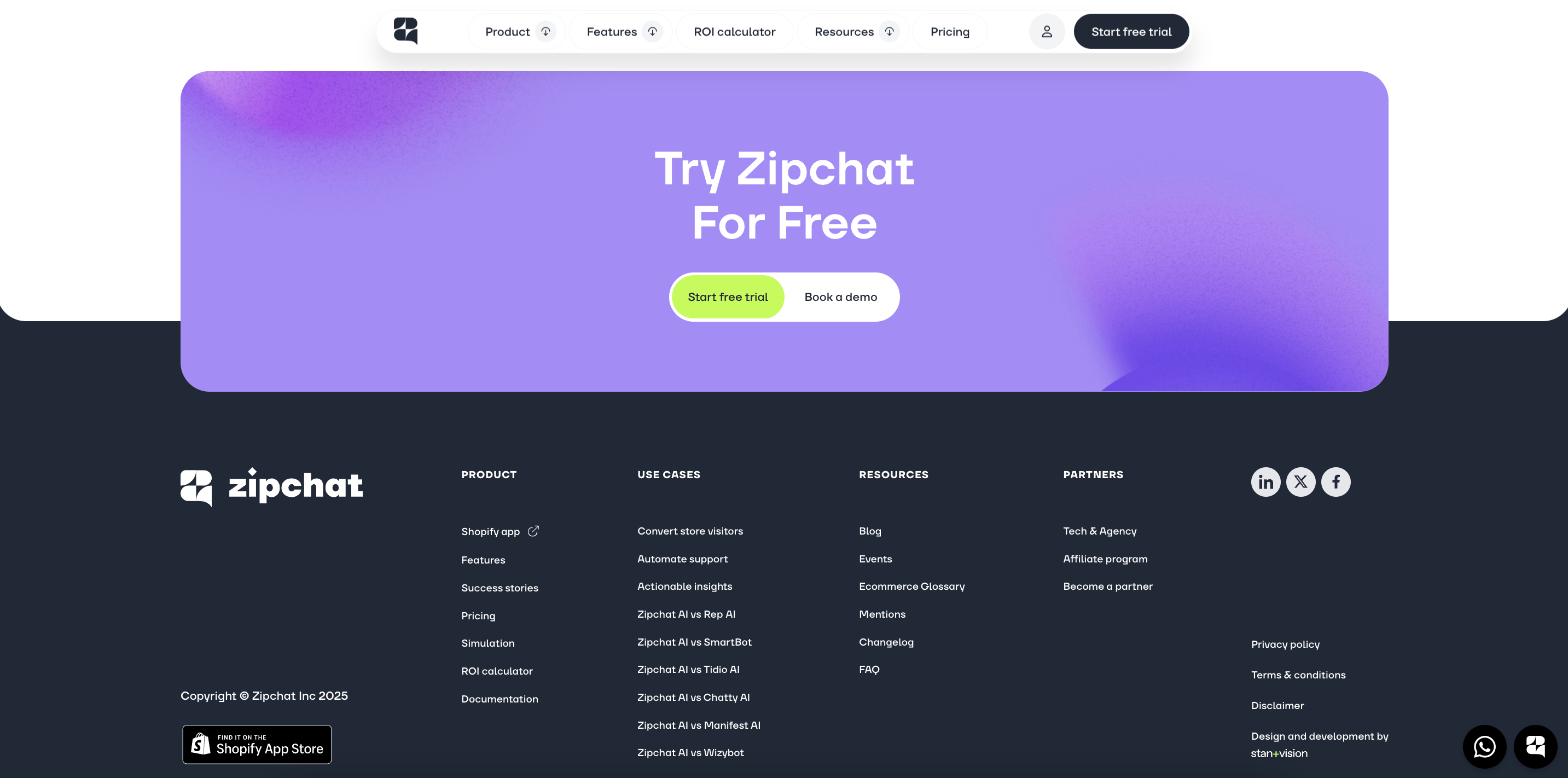
Zipchat opts for bright lilac purple and lime green
These palettes include earthy tones from the 1970s, pastel shades from the 1950s, or vibrant neons from the 1980s. Designers are using these ‘retro’ colours to breathe life into websites, evoking a wide range of feelings in users.
For example, a tech startup might use neon hues of yellow and green to convey energy and innovation, while a lifestyle brand might opt for subdued, earthy tones of green and orange to communicate authenticity and sustainability. Retro colours are particularly effective for brands that want to blend creativity with approachability, making them a favourite for e-commerce, creative portfolios, and personal blogs.
Retro colours break away from the minimalist white and blue palettes that have dominated the internet by injecting warmth, personality, and nostalgia into web design. Bold tones give depth and individuality, offering a refreshing alternative to the sterile designs that we’ve become accustomed to.
In 2025, you’ll likely see more designers getting creative with colour. Why not try it yourself? This colourful resurgence isn’t constrained to age groups or genders, and it ensures your website is extremely memorable.
2. Oversized typography
Oversized typography is a trend we highlighted in our 2022 predictions, but it’s proving to have significant staying power! Far from being a fad, large-scale text continues to dominate modern web design because of its visual impact, versatility, and practicality across devices.
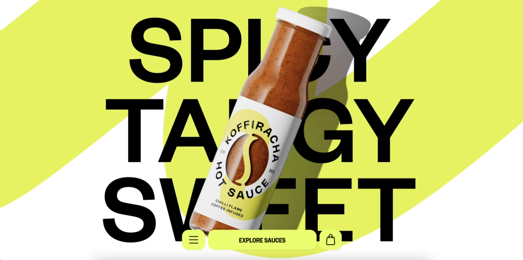
Koffiracha makes a statement by combining their huge typography with neon yellow
One of the standout advantages of oversized typography is its ability to make a bold statement on desktop screens. Big, bold text grabs attention instantly, communicating key messages before a user even has a chance to scroll. This is especially valuable today as users skim pages for relevant information. A powerful headline or call-to-action in oversized typography ensures your message is not only seen but remembered.
From a usability perspective, oversized typography also plays a key role in establishing visual hierarchy on a webpage. By varying font sizes, designers can guide users’ attention to the most important elements first, such as headlines, subheadings, and key calls to action. This approach creates a natural flow of information and enhances the user experience by making content easier to digest.
Moreover, the trend aligns with accessibility best practices. Larger text improves readability for users with visual impairments, ensuring content is inclusive and user-friendly.
In web design, it can be difficult to maintain a design’s essence when moving it from a desktop format to a mobile one. This is particularly cumbersome when handling images, videos, carousels, and tables. However, text is pretty easy to move over to mobile formats. Unlike complex visual elements that may need redesigning for smaller screens, large fonts scale naturally. They remain legible and impactful on any screen size, ensuring your message retains its emphasis without additional design adjustments.
Oversized text might not seem like a ‘brand new’ trend, but it’s definitely here to stay for a while. As the year goes on, we expect to see more of it due to its ability to command attention and as it’s reasonably easy to implement. What text on your website could you oversize?
3. Improved micro-interactions
Another trend that has been growing for a few years is micro-interactions. In 2025, we can expect them to become more sophisticated and more intuitive.
Micro-interactions are the small, often subtle responses embedded in digital interfaces that react to user actions. These include animations, sound effects, or visual changes that occur when you like a post, hover over a button, or complete a form. They’re not just functional, they’re designed to enhance usability while creating ‘moments of delight’ that make a website or app feel more engaging and human.
For example, a shopping cart icon subtly expanding when an item is added, or a button that gently pulses when hovered over, provides feedback that reassures users their actions are registered. These little moments are what make micro-interactions so impactful; they create a sense of satisfaction, encouraging users to stay engaged and interact further.
Micro-interactions strike a balance between form and function. From a technical point of view, they require a fairly small amount of design effort but can elevate the users’ experiences to such a great extent. That being said, designers can get really creative with micro-interactions if they want to; they can be simple or they can be grand. Either way, soon enough micro interactions won’t be a trend anymore, they’ll be the norm; they epitomise user-centred design.
4. Bento box design
Originating from Japan, the concept of bento boxes revolves around neatly compartmentalised containers used for serving meals, with each section holding a different dish. This idea of organisation and visual appeal has inspired the term ‘bento box design’ in web development, describing layouts where elements are neatly confined to individual boxes.
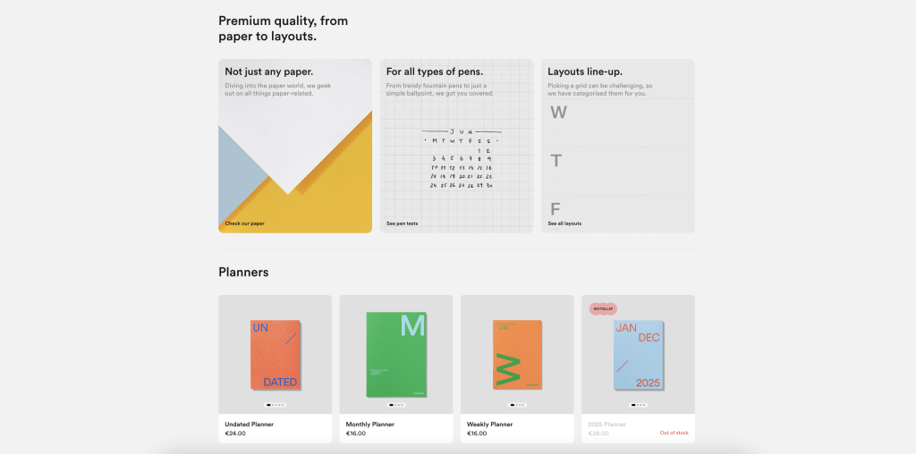
mishmash uses the bento box format to display products and show off their USPs.
The result is a structured, aesthetically pleasing design that draws users in while keeping content easily digestible.
The bento box layout is ideal for presenting information that might otherwise seem dull, repetitive, or overwhelming. For example, services pages, product listings, or feature comparisons can be transformed into engaging and organised presentations using this layout. By dividing content into visually distinct sections, designers can create a sense of balance and clarity, making it easier for users to scan and comprehend the information.
Bento box layouts are very flexible, adapting well to both desktop and mobile formats, ensuring consistent usability across devices. The boxed approach allows for easy stacking and reorganisation on smaller screens, maintaining visual coherence without compromising functionality.
Another benefit of the bento box design is its ability to add visual interest to content-heavy pages. Using a mix of colours, icons, and imagery within each box breaks up monotonous text and adds layers of visual hierarchy. This makes it particularly effective for websites like blogs, e-commerce stores, or portfolios, where diverse types of information need to coexist harmoniously.
Additionally, the design aligns with modern aesthetics favouring minimalism and order. It communicates professionalism and attention to detail, which can enhance the overall impression of a brand.
Whether you’re showcasing complex data or simplifying user navigation, bento box layouts ensure that your content is as captivating as it is easy to understand. Expect to see this style more as websites find creative and innovative ways to engage visitors.
5. Neumorphism
Neumorphism, also known as ‘soft UI,’ is a web design trend that blends elements of skeuomorphism (designs resembling real-world objects) and flat design to create interfaces that feel modern, minimalistic, and slightly tactile. This approach uses subtle shadows, highlights, and gradients to mimic the appearance of raised or recessed surfaces, giving buttons, cards, and other UI elements a soft, three-dimensional look.
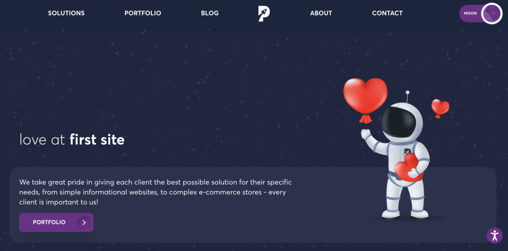
We’ve implemented a little bit of neumorphism ourselves here at purpleplanet – don’t you just want to press that recessed button to see our portfolio page?
The appeal of neumorphism lies in its ability to make digital interfaces feel more tangible and intuitive. Buttons appear as though they can be pressed, switches look like they can be flipped, and sliders seem to glide naturally, all without relying on overly realistic textures. This style strikes a balance between visual depth and simplicity, making it visually engaging without overwhelming the user.
If you choose to implement some neumorphic moments into your website in 2025, know that it can bring a sense of calm and sleekness to the interface. It can be paired with both minimalism or maximalism (whatever you prefer) but will be particularly impactful on websites that want to evoke a sense of luxury, innovation, or professionalism.
Neumorphism also has practical benefits, with elements drawing attention to key interactive features like buttons or toggles, guiding users intuitively through an interface. When used thoughtfully, it can enhance usability and create a more immersive user experience.
Neumorphism is a design trend that continues to evolve, with its origins in those now outdated, hyper-realistic app icons used in the first Apple iPhones. Current use is much more sophisticated, with a greater emphasis on tactility, making it an excellent choice for designers or website owners wanting more intuitive interfaces.
6. Embedded videos
In 2025, short videos won’t be exclusive to platforms like TikTok and Instagram; our taste for this easy-to-digest content doesn’t stop there. Web designers can capitalise on this and engage us on other websites and platforms with these short videos.
These clips might be background loops, product showcases, or quick tutorials. They capture our attention instantly, making them a staple for modern websites.
A prime example of this trend is the fashion retailer, ASOS. ASOS incorporates short videos across its product pages and main landing page, offering dynamic views of clothing items. Instead of static images, users can see models walking, turning, and interacting with the garments in real time. This approach helps customers get a better sense of fit, fabric movement, and overall style, significantly enhancing the online shopping experience.
The popularity of short videos in web design stems from several factors:
- Videos are inherently more captivating than static images or text; keeping users engaged longer increases the likelihood of conversions.
- Short clips provide valuable context that static images can’t, making it easier for users to imagine how products might fit into their lives.
- Short videos are perfect for mobile users, aligning with their scrolling habits.
- Short videos can be used in various ways, from homepage banners to explainer clips and social integrations.
While our short attention spans remain short, the quick video is another ‘trend’ that’s soon to be the norm. This year, expect to see an increasing number of websites utilising this snappy and engaging feature.
7. Personalising with AI
Predictions for the future wouldn’t be complete without mentioning artificial intelligence. Web design is yet another part of our lives that AI has touched, enabling real-time personalisation and countless more optimisations. For example:
- AI algorithms can analyse user behaviour, preferences, and past interactions to display content that resonates. For example, an e-commerce website might showcase recently viewed products, recommend complementary items, or highlight seasonal offers based on the user’s location.
- AI can be used to modify website layouts depending on the user’s device, preferences, or demographics. A first-time visitor might see an introduction or tutorial pop-up, while a returning customer might be directed straight to their frequently visited sections.
- AI-powered translation tools and geolocation data enable websites to automatically adjust language, currency, and regional settings. For instance, a user visiting from France could be greeted with French content, prices in euros, and region-specific promotions.
- AI chatbots can enhance user engagement by answering questions in real-time and providing tailored recommendations. They can also be designed to adapt their tone and suggestions based on the user’s history and context.
These dynamic possibilities offer opportunities for websites to be more relevant, engaging, and intuitive for visitors. There is such a big demand for user-centred design, and modern consumers expect websites to understand their preferences without requiring repetitive manual inputs.
Businesses, in turn, benefit from increased engagement, loyalty, and conversions by delivering these seamless interactions. As AI continues to evolve, the potential for deeper and more nuanced personalisation grows. By integrating AI into web design, businesses can stay ahead of competitors and meet the rising expectations of their digitally savvy audience in 2025.
To get help implementing any of these web design trends, reach out to us here at purpleplanet.