
Effective Use of Colour in Website Design
Effective use of colour in website design is of crucial importance. A well thought-out and implemented scheme affects user experience positively and increases engagement, while poorly-chosen colour palettes have the opposite effect. In the following article, you will learn the best practices for effective use of colour in website design.
Colours and emotions
Colours evoke emotions, and a successfully designed website triggers sensations within its visitors. Humans associate specific emotions with specific colours, regardless of their cultural background.
Here is a short list of references for the emotional “weight” of colours:
- Red – represents love, passion, danger, anger, warning
When we see red, we know that the conveyed message is very important! This is one of the main reasons we put warning signs and colour-specific lines in text in red, to accentuate their importance. - Blue – represents calmness, sadness, peace
This colour is related to the feelings of relaxation and peacefulness, sometimes even melancholy or sadness. Blue is a mellow, calming colour. - Green – represents life, freshness, growth
Even in the business world, green represents a positive development in various revenue reports, while red marks the opposite. - Black – represents dark, mystery, secrets, fear
A dark palette may strike fear in people or evoke the sensation of mystery. - White – represents purity, health, innocence
White is one of the most popular colours for all types of websites, since it aligns very well with all colour palettes.
Unlike the understanding of spoken or written language, colour interpretation is universal. Colours affect the majority of people in the same way, conveying the same emotions. For this reason web designers need to pay special attention to the use of colour in website design.
How to pick your colour palette

Some colours have overall positive and some negative connotations. However, it does not mean you should only pick warm, emotional colours to evoke positive feelings.
Next to the unified interpretation of colours, humans also share specific sets of habits. These habits translate into expectations. For example, when entering a kindergarten we expect to see a wide range of warm colours. When entering an office building, we expect neutral tones that will underline the professional nature of the object. The same expectations are true for the use of colour in website design.
For example, a website that promotes yacht charter services will, naturally, set a blue colour to be its dominant. On the other hand, a website focused on gardening will use green. A landing page for Valentine’s gifts will always sport red colours, and a dentist’s website will use white as its primary. Red certainly would not have a positive effect in the last example.
Company and brand identity
Colours are a crucial part of branding, and therefore very important for the company’s identity on the Internet. We have previously mentioned how colours affect people’s emotional state, and now we need to relate the positive effects of colours on our brand.
It is essential for a website design to have a specific company image, a brand identity that is easily recognizable by the target audience. Naturally, the website needs to reflect the same company and brand identity elements that have been established for off-line use. Logos, the colour palette, the font, need to be in sync with the brand identity.
The rule of 60-30-10
One of the design rules that has been carried over to the world of website design is the so-called Rule of 60-30-10. The rule defines the ratio between the dominant, secondary and accent colours. It has proven to be quite effective in interior room design and has been eventually adopted by website designers across the world.
In web design, 60% is the primary color of the overall space – this is the negative space (background). 30% is the secondary colour and 10% is the accent colour used to make sure the most important sections, such as your primary Call to Action button and important links, draw attention and increase chances of visitors clicking on them.
If you already have your predominant colour selected, you can use one of the many colour scheme generators, such as Adobe’s Colour Wheel, to help you define complementary colours. It’s up to you to decide whether you will use only three or perhaps even four or five colours to design your website.
purplenote: Do not get carried away with the number of colours! Research has shown that the majority of visitors prefer simpler colour schemes with up to a maximum of three primary colours.
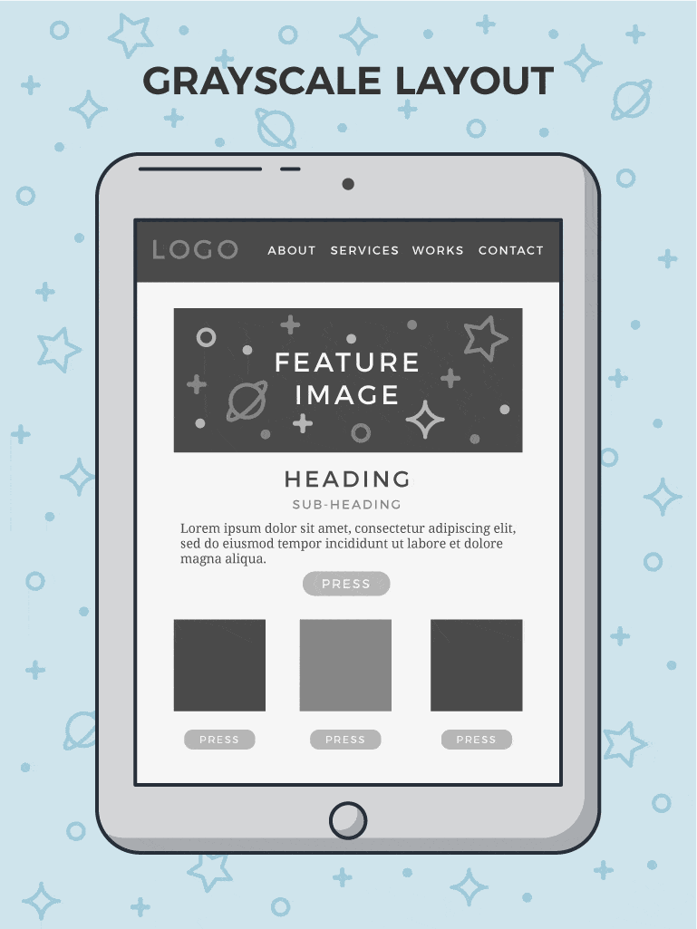
Creating a Greyscale Layout
Many designers resort to creating a grayscale layout before they start working with colours. This enables them to perceive the website in its form, and assess elements throughout the page. Once they have made the grayscale design, they can play around with different colour palettes and test what fits best to the website they’re working on.
Applying the colour scheme to your website
After you have defined your primary and secondary colours, you need to practically apply them to your website. The primary colour that you use for your logo should become your brand colour throughout the website.
You should use your brand colour in some or most of the following elements:
- main navigation
- page titles
- headlines
- highlight important sections of text
- calls to action
You should use the secondary colour for all the elements of secondary nature. These elements include, but are not limited to:
- activated links (when the link has been clicked, it slightly changes its colour)
- subtitles and subheadings throughout the page
- separating elements with secondary information designed to visually break up a page into more manageable parts (prevents the so-called “wall of text” effect).
Finally, you need to choose the background colour for your website. A good background makes visitors feel comfortable and does not divert attention from the content of the page.
The background colour choice mainly depends on the type of website. A rule of thumb for most business websites is to go with a fairly neutral or white background, so that your content will become more prominent. For fashion websites or trendy stores you will probably use bold colours. For graphically intensive websites, such as photographer portfolios, the background can consist of more different images or a single large background image.
Accessibility aspects of design
Another important aspect of the effective use of colour in website design is accessibility. When designing a website, you should not rely only on colour notifications. Around 8% of men and 0.5% of women suffer from some type of colour blindness, with red-green colour blindness being the most common.
In this situation, highlighting a piece of text in red doesn’t work for anyone who is affected by colour blindness, so you need to resort to other types of informative notifications. To overcome this obstacle, you can use icons and other types of markers to direct attention to specific parts of the content, such as required fields that a visitor needs to fill in.

A/B testing of colour in website design
A/B testing is essentially a test of the quality of design layouts. If you don’t want to rely on personal preferences, and you shouldn’t, an A/B test is a way to find out which colour scheme performs best.
To test which colour scheme is more attractive to your target audience, you can simply set up two pages with identical content but different colour schemes, and split the incoming traffic. As long as both webpage versions get sufficient traffic coming to them, you can form proper estimates on their value and conversion capabilities.
Conclusion
Effective use of colour in website design doesn’t leave room for gut feeling or intuition. There is a firm set of rules that results in practical, functional, and visually appealing websites. Everything from the definition of the dominant colour, to how to implement this colour on specific elements on the website, have best practices that you should follow. One of the most important is – put your audience first. If you design websites with your target audience in mind your website projects should be set up for success.