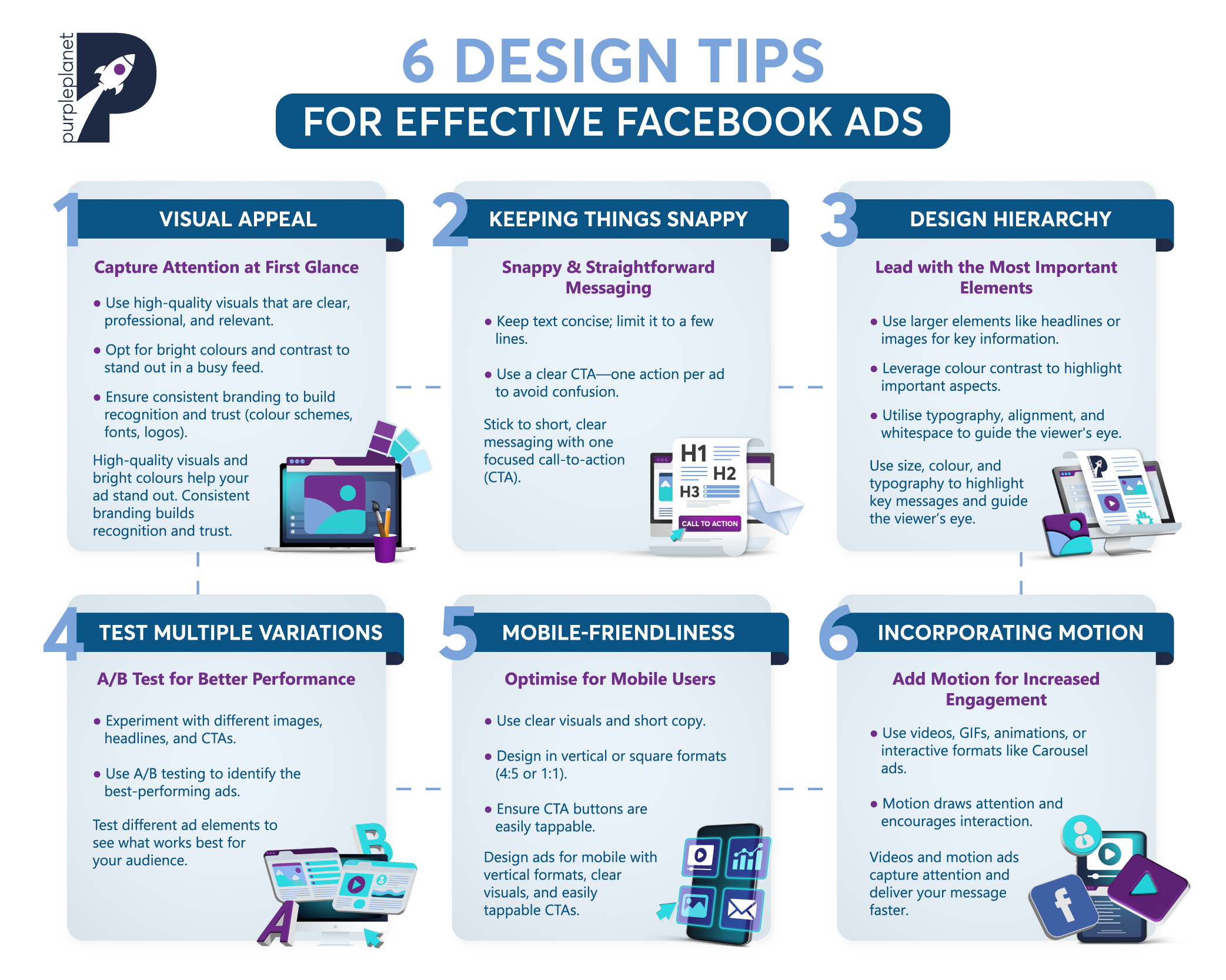

Creative Best Practices for Facebook Ads: 6 Design Tips
With over 3.065 billion monthly active users, Facebook offers businesses a vast number of potential views for their ads. Unfortunately, Facebook is an extremely competitive space; to stand out, your ad design needs to grab attention, resonate with your target audience, and encourage them to take action.
Effectively designed Facebook ads can do wonders for expanding your business’s online reach, driving traffic, and boosting sales.
In this blog, we’ll explore 6 key strategies and best practices for crafting Facebook ads that are not only visually appealing but also optimised for conversions.
Let’s dive in:

6 design tips for effective Facebook ads
1. Visual appeal
The first impression your ad makes is through what it looks like, and a lot of elements go into this. Namely, the colours, overall design, and images will contribute to users’ decisions to either engage or keep scrolling.
We advise you to focus on three key aspects: high-quality visuals, bright colours & contrast, and consistent branding.
Starting with high-quality visuals, these must be crisp, clear, and professional. Low-resolution or blurry images not only look unprofessional but can also erode trust in your brand. High-quality visuals that are relevant to your product or service draw users in and help communicate your message more effectively.
Whether it’s a striking product image, a captivating video, or a well-designed graphic, the quality of your visuals should always reflect the quality of your brand.
Next, the use of bright colours and contrast are crucial for grabbing attention. While users on Facebook are rapidly scrolling through content, a vibrant colour palette can make your ad pop out from the noise. Contrast helps emphasise important elements, like your call-to-action (CTA).
Despite the efficacy of bright colours, it’s more important that your branding is consistent.
Be mindful of your brand’s identity when getting creative because consistency is crucial to building brand recognition and coming across as trustworthy to potential customers. When the design of ads doesn’t match a business’s branding, it’s very jarring to users and can make them second guess what they’re looking at.
When your ads are visually consistent with your other marketing materials, they reinforce your brand image and build familiarity. Users are more likely to engage with ads from brands they recognise and trust. Additionally, staying consistent helps create a cohesive experience across all touchpoints, making it easier for your audience to remember and connect with your brand.
So, your Facebook ads should align with your brand’s established identity, which includes using the same colour schemes, fonts, logos, and overall tone.
2. Keeping things snappy
When it comes to Facebook ads, keeping things precise and quick is key to capturing attention and driving action. With users constantly scrolling through their feeds, you have only a few seconds to make an impact.
Your messaging needs to be concise and easy to digest, allowing viewers to quickly understand the value of your offer.
One way to achieve this is by keeping text short. Aim for a few lines that clearly convey the most important information. Long paragraphs or overly complex descriptions will likely cause users to scroll past. Instead, focus on communicating your core message quickly – whether it’s a discount, product benefit, or announcement. A clear, compelling headline paired with brief supporting text is often all you need.
Equally important is having just one clear call-to-action (CTA). Avoid overwhelming users with multiple options, as this can dilute the message and create confusion. Whether you want users to “Shop Now,” “Sign Up,” or “Learn More,” your CTA should be singular and stand out. This helps guide users toward the specific action you want them to take, increasing the likelihood of conversions.
Brands can implement this by simplifying their ad copy, focusing on one key point, and using straightforward CTAs.
3. Consider design hierarchy
Design hierarchy refers to the arrangement and organisation of elements in a design to guide the viewer’s attention in a particular order of importance. It’s about making sure that the most important information stands out and is noticed first, followed by supporting details.
When done well, design hierarchy helps viewers understand your message more clearly and quickly.
A great demonstration of design hierarchy is the following infographic, created by Caffeine Creative:

In order to guide Facebook users to read your ads in an optimal way, there are a few key principles you can implement. First of all is size. Larger elements, like headlines or key images, naturally draw more attention. You can emphasise the most important information (like a CTA or product image) by making it bigger than other elements.
Next is colour and contrast, seen in the above infographic where your eye is first drawn to the white text on the orange background. Bold or contrasting colours can make certain elements stand out and distinguish between primary and secondary elements.
Position and alignment are also fundamental to how elements in an ad are perceived. Typically, viewers start at the top and move downwards or follow a left-to-right pattern. Placing important elements, like headlines or CTAs, in these “hot spots” ensures they get noticed.
Using different font sizes, styles, or weights (known as typography) can create a clear distinction between different types of information. A bold headline followed by smaller body text establishes a clear order of reading.
Often forgotten is the importance of whitespace (or negative space). If space is left around important elements, it can draw the attention of users as they have more room to stand out.
Proximity and grouping are also going to guide users’ eyes as you can use this to indicate relationships between different elements. For example, a product description should be close to the product image, and a CTA button should be near the persuasive text.
And finally, visual cues like arrows, lines, or directional shapes can guide the viewer’s eye to the most important parts of the design.
These design hierarchy principles are extremely important as they ensure viewers can quickly absorb the most critical information and are more likely to engage with your ads in the way you want them to.
4. Test multiple variations
Testing different variations of your Facebook ads is a powerful and widely used method for improving performance. A/B testing, also known as split testing, is a key strategy where you compare two or more versions of an ad to see which one performs better. By testing various design elements, you can determine what resonates most with your target audience and optimise your ads for maximum impact.
In an A/B test, you create two versions of an ad that differ in only one key element, such as the image, headline, or CTA. You can then show both versions to different segments of your audience and track how they perform. The version with higher engagement, clicks, or conversions is the “winner” and can be rolled out as the primary ad.
You might decide to test images, videos, headlines, CTA buttons, colours, or fonts. Testing helps improve the efficacy of your ads because the data will tell you what works.
5. Mobile-friendliness
With the majority of Facebook users accessing the platform on mobile devices, ensuring your ads are mobile-friendly is crucial for maximising their effectiveness. A mobile-friendly design is one that is optimised for smaller screens and easy to engage with on the go, ensuring that your message is clear and compelling, regardless of the device being used.
To create mobile-friendly Facebook ads, make sure you:
- Avoid cluttered designs. Choose clear, high-quality images or videos that are easily recognisable on a small screen.
- Keep your copy short and punchy and avoid overwhelming users with too much information at once.
- Design your ads in vertical (4:5 or 9:16) or square formats (1:1). These formats take up more screen space on mobile, making your ad more prominent.
- Use large, legible fonts that are easy to read without zooming in. This ensures your message gets across instantly.
- Make your call-to-action button big enough to tap easily with a finger.
Optimising your Facebook ads for mobile ensures they don’t get lost in the feed. By catering to the platform’s mobile-first audience, your ads are more likely to receive engagement and perform well.
6. Incorporating motion
Incorporating motion into your Facebook ads is a way to engage viewers in a way that static ads don’t. Motion can come in many forms, from full-length video ads to subtle animations:
- Short videos: Create quick, engaging video clips that highlight your product or service in action. Videos can showcase features, offer tutorials, or present customer testimonials. Short videos should blend into the non-ad Shorts that viewers scroll through.
- GIFs or animations: Use looping animations or GIFs to add a touch of movement without overwhelming the viewer. These can highlight specific features, illustrate processes, or provide a more playful element to your ad.
- Cinemagraphs: These are still images with a minor, repeating movement, like flowing water or a flickering flame.
- Interactive motion: Facebook supports motion in formats like Carousel or Collection ads, allowing users to swipe or scroll through different images or products, adding a layer of interactivity to the motion.
Incorporating motion makes your ads more effective because movement naturally draws the eye. Motion is more likely to stop viewers in their tracks and encourage interaction.
Additionally, videos and animations help communicate more information in a shorter amount of time, giving your message a greater impact. Motion makes your ad more engaging, memorable, and likely to lead to higher click-through rates and conversions.
Final thoughts
When designing Facebook ads, the key is to strike a balance between creativity and clarity. Always prioritise the user experience – focus on visuals that captivate, messaging that’s concise, and clear calls-to-action that guide users seamlessly toward your goal.
Ultimately, the most effective ads are those that not only look great but also communicate value quickly and compellingly. By continually adapting to your audience’s preferences and keeping your designs fresh, you’ll ensure that your Facebook ads not only capture attention but also drive meaningful engagement and conversions.
To get help with designing your Facebook ads, reach out to us here at purpleplanet.


