Dark Mode in Web Design: 7 Best Practices for an Eye-Friendly Experience
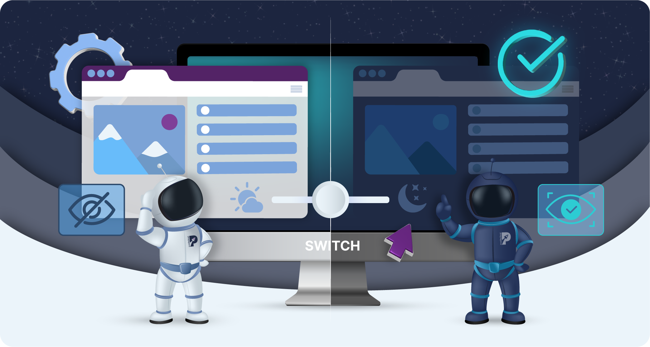
Dark mode is an alternative display setting for websites that swaps out the usual bright, white backgrounds for darker shades, typically black or grey. It’s designed to reduce eye strain, especially in low-light environments, by minimising screen brightness. Instead of blinding whites and bright colours, dark mode offers a more muted and softer contrast.
Dark mode has always been possible in computing, but it’s only become popular in recent years. Its rebirth may be rooted in the 2010s when developers found it easier on the eyes to code with a dark background. Years later, as the general public’s screen time increased, tech giants like Apple and Google began integrating dark mode into their operating systems (circa 2018-2021), and websites and apps soon followed suit.
Eye strain is a genuine concern amongst users, especially those whose jobs involve using computers all day. Dark mode is now a standard feature on many platforms, but websites have to adapt their web design if they want to opt in.
This blog will explore implementing dark mode into your business’s website design and explain the best practices you should follow to execute this optimally.
Let’s dive in:
Why should you implement dark mode in your web design?
Before we get on to the best practices, let’s explore why it’s such a good idea to implement dark mode. You might view it as extra and unnecessary, or you might feel that your business’s website design is perfect the way it is.
Fortunately, implementing a dark mode feature on your website doesn’t mean all the hard work you’ve put into your light web design is wasted. You can still preserve a lot of your branding and design efforts.
Ultimately, users will appreciate it. People are genuinely concerned about eye strain, and you can make internet browsing a more comfortable experience for them. They might not explicitly realise that you’re prioritising their comfort, but subconsciously they’ll have an easier and more enjoyable time on your website – perhaps staying longer and exploring your website long enough to convert.
Users with visual impairments or light sensitivity could arguably appreciate dark mode even more. Dark mode, among other web design adjustments, is part of something called web accessibility and your website can even get in legal trouble for not being accessible enough. So, don’t underestimate the power of making reasonable adjustments.
A final consideration is the possibility that your website might look quite modern and stylish in dark mode. Not only is a dark colour palette synonymous with sleekness, but it will also make your brand come across as contemporary if you keep up to date with current design trends.
Yes, implementing a dark mode requires extra development and design work. Plus, you’ve got to guarantee it’s done to a good quality across all devices and browsers. However, we think it’s a good investment into accessibility and staying current (here at purpleplanet, we are clearly advocates given our own dark mode and other accessibility features!).
So, let’s get into how you can pull off dark mode optimally:
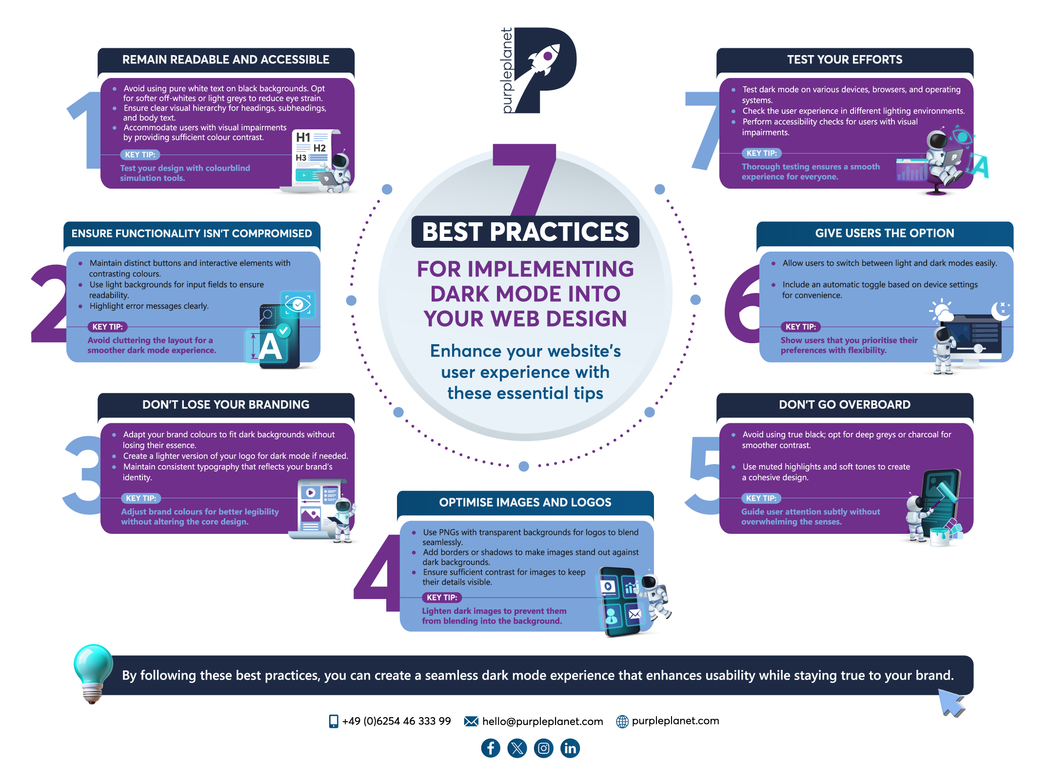
7 best practices for implementing dark mode into your web design
1. Remain readable and accessible
You want to ensure that all your visitors can comfortably interact with your website. In terms of readability, avoid using pure white text on black backgrounds.
This stark contrast can cause eye strain, despite the background being dark. Instead, opt for softer off-whites or light greys, which are gentler on the eyes. Additionally, use a comfortable line height and font size to make text easier to scan, especially for long paragraphs. Headings, subheadings, and body text should have clear visual hierarchy to help users navigate content quickly.
High contrast between text and background is crucial, but too much contrast can be as problematic as too little. Dark mode should accommodate users with visual impairments, such as colour blindness or low vision. This includes providing sufficient colour contrast between elements, especially for buttons, icons, and links.
Top tip: Consider how your chosen colours affect colourblind users by testing the site with colourblind simulation tools.
Additionally, ensure that text remains readable with screen readers, and all functional elements, like forms and buttons, are accessible via keyboard navigation. Offering customisation options, such as adjustable contrast levels or a toggle for dark mode, can further enhance accessibility for a wide range of users.
2. Ensure functionality isn’t compromised
When you arrive at the stage in this process of adapting UI elements for dark mode, it’s important to balance aesthetics with functionality. For example, buttons and interactive elements need to remain distinct against dark backgrounds and you should use contrasting colours, subtle borders, or shadows to ensure visibility, making sure hover states and focus indicators stand out.
For forms, use light backgrounds for input fields and ensure text is readable. Plus, highlight error messages with clear, contrasting colours.
Icons and navigation menus should be adjusted with lighter or inverted colours so they don’t blend into the background, and active states should remain easy to identify. Make sure you avoid cluttering the layout, which can be more overwhelming in dark mode.
3. Don’t lose your branding
Understandably, some businesses worry that their brand identity will get lost if they create a dark mode for their website. However, it is possible to preserve your brand’s visual identity. Here are our tips to do so:
- Instead of completely overhauling brand colours for dark mode, adapt them to suit the darker background. For example, if your brand uses bright colours, consider using slightly toned-down versions that maintain the essence of the brand without becoming too harsh in the darker setting. Key brand colours should remain consistent but with appropriate adjustments for better legibility and aesthetics.
- The business logo is one of the most important branding elements, so it should always remain clear and prominent. If your logo is naturally dark, create a lighter version specifically for dark mode. This preserves brand recognition without sacrificing visibility, ensuring that the logo still stands out in the dark-themed environment.
- Font styles and sizes are critical to maintaining a consistent brand voice. In dark mode, ensure that typography still reflects your brand’s identity. Don’t switch fonts or drastically change their appearance; instead, make sure the text is readable by adjusting font colours or weights while keeping the core design intact.
4. Optimise images and logos
When creating a dark mode for your website, you want to ensure its images and logos remain clear, visually appealing, and aligned with your overall design. It can be tricky, though, because dark backgrounds can affect the visibility of images and logos, especially if they have dark elements or lack contrast.
Here’s what we recommend:
- For logos, using PNGs with transparent backgrounds ensures they seamlessly blend into both light and dark modes without the need for separate versions. This avoids the awkward appearance of white boxes around logos in dark mode.
- If your logo is primarily dark, it might get lost on a dark background. Consider creating an alternate, lighter version of the logo specifically for dark mode to maintain brand visibility and recognition. Some brands invert their logos or adjust the colour palette slightly to fit the dark theme.
- Add subtle borders or shadows around images and logos when necessary to help them stand out against the dark background. This can prevent images from blending into the page too much and becoming difficult to discern.
- Ensure that images used on dark backgrounds have enough contrast so that their details are visible. Darker images may need lightening, or specific adjustments to their brightness and contrast levels, to prevent them from appearing too dim or blending into the background.
5. Don’t go overboard
When implementing dark mode, businesses should strike a balance between aesthetics and usability, avoiding the temptation to go too extreme with design choices.
One common mistake is using true black too heavily across the entire interface. While it may seem sleek, true black creates harsh contrasts with other elements, which can lead to eye strain and make text harder to read. Instead, using softer dark shades like deep greys or charcoal can provide a more comfortable viewing experience and create a smoother contrast between the background and lighter elements.
Similarly, when using subtle highlights, businesses should avoid overusing bright, neon-like colours for accents, links, or buttons. In dark mode, these colours can quickly become overwhelming and distracting.
Instead, muted highlights and soft tones provide emphasis without disrupting the overall flow of the design. The goal is to subtly guide users’ attention without overwhelming the senses, creating a cohesive and pleasant user experience that enhances readability and navigation.
6. Give users the option
Giving users the option to switch between light and dark modes will personalise and enhance their experience. On purpleplanet.com, you can swap between modes with our handy sun/moon toggle at the top right of your desktop screen (or via the menu on phones and tablets).
Offering manual control allows users to tailor the interface to their own preferences. Additionally, providing an automatic toggle based on device settings can streamline the experience, seamlessly adjusting the mode to suit users’ needs without them having to change it manually.
Including a simple switch in the website’s interface makes it easy for users to swap between modes at any time, offering a flexibility that can boost accessibility and user satisfaction. This is another way your business can show how it prioritises its website visitors.
7. Test your efforts
Testing dark mode on different devices is essential to ensure that the design looks consistent and functions smoothly across various platforms, screen sizes, and technologies.
Start by checking how dark mode appears on both desktop and mobile devices. Ensure that elements like buttons, text, and images maintain clarity and are easily distinguishable on all screen types, where colour contrasts may vary. Test across multiple browsers (e.g., Chrome, Safari, Firefox) and operating systems (e.g., Windows, macOS, Android, iOS) to ensure compatibility and consistent performance.
You might also examine the user experience in different lighting environments, like bright daylight and dim settings, to ensure dark mode remains readable and visually appealing. Don’t forget to check how dynamic elements, animations, and third-party integrations behave in dark mode, ensuring nothing breaks or looks out of place.
Finally, perform accessibility checks for users with visual impairments by using tools to ensure the contrast ratios are appropriate for all users. This kind of thorough testing will ensure everyone has a smooth and cohesive experience on your website.
Final thoughts
Implementing dark mode on websites can enhance user experience, improve accessibility, and modernise a brand’s digital presence. However, to make it effective, businesses must preserve readability and ensure that UI elements function seamlessly across devices.
Proper attention to accessibility, such as ensuring adequate contrast, supporting screen readers, and providing customisation options, ensures that the design is inclusive for all users. By thoughtfully integrating dark mode, you can offer an experience that balances style, comfort, and functionality, meeting the diverse needs of your audience.
To get help with web design, site accessibility, and even creating a dark mode reach out to us here at purpleplanet.