


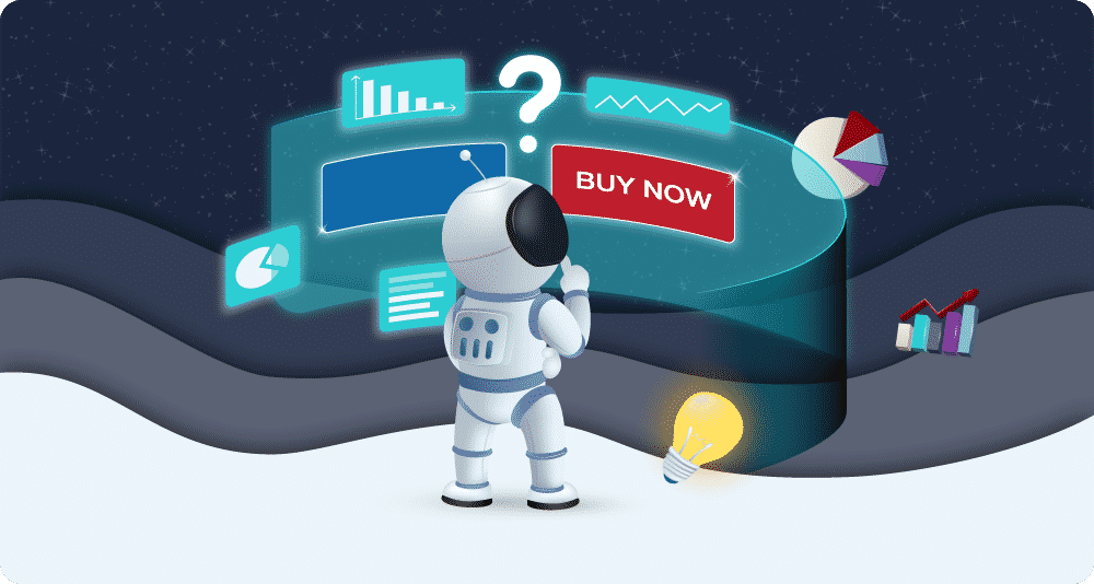


How to Craft E-Commerce CTAs That Convert
Marketing efforts are successful if they bring true value to a business. Marketing campaigns should attract, keep and convert visitors into customers.
Your business website is the best place to focus on when it comes to increasing website traffic and making online sales.
Stimulate your target audience to follow the buyer’s journey and reach the end – purchasing a service or a product.
There are different strategies that can help you improve your website conversion rate. One of those strategies is to incorporate call-to-action buttons.
In order for them to work right, they need to be done right.
What is a CTA?
CTAs (calls-to-action) are buttons used throughout a website to navigate visitors to the actions they need to take, where to click, what to read or what to buy.
A CTA is a combination of words and advertising messages that encourage sales.
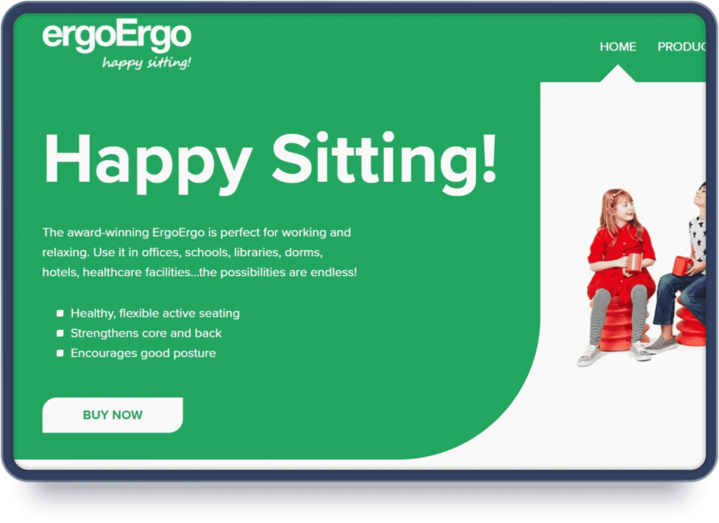
A CTA message must be clear and straight-forward. People need to know what will happen after they click it before doing so.
Check out this example from the ErgoErgo website.
What do you think would happen if you click the “BUY NOW” button?
You’ll probably be directed to a product page, where you can purchase the product, or a list of retail stores that are offering that product.
In any case, it will take a customer to the next step in the sales funnel.
 Placing the right CTAs in the right places can keep your customers engaged without jeopardising the relationship you’re building with them.
There is no right way to make your CTAs more effective. You need to spend time testing phrases, colours, and placement to see what resonates best with your audience.
Here are some best practices you can incorporate on your website that are proven to have a positive effect on the conversion rate of a website.
Consider the CTA intent
The actions your CTA entices your customers to make should be aligned with their interests.
For example, someone on a product page is interested in buying, someone on a blog page might be interested in signing up for a newsletter, someone researching your services might be interested in learning more about what you’re offering.
Use CTAs that entice them to learn more about your services.
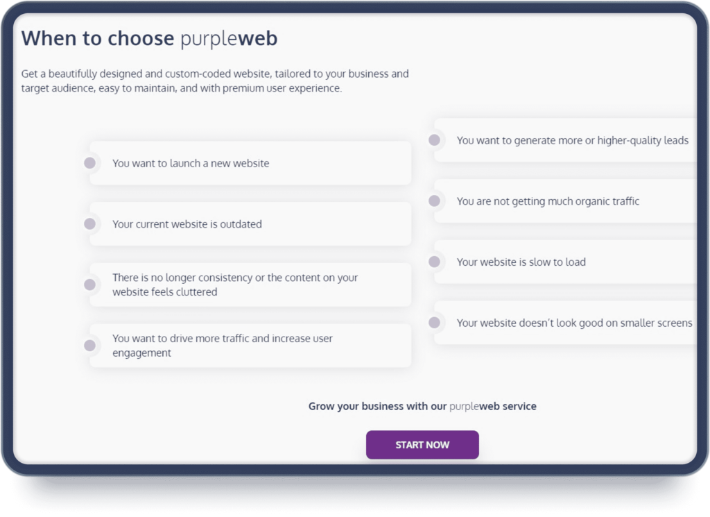
Here is an example from our own website.
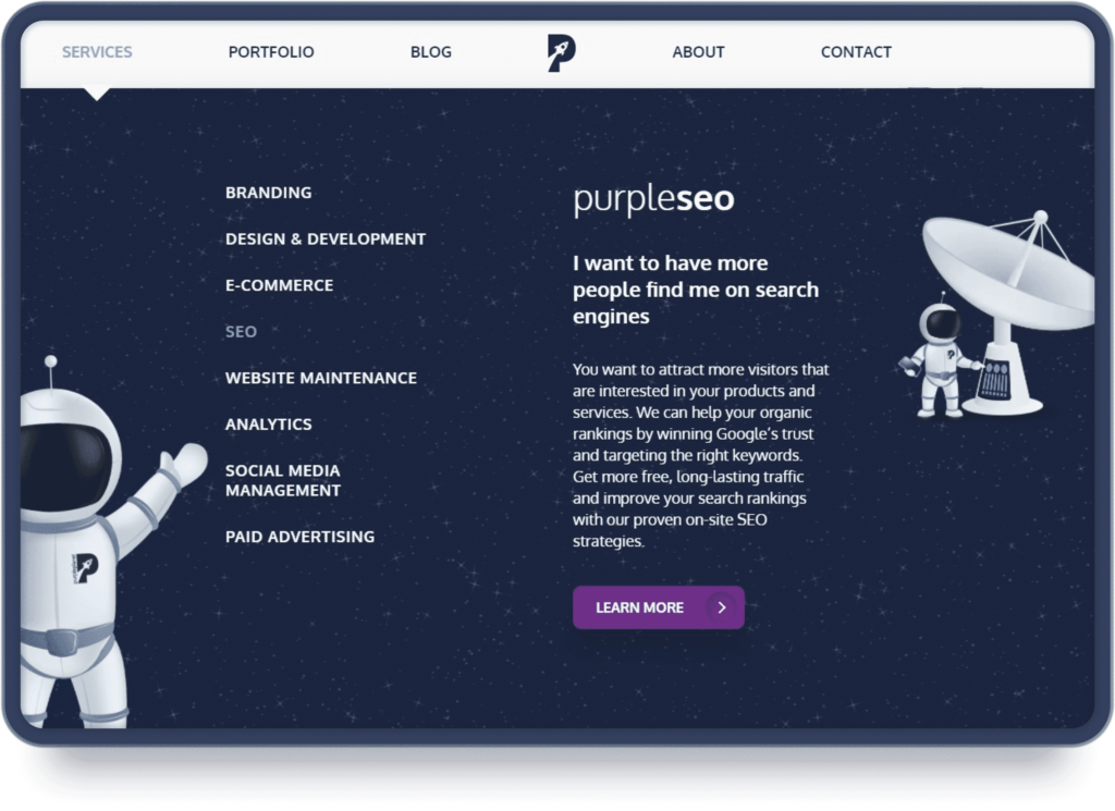 Someone on a contact page is interested in making contact with your business. Add a way to call or send a message.
The CTAs must help them achieve their goal, rather than moving them away from that goal.
People are often hesitant to click buttons on websites, so you need to make sure you connect the action with the customer’s intent.
All this requires you to know who your audience is, what their problems and desires are, and how they got to your page.
For example, if you place a “BUY NOW” button on educational content such as a blog post, you can be sure that nobody will click on it. That type of CTA will work better on a service or product page.
Work on the CTA copy
Words you use in CTAs are important.
There are certain action words that are proven to improve conversions.
Some of these words are “Buy”, “Download”, “Get”, “Join”, “Start”, “Explore”
The copy of the whole landing page is important when it comes to conversions. No matter how well you craft your CTAs, they won’t work if people do not have all the information to make an informed decision. You want the web content to sell your CTA.
Keep things simple and scannable.
Make the CTA personal to your audience. The more personal you can make it, the better your conversions will be.
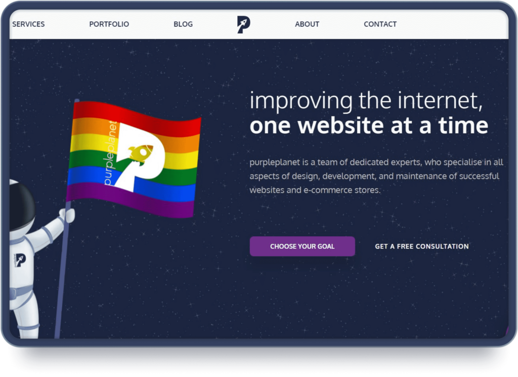
On the purpleplanet homepage, we use “Choose your goal” instead of “Services”.
This way we not only use an active verb and entice the people to take action but we also connect it with the main reason they landed on our website – to improve their website presence.
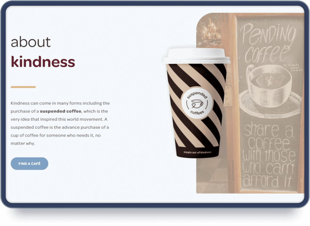
 Keep the copy short and sweet.
Suspended Coffees uses short buttons such as “Find a Café” to drive customers to a listing page where they can explore different coffee shops.
 Set clear expectations of what you want your clients to do, and what you will deliver when they complete the actions, to improve your chances of conversion.
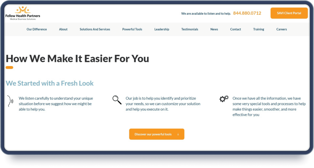
If your goal is to get visitors to learn more about the services you offer, place a button that says “Browse our services” instead of a simple “Learn more”, similar to what Fellow Health Partners are doing.

CTA Design and colour
When it comes to CTAs, design is crucial.
CTAs need to be consistent with the overall look of the website, but they also need to stand out.
- Use consistent CTAs throughout the whole website
You cannot use a big bright red button in the navigation and then use a blue or green one further down the page. This will confuse your visitors. You should follow brand guidelines regarding colours, shapes, and forms.
Incorporate contrasting colours in the buttons and make them look clickable, like Fellow Health Partners do.
- Use big, bold CTAs
Use bigger CTAs to attract visitors’ attention. Bigger buttons are hard to ignore.
Look at this CTA from Common Sense Advisors, for example.
 Big CTAs are also mobile-friendly, as they are easier to click.
It’s hard to miss the Common Sense Advisors button, even on mobile.

If you don’t want to use big CTAs you can still make people pay attention to them by distinguishing them by using different colours or by using a lot of white space around the button to make it stand out.
Just like Healthalytica are doing.

- Use loud colours
People often scan the content on a page instead of reading it, so if the page has a lot of text, make the buttons stand out by using bold text, highlighting the text or with a bold background colour.
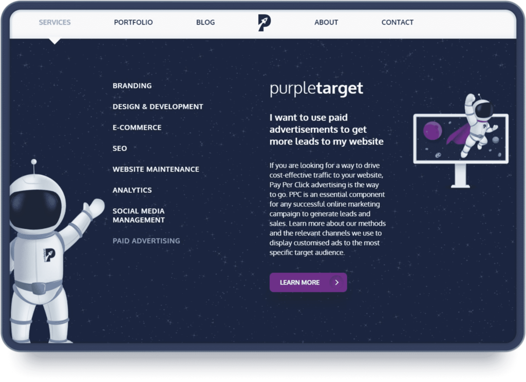
You can also accompany the button with attractive illustrations that excite the user, to drive more clicks.
See how we’re doing that when presenting our services.
Place the CTAs strategically throughout the page
Grab your visitors’ attention the second they land on your website. It’s a good practice to place your main CTA above the fold on your website.
“Above the fold” is the first section a visitor sees on a website without having to scroll down the page.
To figure out where to place the rest of the buttons, think about the sales funnel. For example, a great placement for a “Buy Now” button is after a section where you explain the product benefits.
Include a secondary CTA
Using a secondary CTA is a great strategy for a website that has a lot of information to explore or services to browse.
Keep the emphasis on your main CTA.
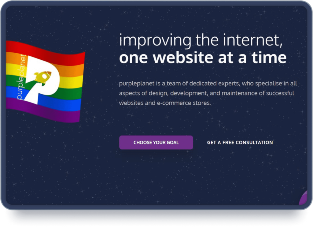 There’s a main CTA “Choose your goal” and a muted CTA “Get a free consultation”
Both are clickable and actionable but we want to highlight one over the other.
The second CTA is without a colourful background, to make the main one stand out more.
The buttons also target people from different stages of the funnel. The first button is for people who are already convinced what types of services they need and want to explore more. The second “muted” one is for people who know they need to improve their website presence but are still unsure of how they can do that. Hence, we provide a free consultation to help them figure it out.
Incorporating muted CTAs is a smart strategy when targeting different conversion points.
Be careful when incorporating a second button, you want to make sure that one of them is truly muted, as you don’t want them to compete for the user’s attention.
CTAs can make or break your conversion rate.
You need to spend time crafting CTAs that will resonate with your audience. If you need help creating and applying the right CTAs on your website, feel free to contact us.