Do I Need a Responsive Website?
If the meaning behind the term “responsive website” is unfamiliar to you, you’re more than likely in the majority. Let’s start with some background information, for those who aren’t familiar with this fairly new functionality.
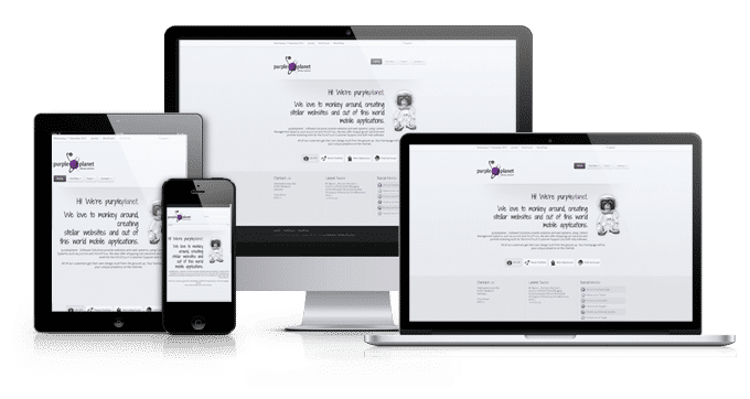
Responsive websites adjust automatically to fit on desktop, tablet and smartphone browsers. In the past, you’ve probably opened a website on your smartphone and it was a miniaturised version of what you would see on your desktop. You zoomed in and then moved the website around and enlarged and zoomed out as needed, to read text and click on things. That was not a responsive website. A responsive website looks good whether you’re looking at it on a phone, a tablet, or on a desktop. In fact, you’re reading this post on a responsive website. If you’re able to, open this page in a desktop browser and also a tablet (portrait or landscape) or a smartphone, and you’ll see the subtle changes that are programmed in so that the site displays in an appropriate format on the screen, and orientation, of choice.
So, do I need a Responsive Website?
Is your business or organisation taking advantage of responsive web design right now or planning to in the very near future? If not, you are in danger of losing a lot of potential business in the coming year. There are three general exceptions to this:
- You don’t depend on your website to stay in business
- Your competitors are not important or you don’t have any
- You are familiar with responsive design, you’ve already decided it’s not right for you and you have an alternative mobile strategy
If any of the above apply to you, please feel free to read on for informational purposes and perhaps comment below on your website experiences. If your company or organisation depends on its web presence enough that losing the business it brings to you would be a major blow, getting a responsive website as soon as possible should be your primary online marketing goal.
Responsive is Better
To illustrate why responsive is better, take a look at these stats from a website I administer, which is representative of many others. If you use Google Analytics on your website, you can look at these kind of statistics and gauge how urgent a responsive change is for your company.
The chart shows website visitors using mobile, tablet and desktop devices over the last 12 months.
In this case, the website receives around 34% of its traffic via mobile devices. For the purposes of this analysis, we’re including tablets as mobile devices. Given that this website is not responsive, and doesn’t have a mobile version, a large chunk of visitors are receiving a sub-optimal experience.
And that’s not the worst of it…
What this chart doesn’t show is consumer trend. This comparison below shows us the obvious direction in which things are heading, as it displays mobile vs. desktop visitors for the past 12 months (as above) plus the 12 months preceding those. Mobile interaction with this website doubled in one year. This, by itself, should be all the reason you need in the case for a responsive website.
What Does It Cost?
If you have a relatively simple brochure website for your business, modifying your existing site to be responsive may cost as little as a few hundred dollars or euros. That is assuming the design lends itself to responsive functionality. If you haven’t renewed your website in some time, then the chances are you’ll need to go through a complete redesign process and incorporate the responsive functionality into the new site. If you are already thinking of a website “refresh”, then it’s a no-brainer to add a little to the budget to get the responsiveness your customers are coming to expect.
The Future Is Mobile
Without a mobile-friendly website, your online future isn’t bright. If you’re not providing a mobile-friendly experience for your customers, they’ll quickly move away from your website and head over to your competitor, whose shiny, new responsive website is easier to use. The future, if not completely mobile, will certainly have its roots in mobile technology, as we see users increasingly favouring their mobile devices over desktop computers.
Get in touch for a free consultation on your current website and its potential for including responsive functionality.