


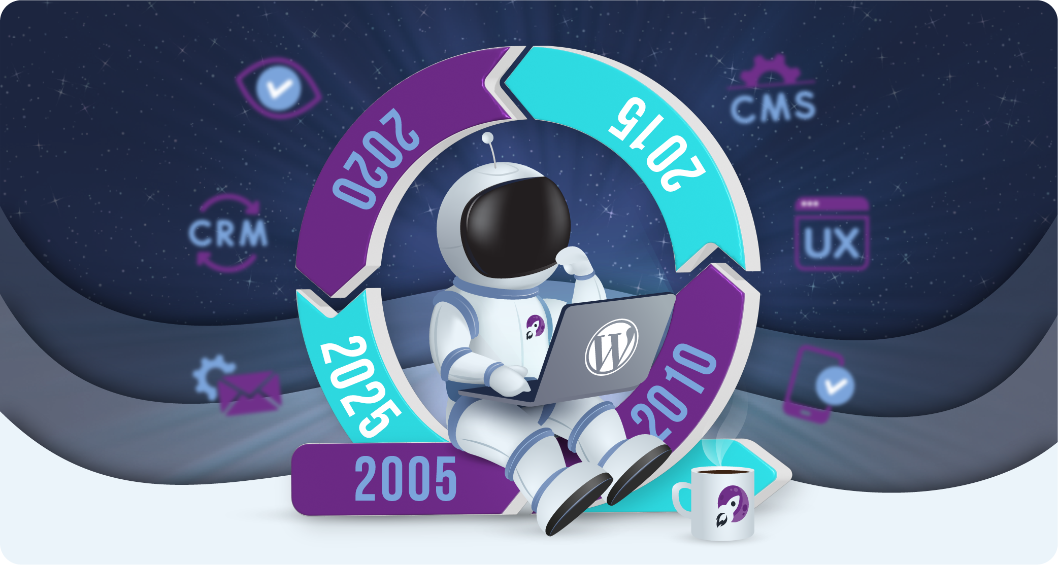
purpleplanet at 20: Two Decades of Transformation in Web Design
Key takeaways
-
Web design has evolved from text-heavy layouts to minimalist, responsive, and user-focused designs.
-
Accessibility and mobile responsiveness are now essential for inclusive digital experiences.
-
Innovations like AI and motion UI are shaping the future of personalised and interactive web design.
As I sit here today, taking a moment to reflect on my journey as a business owner over the past twenty years, I am struck by the profound changes that have shaped the realm of web design. The digital landscape in 2005 was remarkably different from what it is now, and the transformation has been nothing short of revolutionary.
When I started purpleplanet in the early 2000s, the internet was already a bustling marketplace, but the aesthetics and functionality of websites were rudimentary by today’s standards. Back then, web design was largely dominated by a utilitarian approach. Websites were primarily created for functionality, with less emphasis on aesthetics. The typical website was cluttered with text, hyperlinks were blue and underlined, and navigation could often be confusing. It was an era when frames and tables ruled the layout, and the notion of ‘user experience’ was in its infancy.
The mid-2000s brought with them a wave of creativity as designers began to push the boundaries of what was possible. With the advent of CSS (Cascading Style Sheets), web design took a significant leap forward. This allowed for more sophisticated layouts and the separation of content from design, which meant websites could be more visually appealing without compromising on speed or functionality. The focus started shifting towards making sites more engaging and aligned with brand identity, a trend that has only intensified over the years.
As we moved into the 2010s, responsiveness became the linchpin of web design. The explosion of smartphones and tablets meant that people were no longer accessing websites solely from desktop computers. The concept of responsive design – where a website adapts seamlessly to the size of the screen it’s being viewed on — became fundamental. This era also saw the rise of minimalism in web design. Where once pages were crammed full of information and media, now space, clean lines, and restrained colour palettes became markers of a sophisticated site.
Today, we are witnessing an era where web design is not only about making sites look beautiful but also about crafting experiences that are intuitive and accessible. The integration of AI and machine learning for personalised experiences, the emphasis on accessibility to ensure inclusivity, and innovative interactions through motion UI are just glimpses of how technology is continually reshaping our approaches.
Looking back from the vantage point of twenty years of purpleplanet, it’s fascinating to see how these changes in web design reflect broader shifts in technology and society. Each trend has not just been about aesthetics but about adapting to the changing ways in which people interact with digital content.
As I look to the future, I am excited about the possibilities that new technologies and design philosophies will bring. I also recognise the importance of maintaining a balance between innovation and accessibility, ensuring that as we move forward, we do not leave behind those who interact with our digital spaces.
It’s been a remarkable journey so far, and as I continue to steer the purpleplanet team in this ever-evolving digital world, I remain committed to embracing change, fostering creativity, and delivering exceptional digital experiences that resonate with users and stand the test of time.
The future of web design looks promising, and I am here for it, ready to adapt and innovate, just as I have done for the last twenty years.
As we celebrate two decades of web design transformation, we’d like to share some wisdom that has stood the test of time:Keep User Experience at the Forefront: Always design with the user in mind. A beautiful website means nothing if it isn’t easy to navigate and enjoyable to use.
- Stay Adaptable: The digital world is ever-changing. Be ready to evolve your website as new technologies and user preferences emerge.
- Focus on Accessibility: Make sure your website is accessible to all users, including those with disabilities. It’s not just good practice; it’s essential.
- Embrace Minimalism: A clean, uncluttered website is often more effective than one crammed with information. Less is more in modern web design.
- Prioritize Mobile Responsiveness: With the majority of internet traffic coming from mobile devices, ensure your website looks great and functions well on all screens.
Remember, whether you’re looking to revamp your website, boost your brand, or streamline your business processes, our team at purpleplanet is here to help. We combine twenty years of experience with cutting-edge innovation to deliver digital experiences that truly stand out. Let’s make the next decade even more transformative together.
Need a website design refresh? Find out how purpleWeb can help elevate your brand and design identity.