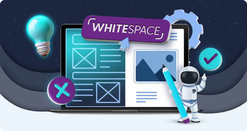

Whitespace in Web Design: 5 Reasons Why Less is More
Whitespace, often mislabelled ‘empty space,’ can be a highly impactful element of web design.
Far from being wasteful, whitespace gives structure, balance, and clarity to a page, shaping how users interact with and experience the content of a website. By providing subtle space between text, images, and interactive elements, whitespace can create a visual hierarchy, guide user focus, and enhance readability.
When web designers utilise whitespace well, they transform a cluttered, overwhelming layout into a clean, intuitive one, allowing content to ‘breathe’ and highlighting what’s most important on a webpage.
This blog will explore the ways whitespace can be used, how it impacts user experience, and why it is an unforgettable aspect of web design. Let’s dive in:
Why are web designers not using whitespace?
First, let’s explore the problem. Why are web designers forgetting, or choosing not to use, whitespace? What misconceptions might be at play that are misleading the creative process?
On the whole, web designers might feel pressured to make impressive-looking websites or convey vast amounts of information at once. They may succumb to the compulsion to make a ‘bold’ impression, choosing to ‘fill up’ space with animations, detailed textured areas, or large images. This may be brought on by clients, who associate complexity with value – asking for more features, design elements, or information on each page.
There’s also the misconception that every pixel should ‘count’ and communicate something. Empty areas may be perceived by some web designers to be ‘wasting space’. Unfortunately, this can just create a cluttered visual experience for visitors.
Another aspect of this problem is designers who are eager to showcase their skills. These creative types, if new to the industry, may want to use complex layouts, gradients, and textures to communicate how talented and able they are. It’s understandable if they want to make a good impression, but sometimes less is more.
And finally, some web designers may not have learned the power of whitespace yet. Web design is a huge field with countless methods and approaches. Some designers are self-taught, and others take official courses. Whitespace is simply another aspect of web design that may have been overlooked.
That is, until now! Whitespace is actually an active element that will help designers create balanced, intuitive layouts that are both engaging and functional.
Different types of whitespace
The first thing to know is that whitespace comes in several forms, each playing a unique role in shaping user experience and visual clarity. The two main types are macro whitespace and micro whitespace.
Macro whitespace refers to the larger gaps that separate sections or elements on a page, like the space around headers, images, and margins between blocks of content. This type of whitespace creates structure and a visual hierarchy, guiding the user’s eye across the page and emphasising key areas without overcrowding.
Micro whitespace, on the other hand, is the smaller space between lines of text, individual letters, and elements within a design component. This subtle spacing enhances readability, especially in text-heavy areas, making content more comfortable to read and absorb.
Whitespace can also be active or passive. Active whitespace is intentionally added to direct attention and improve navigation, while passive whitespace naturally results from margins, padding, and default spacing within elements.
Why is whitespace important? 5 reasons why less is more
As an active element of design, whitespace is often working just as hard as visible content to shape the product that users see. There are 5 main reasons why it’s so critical:
1. Whitespace enhances readability
Whitespace plays a big role in enhancing readability, particularly on content-rich or text-heavy pages that can otherwise feel dense and overwhelming.
By incorporating adequate whitespace around paragraphs, between lines of text, and even between letters, designers give users’ eyes a break, making the reading experience more comfortable and visually inviting. This micro whitespace increases text legibility by creating a gentle flow that helps users’ eyes track from one line to the next without strain, especially on screens where text can easily feel cluttered.
For instance, line height (or line spacing) allows each line of text to stand out clearly, while letter spacing (kerning) prevents words from feeling cramped. This well-spaced text not only improves comprehension but also reduces fatigue, encouraging readers to stay on the page longer and engage more deeply with the content.
Without enough whitespace, even the most valuable information can go unread, as users are likely to skip or skim over dense, unappealing text. Thoughtful use of whitespace, therefore, boosts readability and increases the chances that readers will fully absorb and understand the message.
2. Whitespace reduces visual chaos
Whitespace tempers the complexity of a layout and creates a sense of order. When a page has too many elements crowded together, it can quickly feel cluttered, making it difficult for users to focus and absorb information.
By introducing whitespace around images, text blocks, buttons, and other design elements, designers establish a clear separation that defines each area’s purpose, helping users to navigate the layout more intuitively. This separation adds a visual rhythm to the design, making the user experience smoother and more comfortable.
For example, generous spacing around high-priority elements, like headers or call-to-action buttons, isolates them visually, so they attract attention without competing with surrounding content. This clear structure reduces cognitive load by giving users an effortless way to process each section of content.
Furthermore, whitespace enhances contrast, allowing visually complex or colourful elements to coexist without clashing. This balance is crucial for both aesthetics and usability, as it creates a calm, harmonious design that encourages users to linger and explore.
3. Whitespace guides the eye
Whitespace can guide users’ attention and establish a natural flow through the content on your website. By creating intentional gaps and spacing around specific elements, whitespace subtly directs the eye to key areas without overwhelming users with competing visual cues.
For instance, when whitespace surrounds a headline or call-to-action (CTA) button, it frames these elements as focal points, naturally drawing users’ attention toward them. This focused attention helps users understand what actions to take next or which information to prioritise.
This approach to spacing also builds a strong visual hierarchy, where larger or isolated sections catch the eye first while supporting content follows seamlessly. By controlling how users’ eyes move across a page, whitespace helps break down complex layouts into digestible chunks, guiding users from one section to the next. Instead of a cluttered experience that demands users to ‘hunt’ for information, whitespace offers a structured, almost effortless path through the content.
4. Whitespace demonstrates confidence and trust
Whitespace in design can often signal confidence, professionalism, and trustworthiness – qualities that resonate with users across all types of brands, not just luxury ones.
By allowing elements to ‘breathe’ and refraining from cluttering every inch of the page, whitespace creates a sense of intentionality, suggesting that the brand values clarity and quality over flashy distractions. This restraint implies a deep understanding of design and usability, which fosters trust in users, who feel more at ease navigating a well-organised, open layout.
Whitespace also communicates confidence by showing that the brand isn’t desperate to push content in front of users; instead, it allows the user to explore at their own pace. This open, uncluttered presentation can make users feel welcomed and respected, creating a subtle psychological effect where the brand comes across as assured and credible.
By not overwhelming users with information, the design suggests that the brand has faith in its product or service and trusts the user to engage without pressure.
This approach benefits not only luxury brands but also any business aiming to build customer trust and brand authority. Whether it’s a tech company, a healthcare provider, or an educational institution, whitespace used with purpose gives users the impression of reliability and professionalism.
It shows that the brand has considered user experience carefully, aligning its design choices with the values of transparency, calmness, and user-centred thinking, which in turn can elevate a brand’s reputation and encourage long-term loyalty.
5. Whitespace highlights key elements
Whitespace creates visual separations, allowing important content to stand out without overwhelming users with excessive decoration or noise. In web design, this is particularly useful for emphasising elements like headlines, product images, call-to-action (CTA) buttons, and important messages.
By surrounding these high-priority items with ample whitespace, designers can draw the user’s eye directly to these focal points, making them easy to locate and act upon.
For instance, a CTA button that sits within a clean, open space will naturally attract attention because it doesn’t compete with surrounding elements. This intentional emphasis creates a direct path for users to follow, which increases engagement and click-through rates. Similarly, whitespace around product images or headlines adds impact, reinforcing their importance within the page’s hierarchy.
This helps users absorb information faster and guides them naturally through the desired actions on the site, whether that’s signing up for a newsletter, making a purchase, or simply reading further.
Whitespace FAQs
Now that you’re familiar with the different types of whitespace and how they impact your website visitors, we’ll answer some of the common questions that come up around this aspect of web design:
Q: Should whitespace be used differently on mobiles and desktops?
A: Yes. While whitespace is essential in desktop designs, it’s perhaps more crucial on mobile.
Since screen space is limited on mobile, whitespace must be used thoughtfully to prevent clutter. Spacing between interactive elements, like buttons or links, is essential on mobile, where users rely on touch navigation. Clear, generous padding ensures that users can tap accurately without accidentally selecting adjacent elements, enhancing the overall user experience.
On desktop, there is more room to incorporate whitespace, giving designers the flexibility to create a balanced and structured layout. Desktop designs can afford to use both macro and micro whitespace to segment content, emphasise calls to action, and create a sense of openness without the constraints of mobile. However, effective design adapts whitespace for both platforms, ensuring a cohesive, user-friendly experience no matter the device.
Q: Is whitespace good for accessibility?
A: Whitespace is incredibly relevant in the conversation about web accessibility. Adequate whitespace around text, buttons, and interactive elements helps users with visual impairments or motor disabilities engage more comfortably.
In text-heavy areas, whitespace improves readability for users with cognitive impairments, dyslexia, or visual processing challenges by reducing eye strain and making text blocks less overwhelming. A thoughtful use of whitespace ultimately supports an inclusive design, making websites more user-friendly for a diverse audience.
Q: Can there be too much whitespace?
A: Yes. While whitespace is beneficial, overusing it can leave a design feeling too sparse or empty, leading to a loss of focus. The key is balance. Designers should use whitespace to highlight key elements and create a clear visual hierarchy while ensuring the design remains engaging and informative.
Q: Can whitespace impact SEO?
A: While whitespace itself doesn’t directly affect SEO, a well-structured page with whitespace can improve user engagement metrics like time on page and reduce bounce rates, which are indirect factors that can positively influence SEO rankings.
Final thoughts
Designers who understand whitespace as an active, guiding force can leverage it to make their creations more enjoyable, intuitive, and memorable. It’s not wasted space but rather an element that holds a lot of power in how users experience and perceive content.
Get help with your web design and use of whitespace by reaching out to us here at purpleplanet.


