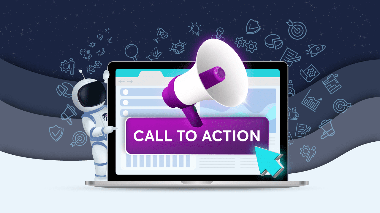
A Fundamental Guide to Effective CTA Buttons
Key Takeaways
When you’ve poured so much into every detail of your digital marketing strategy, it’s hard to believe that a click stands between a conversion and a bounce. But it does. Out of all the messages that your copy delivers, your call-to-action (CTA) is the most important.
A CTA tells a potential customer what you would like them to do after making a case for your business. Naturally, this must be clear and compelling enough to get the customer to take action. Whether it’s for making a purchase, signing up, or getting in touch with you, a well-designed CTA can boost clicks and drive conversions.
Although businesses often present CTAs in various ways, such as links, buttons, pop-ups, and banners, we’ll focus on buttons. What makes a good CTA button? What doesn’t?
To help you get more clicks and conversions out of your buttons, we’ll be exploring all there is to know about high-converting CTA buttons. Let’s dive in.
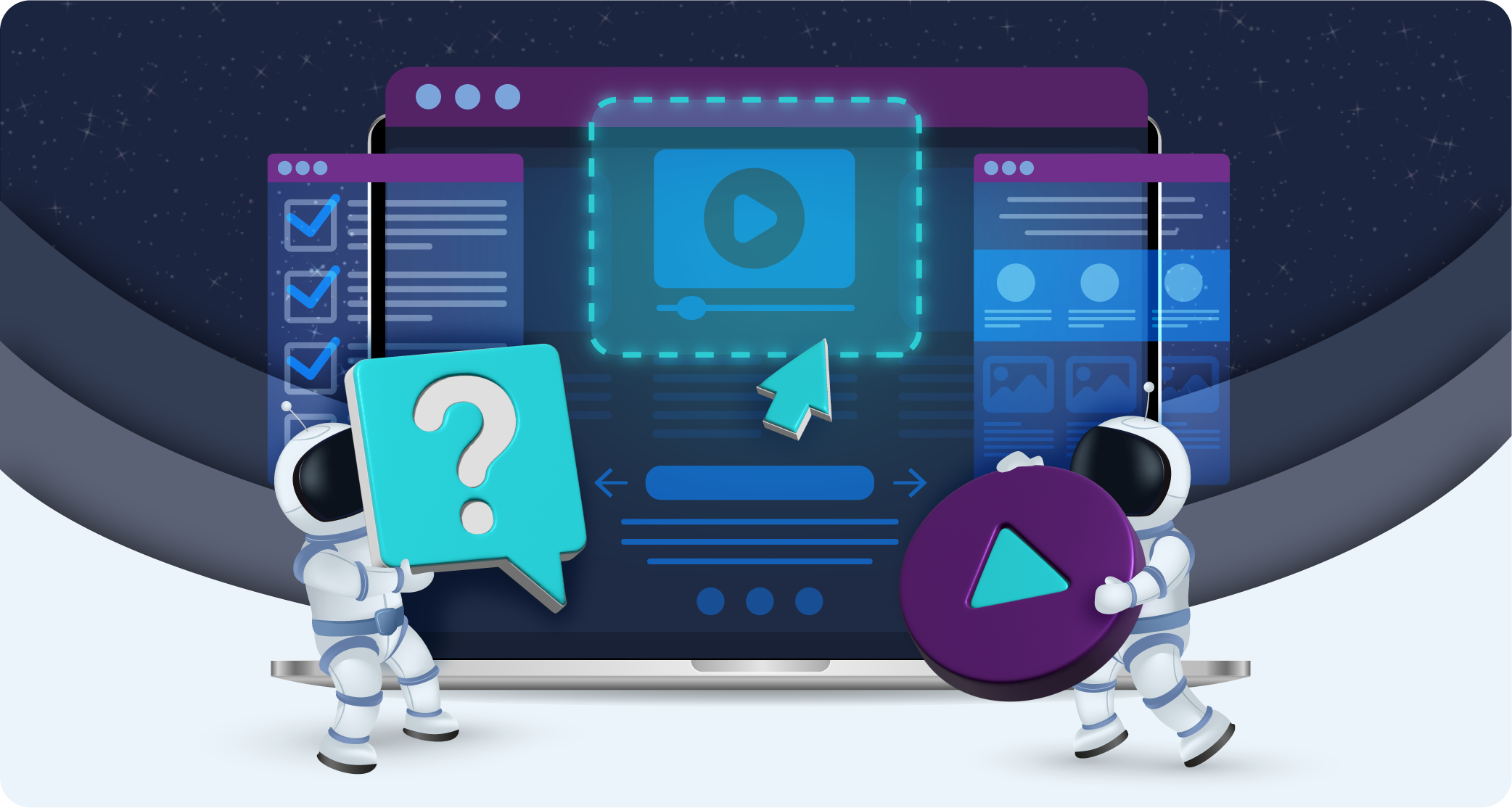
What are CTA Buttons?
Call-to-action or CTA buttons are the buttons used on websites and landing pages to get users to convert. These buttons come in different sizes and styles, but they all have one goal: to get a visitor to click and convert. Depending on your business’s nature and objectives, that could be an opt-in, a download, or even a paid subscription.
Effective CTA buttons 1) do exactly what you want them to do (get a visitor to click) and 2) give a visitor exactly what they want, which is to take up your offer.
CTA buttons work so well because:
- They have design elements that make them stand out
- Internet users have become accustomed to receiving instructions through buttons
- They make it easier for visitors to identify where they need to click to get what they want
- They drive more conversions by eliminating confusion and telling visitors what to do
How Do You Make A Good CTA?
A good CTA:
1. Attracts attention
2. Develops a connection
3. Creates interest
4. Builds suspense
5. Gets users to take the next step
How do you ensure that your CTA does all five things?
Establish your primary goal
Narrowing your goals down allows you to keep your landing pages focused and impactful. It’s often more effective to pick one main goal for conversion and then use your CTAs to drive people through that specific funnel. If you want visitors to sign up for a free trial, also asking them to follow you on social media or subscribe to your newsletter takes away from your main goal.
Understand your audience
Develop a clear understanding of your buyer personas. Understanding your target customers’ needs, pain points, desires, and concerns allows you to craft messages that drive more clicks and, ultimately, higher conversions.
Optimise placement and design
When a customer has made it to your page, the last thing you want is for them to miss your CTA and leave out of frustration. Poorly designed CTAs are not only hard to spot but tend to leave customers uncertain of what they need to do. Hence, the design and placement of your CTAs matter. Buttons attract more clicks than links, pop-ups, or banners, so, it’s easy to see why – well-designed buttons are almost impossible to miss.
Use clear and impactful copy
A great CTA tells your audience what you want them to do as concisely as possible. Leading with action words is a great way to do this. For example, start your CTA with the word “subscribe” if you want to build an email list or “shop” if you run an online store; this will help increase click-through rates. In other words, you don’t want to be passive; you want to compel customers to take action by being clear about what they need to do.
Another way to leverage copy is to make use of microcopy. Microcopy is the text around a CTA button that provides more information and encourages action by eliminating anxiety.
State your value proposition
CTAs that communicate your value proposition do better at persuading visitors to take action. Instead of stating what you would like visitors to do, tell them what they stand to gain by taking action. Benefits-driven copy generates enthusiasm and can increase your conversion rates.
Use numbers to your advantage
Customers respond favourably to discounts, incentives, and special offers. In fact, 93% of consumers purchase something because of a discount. Plus, using numbers is a great way to convey value and set expectations.
Use emotion
CTAs that are emotionally engaging tend to perform better. As customers are faced with countless decisions every day, triggering certain emotions through your copy allows you to reach them.
Play on FOMO
When customers think they might miss out on a great deal, they’re more likely to take action. This phenomenon is called FOMO (fear of missing out) and you can take advantage of it by providing time-sensitive offers and using words such as “now”, “only”, or “today,” which create a sense of urgency.
Optimise your CTAs for mobile and PC
Optimising your CTAs for mobile and PC guarantees you better click-through rates. Because users on desktops and mobile exhibit different behaviours, it’s a good idea to tailor your CTAs according to device. Design considerations are also important, as they ensure a seamless user experience. Your website and landing pages should be optimised for mobile so that your CTAs display the right way.
Test everything
Increasing your click-through rate is strongly related to how well you know your audience. Taking a people-first approach involves testing and iteration. As such, it’s important to test the design, placement, and copy of your CTAs to find out what works best. A/B testing is a great way to figure out which CTAs are effective. Heatmaps can help you determine which
CTAs aren’t getting clicks. Google Analytics also allows you to track button clicks and optimise your CTAs accordingly.
7 CTA Button Best Practices
Here are 7 CTA button best practices to help you get more clicks:
1. Your buttons should look like buttons
For a user to click on a button, they should be able to tell it’s a button. This means it should look clickable and have a bold background that contrasts with the rest of your webpage. In terms of shape, rectangular buttons and buttons with rounded corners have become the standard.
Research even suggests that rounded corners enhance information processing and draw attention to the centre of a button. Conduct usability testing if you want to ensure that your buttons are easy to identify.
2. Make your main button stand out
Although green, orange, and blue buttons tend to perform better, being mindful of your site’s design and colour scheme is a more user-friendly approach. The key is to use contrasting colours to draw attention to your button.
It’s also common to have other buttons on your website that aren’t your main CTA. These buttons should blend in and not draw attention away from your CTA. Using graphics such as arrows can also make your button stand out more.
There should also be enough whitespace around your buttons to ensure they don’t get crowded out by other components on your webpage. In fact, making use of whitespace increases visibility and comprehension by as much as 20%.
3. Get your text size right
Getting your text size right is crucial. It’s easier for users to miss small text, and text that’s too big discourages clicks. Although people have a subconscious dislike for large lettering, you don’t want them to have a hard time reading your buttons either. It’s about striking a balance and finding the appropriate size for your website.
4. Phrase your buttons for action
CTA buttons should contain action-oriented text. Getting rid of certain words and replacing them with high-energy words like “get”, “download”, or “try” can lead to more conversions. This is because these words tell the user what to expect after clicking on your button.
For example, instead of saying “free trial”, go for “start free trial.” Adding words like” now” or “today” to your CTA buttons encourages your visitors to take action while an offer still stands. Customers hate to miss out on a good deal, so they are more likely to click through.
5. Keep your button text short
For buttons that convert, say what you want to say as concisely as possible; two to five words will do. This doesn’t give you much to work with, which is why adding microcopy just above or below your CTA buttons allows you to provide extra information, deliver more value or highlight your CTA. Leveraging the power of numbers and social proof in your microcopy is another great way to boost clicks.
6. Personalise your button text
You’ll generate more clicks by changing your phrasing from the second person to the first person tense. This is because using the first person makes potential customers feel more connected to your brand. When users feel valued and seen, they’re more likely to click and convert.
7. Optimise your button placement
Picking the best button placement can be the difference between a conversion and a bounce. Too soon, and a customer might have too little information to make a decision; too late, and a customer might abandon your page altogether.
Above-the-fold placement guarantees that visitors won’t miss the button — it’s the first thing they’ll see after landing on your page. Above the fold works best for simple products and for warm-to-hot leads who are already familiar with your offering.
Placement below the fold allows you to inform and persuade a visitor, which is why it tends to work better for complex products. Because placing a CTA below the fold nurtures your visitors before they can click on your button, it’s great for cold leads or visitors who still have a lot to learn about you and your offering.
6 CTA Button Mistakes to Avoid
Avoid these mistakes to ensure higher click-through rates and conversions:
1. Not delivering on your promises
Your CTA makes certain promises and tells customers what to expect once they click on your button. If you fail to deliver what you promised, customers will feel duped. This does nothing to inspire confidence in your business. You’ll lose their trust — and support.
2. Not testing your buttons
Sometimes being creative and flouting convention can pay off in major ways. But you’ll never know unless you test your buttons and repeat. If you’re not testing your buttons, you’re relying on assumptions and leaving valuable insights on the table.
3. Misplaced CTAs
A visitor on your pricing page is a lot further on their buying journey than someone on your blog. A misplaced CTA would ask them to download an offer or opt-in for your newsletter. A great CTA, on the other hand, would offer something more purchase-oriented, like a discount or free trial.
4. Competing CTAs
When it comes to CTAs, more isn’t always better. To increase conversions on your landing pages, you need to keep them focused, meaning one high value offer per page. Competing CTAs are confusing and can harm your landing page conversion rates.
5. Offering too many options
The more choices a customer has, the less likely they are to make a decision. Even when they do make a decision, they are less likely to be satisfied with it. This is known as the paradox of choice, and it can cause friction during the conversion process.
While some situations might be better suited to multiple options (such as different subscription options for the same product), it’s always better to limit your options to prevent analysis paralysis.
6. Asking for too much
Asking for too much information can affect the performance of your CTAs, too. If a customer feels like they have to work too hard to take up an offer, they might reconsider. The key is to keep your asks simple to cause as little friction as possible during the conversion process.
Even if you aren’t expecting customers to do much, your wording could still give them that impression. Words like “buy”, “submit”, or “complete,” which suggest the customer has to give up something to take up an offer, might make them think twice.
Final Thoughts
CTA buttons are usually the first and last things your customers see, so make them count.
The tips and best practices we’ve covered work well across different businesses and industries, but it’s still a good idea to use testing. This will allow you to gather valuable insights about your customers and help guide your marketing decisions, too.
Remember, a business that remains agile and responsive to what customers want is a business that will remain competitive and, most of all, profitable.