How to Design Your Website for Conversion
A lot of businesses judge their website by how it looks, and while design absolutely matters, conversion doesn’t depend on whether a site feels modern or visually impressive.
Most of the time, people don’t leave because the colours are wrong or the layout feels dated. They leave because the experience feels unclear, frustrating, or disconnected from what they came to do in the first place.
That’s the gap so many websites fail to close, and it’s a more common problem than people realise.
Conversion starts way before the design
One of the most common mistakes businesses make is jumping straight into visuals before they’ve defined what the website needs to achieve.
A website for a scaling SaaS business should behave very differently from one built for a professional services firm, and an e-commerce site has entirely different conversion goals from a B2B company with a long, relationship-driven sales cycle.
Without that clarity established upfront, design decisions become subjective quickly, and subjective decisions don’t serve the user.
Everything on a website should support a clear purpose, including the structure, the messaging, the navigation, the page layouts, and the calls to action. When those elements align properly, users move through the site with less friction and more confidence. When they don’t, even the most visually impressive website will underperform, because people struggle to understand what the business does, who it helps, or where they should go next.
Your website is your hardest-working team member.
It should be generating leads, building trust, and answering questions around the clock, long before a prospect picks up the phone or fills in a form.
Your homepage needs to answer three questions immediately
Most users decide within a few seconds whether they want to keep exploring. That decision tends to come down to three things: what does this business do, is it relevant to me, and can it solve the problem I have?
A homepage that tries to say everything at once usually ends up saying very little.
Businesses often overload their homepage with generic messaging, internal language, or too many competing priorities, and the result is a site that feels busy without being useful. Clear messaging consistently outperforms clever messaging, and strong conversion-focused websites communicate value early, making it easy for users to understand the offer, understand the benefit, and understand what to do next.
That doesn’t mean reducing everything to aggressive sales language. In most industries, and certainly in the sectors purpleplanet works across, trust and clarity convert far better than pressure.
Structure matters more than most people realise
Many conversion problems are structural rather than visual, and this is where websites often go wrong in ways that aren’t immediately obvious.
Users shouldn’t have to work to find information. The journey through a website should feel intuitive, with each section naturally leading into the next, and each page giving people enough to either take action or move forward with confidence.
This becomes especially important on larger websites, where users frequently arrive through search rather than the homepage. Every service page, landing page, or article needs to guide people clearly towards the next stage of the journey, rather than leaving them to figure it out on their own.
Good structure also strengthens performance beyond conversion. Search engines rely on clear organisation to understand and rank content, and users rely on it to navigate confidently. As search behaviour continues to shift through AI-driven discovery and answer engines, websites built around clear structure and genuinely useful content are far better positioned than those built around isolated keywords or disconnected pages.
SEO isn’t a bolt-on; it needs to be baked into the architecture from the start.
Design should reflect how people actually behave
One of the most overlooked aspects of conversion-focused website design is behavioural thinking. People scan before they read, look for reassurance before they commit, and weigh up risk before they enquire. Good design takes all of that into account.
Spacing, hierarchy, page flow, typography, navigation, and content placement all influence how people interact with a site. Small decisions can have a measurable impact on whether users continue engaging or leave, which is why conversion design is rarely about one dramatic change. It’s usually the result of multiple smaller improvements working together, including clearer calls to action, simplified layouts, better content hierarchy, stronger proof points, faster loading times, and reduced friction across forms and navigation.
Over time, those improvements compound.
A meaningful increase in conversion rate can create a significant commercial difference, particularly for businesses already investing in traffic through SEO, paid advertising, email, or outbound activity. We work on data-driven facts, not opinion, and the numbers tend to tell a clearer story than gut instinct.
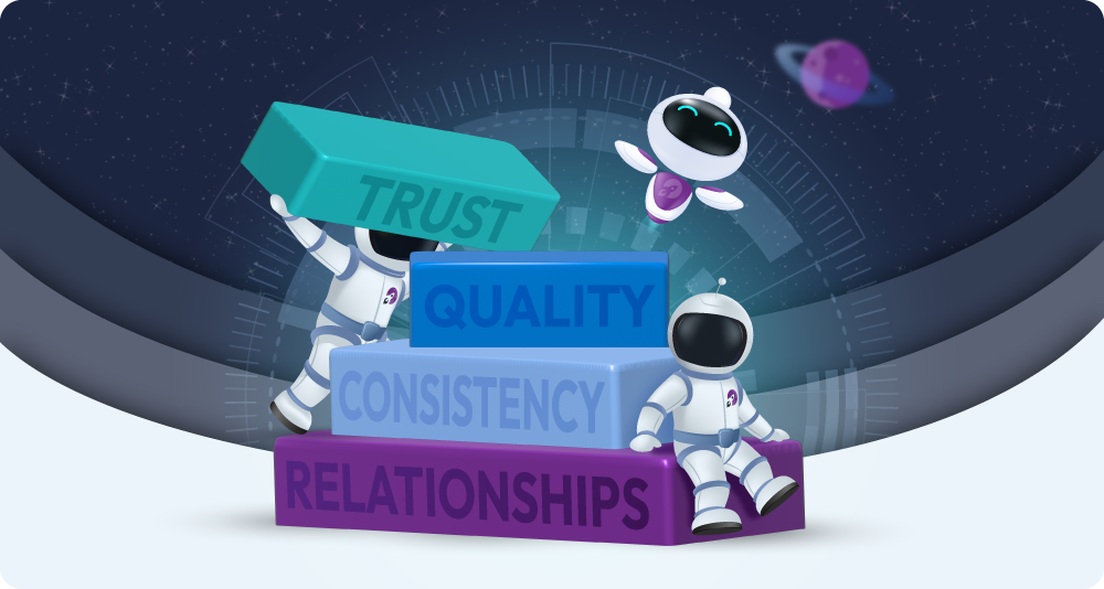
Trust is doing more work than you think
Most users are evaluating credibility long before they contact you, and that evaluation happens through every detail of the experience.
Outdated pages, conflicting messaging, poor mobile experiences, broken layouts, or unclear service information all create hesitation. Even when the business itself is strong, the website can quietly undermine confidence in ways the team never sees.
The opposite is equally true.
A well-structured website with clear messaging and strong supporting content makes sales conversations easier because people arrive with a much better understanding of the business and how it can help them. Clients like iPipeline saw a 75% increase in user engagement within six months of us redesigning and restructuring their website around clearer journeys, stronger messaging, and a better overall user experience.
That kind of result doesn’t come from a prettier homepage; it comes from fixing the right things in the right order.
Not every visitor converts on the first visit. Some return multiple times, some share the site internally with decision-makers, and some compare it against competitors before reaching out weeks later. A website that builds trust at every stage supports all of those moments, not just the immediate ones.
Conversion optimisation doesn’t stop at launch
One of the biggest misconceptions around websites is that they’re finished once they go live. In reality, launch is usually just the starting point. User behaviour changes, search behaviour changes, businesses evolve, and customer expectations shift.
Websites that continue performing well over time are treated as evolving systems rather than static projects. That means reviewing data, understanding how users behave, identifying friction points, and refining the experience gradually. Not constant redesign for its own sake, but continuous improvement based on how people are actually using the site in the real world.
Often, the most valuable changes are relatively straightforward once the underlying problems are clearly identified and the noise is stripped away.
How we approach it
At purpleplanet, we focus on the end user first.
The information they need to understand before they can enquire.
How the website is organised, how information flows, and how it supports the way people make decisions. From there, we build something flexible enough to evolve.
Not just in terms of design, but in how it performs over time as the business grows and behaviour changes.
If you’re looking at your website and wondering how it fits into all of this, it’s probably worth a second look. We’re always happy to give you an honest review.