10 Web Design Trends for 2022
Upgrade your site with one of these web design trends 2022
Whether you’re selling products on your e-commerce site, advertising your services, showcasing your portfolio, or providing information about your real-life store, your website says a lot about your business.
Your website’s design is a key factor in determining what your potential customers think of your company. If you want leads to trust you, find your site easy to use, or resonate with your brand values, you can achieve these goals with effective website design. But which design choices should you go for?
Think your website is fine as it is? There’s no harm in double-checking if your site is due for an upgrade by running through our article here. We go over all the main signifiers that your website needs a makeover.
You can do so much to your website to make it stand out from others. But you might need a little inspiration. So, here’s our round-up of web design trends 2022 to let you in on what’s fashionable right now.
1. Single-Page Sites
We can all agree that sometimes, in artistic matters, less is more. Single-page sites certainly tick this box, as well as providing practical simplicity for users. Plus, they’re a lot easier to make mobile-friendly. No wonder why this trend is so popular with website creators!
If you’re thinking about opting for simple scroll navigation and jumping on this trend, remember that it’s most suitable for sites with less content (ones that can go without navigation and menus). For example, a single-page site works perfectly for portfolios.
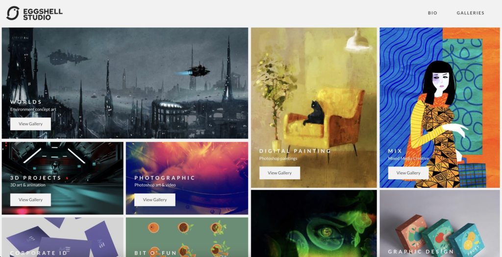
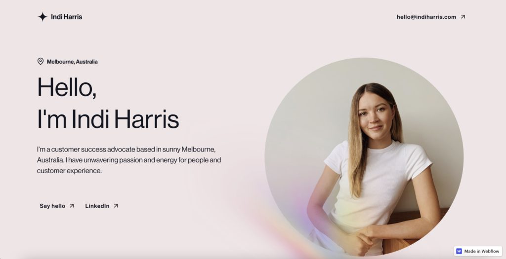
Both portfolio sites linked below (Eggshell Studio and Indi Harris) maximise the potential of single-page sites with their displayed portfolios. Showcasing design collections and work experience, respectively, this trend does not limit either site’s aims.
Research shows that websites with one page can have an increased conversion rate because the process of using them is so simplified and a lot faster. Don’t be fooled, though. If you have a more complex site, you won’t be able to pull this trend off easily. Plus, single-page sites aren’t suited to growing companies.
2. Location-Specific Photos
With the recent rise in working from home, people are becoming more aware of where they spend most of their time. Some remote workers are even moving to different countries and becoming digital nomads – just because they can!
With this change, our second item in web design trends 2022 isn’t surprising: it’s become more popular for the homepage of blogs and websites to be of a location. So, if you’re proud of where your business began, why not join the trend, and showcase a photo of its hometown?
Or, if you’re providing your online coaching business from the beaches of Madeira, it wouldn’t be unfashionable to use an image of a gorgeous local beach.
Although most might think a hero page should convey brand values, list products, and services, or be a kind of site directory, some companies are suited to this geographical trend instead. Showing where your business comes from can express an authentic company image and encourage leads to trust your business.
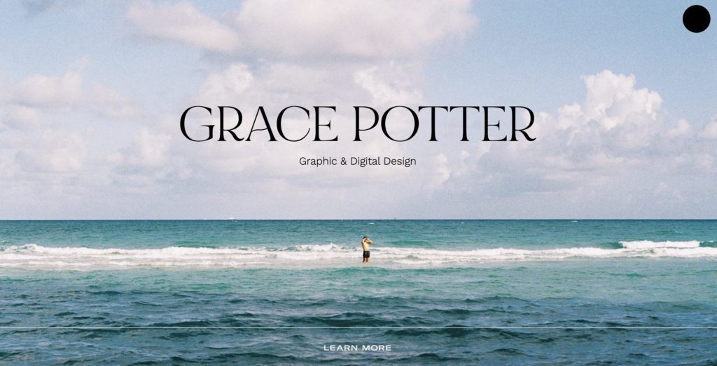
Grace Potter’s website showcases a stunning New Zealand beach, where she is based. The added graininess and pleasing camera angle combine to produce an attractive image, showing off her skills as a creative that would be desirable in any graphic designer. She could have shown off this skill with non-locational images or illustrations, but the fact that it’s where she is based adds the valuable (and marketable) element of humanity. Thus, she uses the location trend to her advantage.
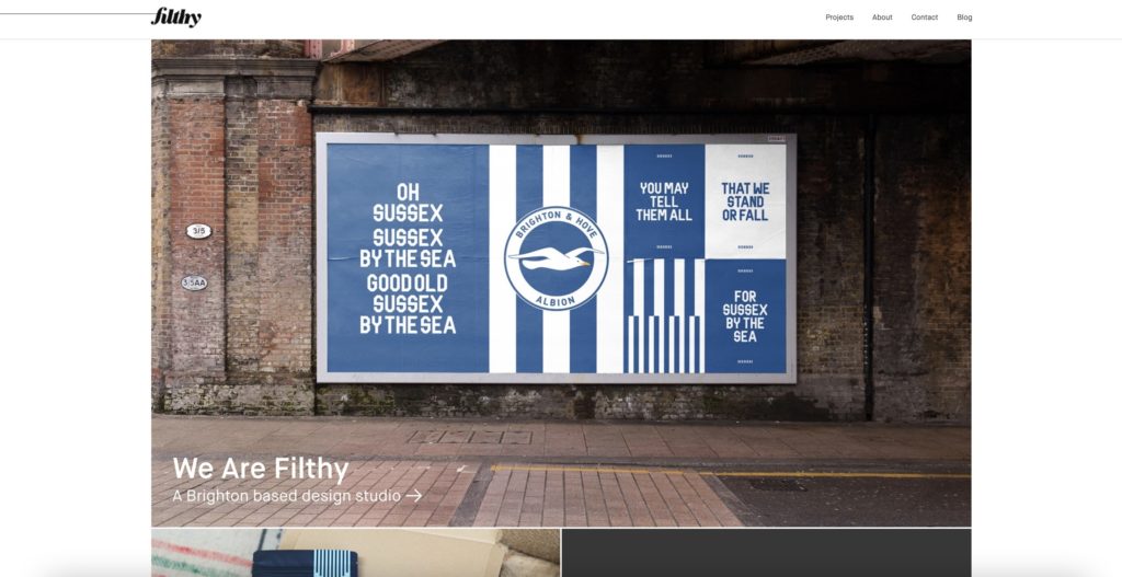
Based in Brighton, UK, Filthy showcases its hometown with a photo of a billboard (designed by them) that exclaims pride for its local football team. In fact, there are many shots of Brighton across the website. Though Filthy designs work for clients outside of the town, much of their clientele is local. Much is the ethos in Brighton to ‘shop local’, Filthy showcases itself to Brightonian customers as a homegrown company, and who better to choose than a company that understands the local spirit?
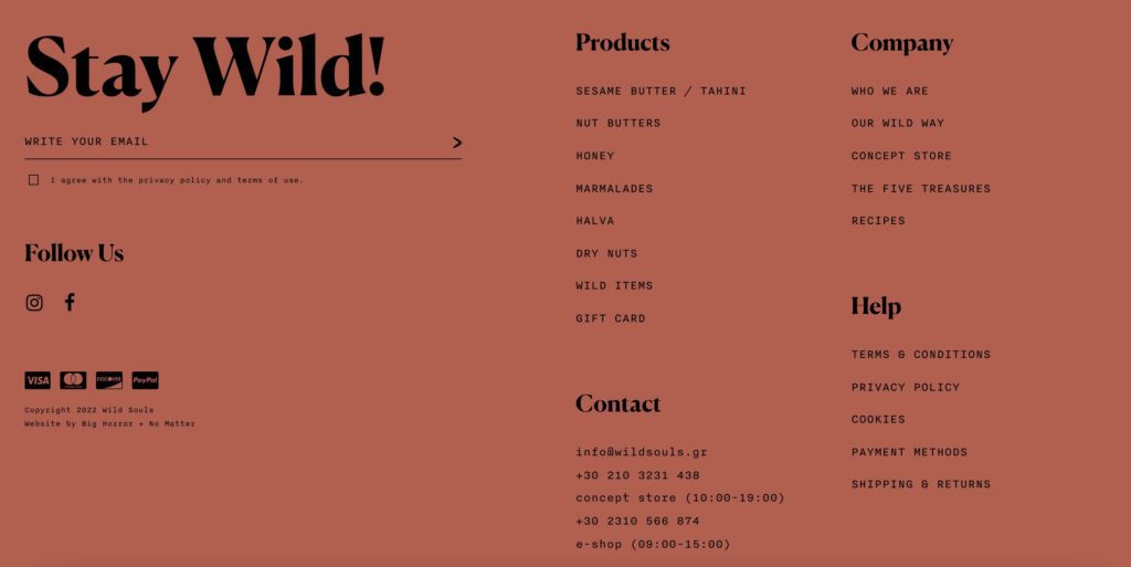
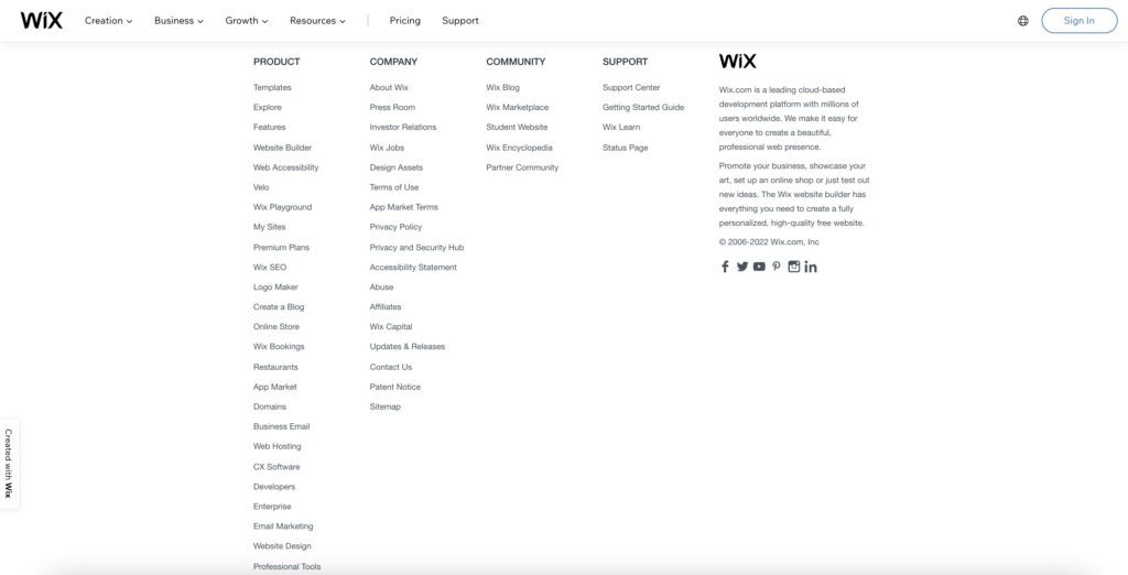
3. Extra-Large Footers
Who’d have thought that this practical section of sites would be experimented with and make its way onto our list for web design trends 2022? If your website has lots of information or pages, this trend is perfect for you. Though they’re often just a directory for all the serious stuff, your footer doesn’t have to be boring.
Don’t fear! Making your footer oversized just means you have lots of room to play with to make a statement. Plus, if this is what it takes for your extensive site to be organised, then it’s worth it! Users will thank you for it because their experience will run more smoothly.
If you’re going to join this trend, just make sure your footers are clearly structured. Wild Souls and Wix are great sites to take inspiration from: they’ve both organised similar information into different groups under separate headings.
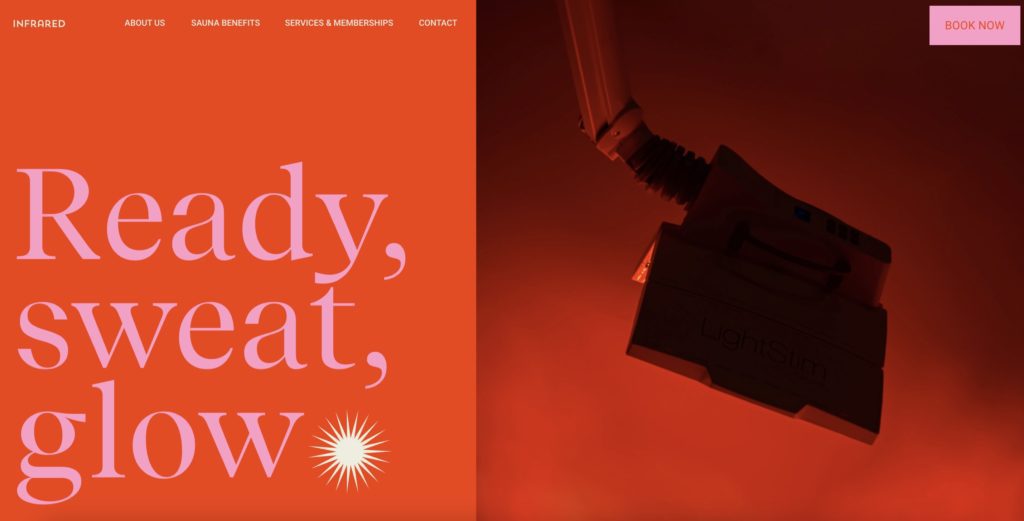
4. Split-Screen Sites
That’s right. Split-screen sites are back! In the past, this layout was popular primarily for its practicality. Whereas now, it’s made a comeback onto our list of web design trends 2022 as an aesthetic feature too.
Whilst this layout can provide an eye-catching contrast with shape and colour, its usefulness can’t be ignored. Splitting your screen gives the functionality of separating information and clickable content, making it easier for users to navigate your site.
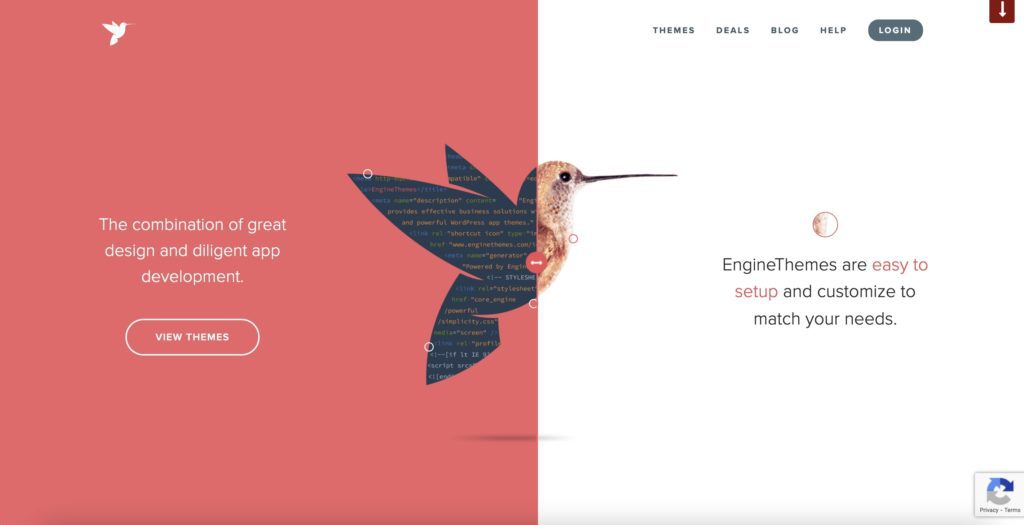
Although Infrared has used the split-screen layout purely as a visually attractive feature, its practical potential can be seen in EngineThemes’ hero page.
Featuring a hummingbird with several buttons, the user can click around the page to learn more about the company. When each button is clicked, the split-screen changes its position and information about services pop up.
The interactive element that EngineThemes has incorporated into its split-screen has a lot of UX potential, as it provides an engaging interface for customers who are just learning about their business.
5. Horizontal Scrolling
This trend is brilliant for websites showcasing catalogues, maps, or portfolios. When executed well, it can produce highly engaging visual effects through the combination of text and images. With these elements playing together, the result can be unforgettable for site users, who are encouraged to continue scrolling.
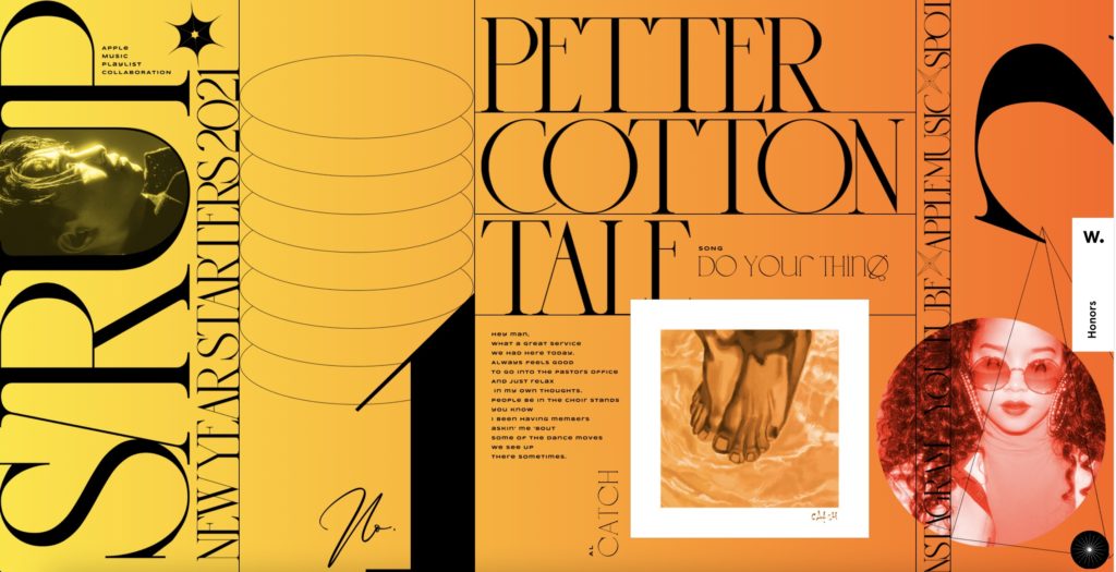
SIRUP, a site for listening to playlists, showcases horizontal scrolling beautifully. It echoes that of Spotify’s app function of scrolling horizontally through an album or playlist, but with the addition of textures, album and artist information and artwork. As you scroll across to different songs, the huge, oversized cursor changes to a photo of the artist who is playing.
Furthermore, the site has the surface delight of the screen changing colour when a different song plays, making it even more memorable, visually pleasing, and satisfying to use.
6. Simplified Heroes
Our sixth web design trend is simplified heroes: these home pages are all stripped back but in different ways.
Designers are choosing to simplify their home pages by removing images and replacing them with stylised typography or minimalist illustrations. Or they’re going all out and opting for just text.
Simplistic design choices can often be stunning and highly memorable for site users. However, one risk that this design choice poses is the element of mystery. If your typography or illustration doesn’t convey a clear enough message, users might be confused about your company’s purpose.
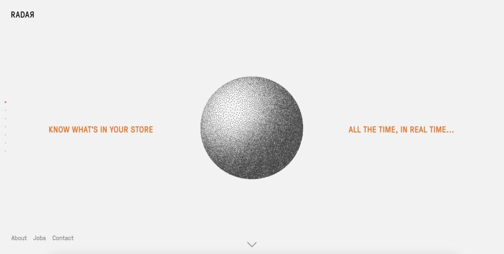
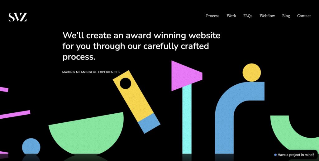
If you’re going to jump on this trend, first make sure you can get across your site’s purpose in simple terms. Check out what SVZ and Go Radar have done with their site headlines.
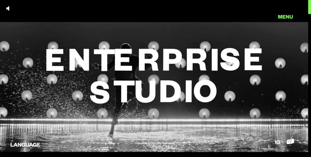
7. Brutalist and Oversized Typography
This year, prepare for font styles and sizes to go wild.
Rather than the modern, polished, and minimal fonts and styles that have been so popular for years, brutalist and oversized fonts are making their way onto our list of web design trends 2022.
Brutalist and oversized fonts are being chosen by designers to fill site hero pages from top to bottom and side to side. Taking up the whole screen, these fonts are intended to leave an impact on site users. They’re distinctive, proud, and challenge site owners to get a message across in a few words.
It doesn’t matter whether the rest of the site is minimalist or maximalist – all kinds of brands are using large fonts. Language LA combines an oversized heading with cursor-sensitive features. This combination results in the site being fun to use, and there’s no doubt its users will remember it.
In these cases, there’s no need for images or graphics because the font itself is the centrepiece. The catch with brutalist and oversized fonts, though, is – how will it look on a mobile?
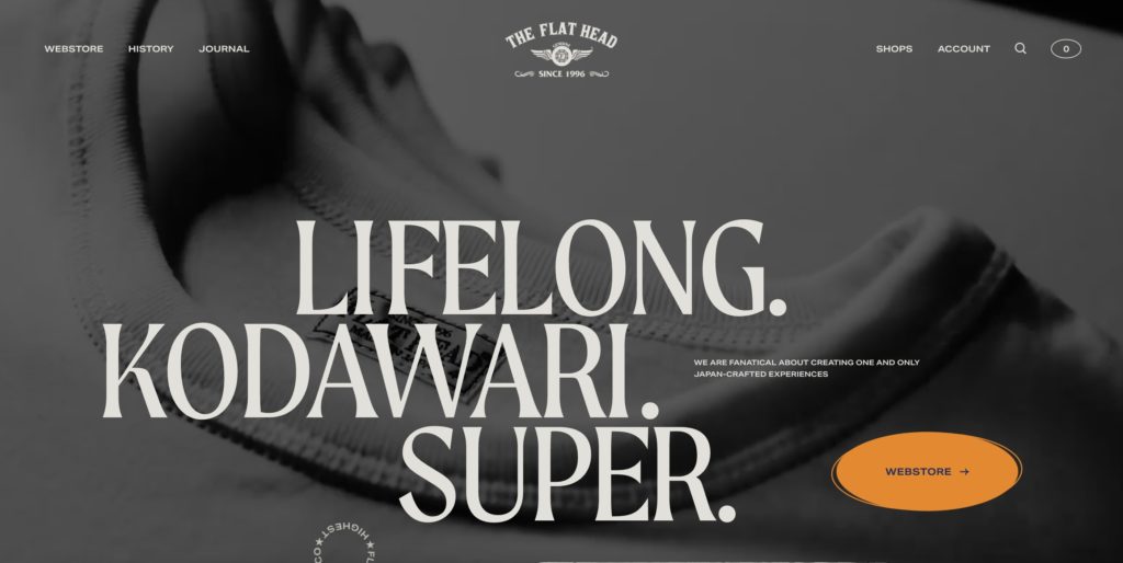
The Flat Head pairs its huge heading with subtle, black and white moving pictures behind. The words convey the clothing brand’s values whilst its barely-there videos give an insight into their production process. In this way, The Flat Head captures the attention of two kinds of users: the one that has time to wait and watch and the one that only has time for a snapshot of the site’s values.
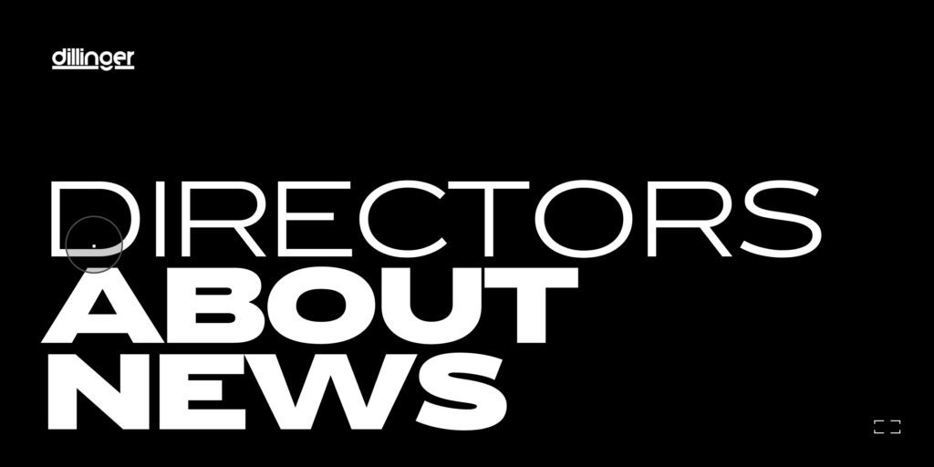
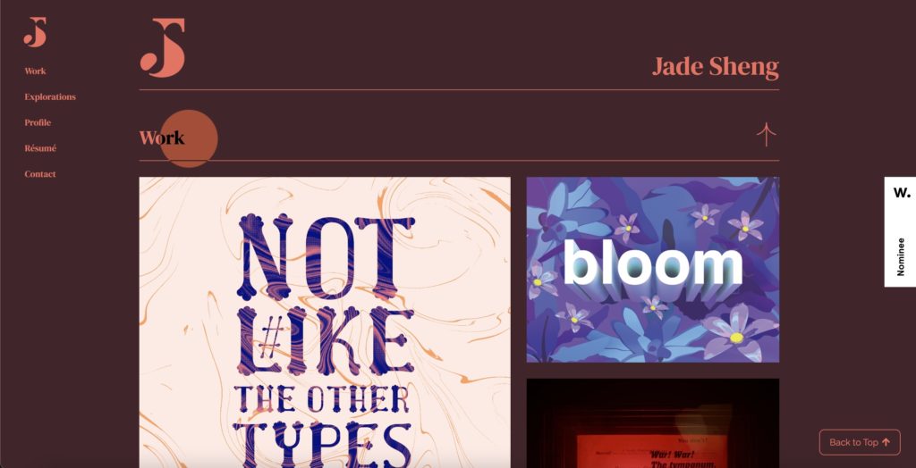
8. Interactive fonts and cursors
Making website copy even more exciting are designers using interactive fonts. They’re creating effects whereby elements on your screen change colour, size, or texture when the cursor touches them.
Dillinger TV is doing this in large but simplistic terms: its hero page is its menu, offering the user either Director, About, or News. You might think that interactive fonts will be wild and chaotic, but Dillinger TV executes this in a gentle way that’s extremely easy to navigate through.
On the other hand, Jade Sheng’s interactive design is bursting with fun and colour. When touched by the cursor, everything either changes colour or moves. Users will find this design feature extremely satisfying and memorable.
However, if you want to do this to your site, remember that some people might struggle visually if the effects are too significant. Changing colours and moving shapes can distract the eyes and result in users not getting your message.
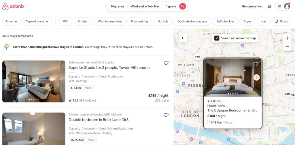
9. Delights
Delights have been steadily becoming more popular over recent years, with Airbnb being a textbook example. Users can see which map tags they’ve already viewed, making the process of searching for a place to stay a lot easier.
Airbnb also asks a lot of its hosts: high-quality photos and cleaning criteria, to mention a couple. These standards ensure the site is attractive to look at and that Airbnb isn’t allowing its users to stay at poorly maintained homes or interact with sub-par hosts.
There’s no wonder that delights are trending amongst UX designers: delights improve user experience by providing usability, function, and, let’s not forget: a pleasurable experience. If you’re keen to get aboard the delight train, consider the difference between surface delights and deep delights. We’ll run you through them now:
Surface delights include sound interactions, animations, high-resolution images, tactile transitions, and micro-copy. These features can be super effective when the rest of your site’s design looks good. Otherwise, surface delights can seem a little tacky. Therefore, it’s best to only embark on surface delights once your deep delights have been established. Here’s what we mean by deep delights:
A site with deep delights is easy to use, very functional, free of errors, and has clear user paths. Essentially, users will achieve a sense of deep delight when the interface acts smoothly at their fingertips. They won’t run into trouble on your site because of something confusing. Instead, they’ll be in a “flow” state, operating your site flawlessly and finding what they need.
Sometimes, a site isn’t very flashy or beautiful but works exceptionally well due to its deep delights.
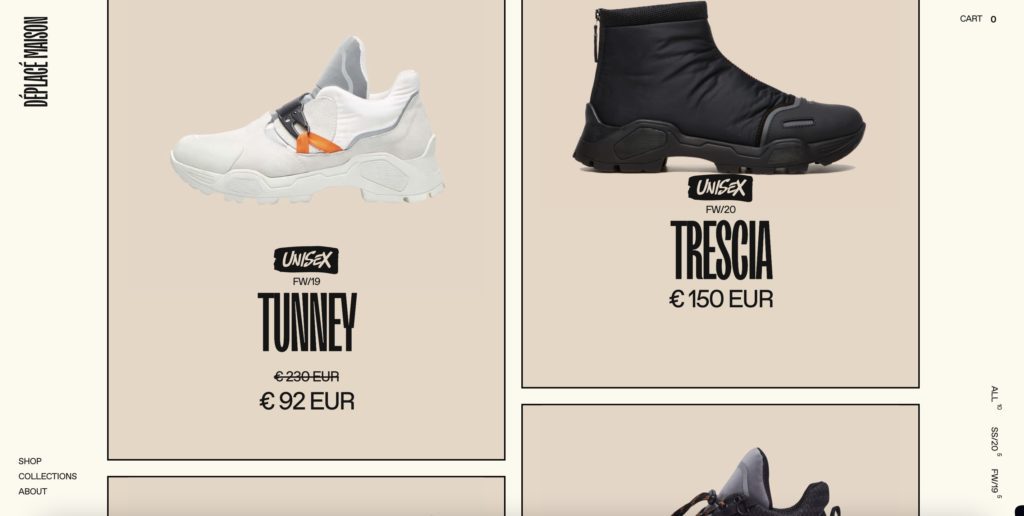
10. Inclusivity
With the increased discussion about gender we’ve had in recent years, it’s no surprise that brands are picking up on the need for gender-neutral designs. Even if you don’t intend to make a political statement, there is a growing demand for gender-neutral design. Going for this opens up your market scope even wider so that you can reach more customers than ever before.
A great example is Déplacé Maison’s website; not only have they got a unisex range of products, but their choice of colour for their site is neutral too. The brand concentrates more on futuristic streetwear rather than any gendered demographic, resulting in a modern and minimalist effect.
The design choices you make will have a significant impact on your site’s success. We’ve touched on a lot in this article, but that doesn’t mean you have to go mad with incorporating each design trend into your site. Pick the ones that are suited to you.
Remember: it doesn’t hurt to stay current, but it might hurt if you’re not current at all.