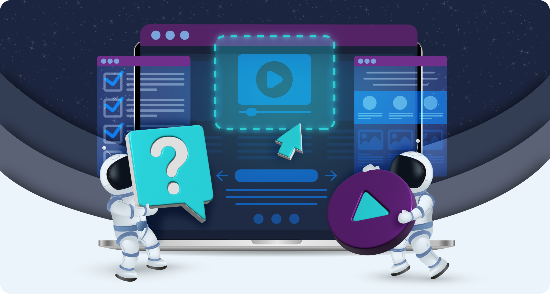
The Role of UX/UI in Website Conversion Rates
Key takeaways
Conversion rate ((number of conversions / total number of visitors) * 100) directly reflects a website’s ability to make visitors take valuable actions, whether that means making a purchase, signing up for a newsletter, or any other desired outcome. Conversion rate has a direct impact on revenue and profitability, and conversion rate optimisation (CRO) tactics allow businesses to maximise their return on investment (ROI).
Since user experience is such an important factor in converting leads, UX and UI efforts are crucial for conversion rate optimisation (CRO).
By analysing how visitors interact with a website and identifying barriers to conversion, businesses can make data-driven improvements that not only increase conversions but also improve overall user satisfaction. This, in turn, can lead to increased customer loyalty, higher lifetime value, and positive word-of-mouth referrals.
This blog will discuss how conversion rate interconnects with aspects of UX and UI, providing tips for your new CRO strategy:
UX and conversion rate
User experience (UX) encompasses all aspects of the user’s interaction with a company, its services, and its products. UX design aims to create products that provide meaningful and relevant experiences. Its main concerns are:
- Usability – How easy and efficient it is for users to achieve their goals on the website.
- Accessibility – Ensuring the website is usable by people of all abilities and disabilities.
- Information architecture – Structuring and organising website content for ease of use.
- Interaction design – Creating engaging interfaces with well-thought-out behaviours.
At its best, good UX makes a well-designed e-commerce site with a straightforward checkout process, intuitive navigation, and quick load times. At its worst, a lack of UX design can make a website with cluttered navigation, slow-loading pages, and a confusing layout that frustrates users.
Let’s consider how you can enhance your website’s conversion rate through different elements of UX design:
1. Ease of navigation
When users visit a website, they typically have specific goals in mind, such as finding information, making a purchase, or contacting the business. If the website’s navigation is well-designed, users can achieve these goals efficiently, which enhances their overall experience and increases the likelihood of conversion.
A streamlined and logical navigation design helps users find what they need quickly, leading to higher engagement and a greater likelihood of completing desired actions. Website owners should take an interest in something called intuitive navigation.
Intuitive navigation aligns with users’ natural behaviours and expectations, making their journey through the website seamless and enjoyable:
- Users should not have to think hard about where to click next or how to find information, because a reduced cognitive load will make things easier.
- A well-designed navigation bar with clear, concise labels and a logical hierarchy helps users understand the site’s structure at a glance, allowing them to move from one section to another effortlessly.
- Features such as breadcrumb trails, search bars, and sticky menus further enhance navigation by providing users with multiple ways to find and access content.
2. Load time
A slow website not only frustrates users but also diminishes their trust in the brand, making them less likely to convert. Fast load times, on the other hand, enhance the user experience by providing immediate access to content, fostering a sense of efficiency and reliability, which is crucial for keeping users engaged and encouraging them to complete desired actions.
You can improve page loading speeds by:
- Optimising images – Compress and resize images to reduce their file size without compromising their quality.
- Minimising HTTP requests – Reduce the number of elements on a page that require loading, such as scripts, images, and stylesheets.
- Enabling browser caching – Store some data locally on users’ devices to speed up load times for returning visitors.
- Use a Content Delivery Network (CDN) – Distribute content across multiple servers to reduce load times by serving data from locations closer to the user.
- Optimising code – Minify CSS, JavaScript, and HTML code to reduce file sizes and eliminate unnecessary code.
- Leveraging asynchronous loading – Allow some elements, like JavaScript, to load asynchronously so they do not delay the rendering of the entire page.
UX can fail on the page loading speed front if its design emphasises heavy graphics, large images, or complex animations. Designers must balance aesthetic appeal with performance, opting for optimised media and streamlined elements to ensure quick loading. It’s a good idea to implement lazy loading (where images and content load as they are needed rather than all at once) as this can improve load times without sacrificing user experience.
3. Mobile responsiveness
Mobile responsiveness is crucial due to the significant number of users accessing websites via smartphones and tablets. A mobile-friendly design ensures that a website functions well on smaller screens, providing a seamless and intuitive experience regardless of the device being used.
Users expect the same level of functionality and ease of use on their mobile devices as they do on desktops. A website that is not optimised for mobile can lead to difficulties such as hard-to-read text, cumbersome navigation, and slow load times, which can frustrate users and lead to higher bounce rates.
To achieve a high-quality mobile UX, several best practices should be followed:
- Responsive design – Implement a responsive design that automatically adjusts the layout and content based on the screen size and orientation of the device.
- Simplified navigation – Use a simplified navigation structure, such as a hamburger menu, to ensure easy access to different sections of the site.
- Optimised touch targets – Ensure that buttons and links are large enough and spaced appropriately to be easily tappable on touchscreens.
- Fast load times – Optimise images and code to ensure quick loading times on mobile networks.
- Readability – Use larger fonts and sufficient line spacing to enhance readability on small screens.
- Minimise pop-ups – Avoid intrusive pop-ups that can be difficult to close on mobile devices.
Poor UX decisions, such as using non-responsive elements or neglecting mobile-specific optimisation, can result in a frustrating experience where users struggle to navigate or interact with the site, leading to increased bounce rates and lower conversions.
When users can easily browse, find information, and complete actions on their mobile devices, they are more likely to convert. This is particularly important for e-commerce sites, where a streamlined mobile experience can directly influence purchasing decisions.
4. Content accessibility
Improving content accessibility means making website content available and usable for all users, including those with disabilities. This involves implementing design and development
practices that allow individuals with varying abilities to perceive, understand, navigate, and interact with the website effectively.
Key aspects of content accessibility include providing alternative text for images, ensuring sufficient colour contrast, using clear and simple language, and enabling keyboard navigation:
- Scalable fonts, clear headings, and accessible forms ensure that content is easy to read and interact with for users with visual impairments or cognitive challenges.
- Captions, transcripts, and alternative text for multimedia content enable users with visual and hearing impairments to access the information.
- Ensuring that all interactive elements are navigable via keyboard aids users with motor disabilities.
When users can easily access and interact with content, they are more likely to stay on the site longer, explore more pages, and complete desired actions, such as filling out forms or making purchases. Improved accessibility also fosters a sense of trust and inclusivity, which can enhance user loyalty and encourage repeat visits.
As a result, websites that prioritise content accessibility often see higher conversion rates, as they effectively cater to a wider audience and eliminate barriers that might prevent users from completing their goals.
5. Trust and credibility
When users feel confident that a website is credible and trustworthy, they are more likely to engage deeply, share personal information, and make purchases, thereby increasing conversion rates.
Trust is fostered by creating a website that is not only visually appealing but also reliable, secure, and easy to use. To improve your website’s credibility, consider the following UX design tips:
- Professional design – A clean, professional design with high-quality images and consistent branding helps establish a strong first impression.
- Security features – Visible security indicators such as SSL certificates, privacy policies, and trust badges reassure users that their data is protected.
- Clear contact information – Easily accessible contact information, including phone numbers, email addresses, and physical addresses, enhances trust.
- User testimonials and reviews – Displaying genuine customer reviews and testimonials provides social proof and reinforces credibility.
- Transparency – Honest information about products, services, pricing, and policies reduces uncertainty and builds trust.
- Easy navigation – Intuitive and straightforward navigation ensures users can find information easily, enhancing their confidence in the site’s usability.
A website with a cluttered design, inconsistent branding, or difficult navigation can appear unprofessional and unreliable, causing users to question its legitimacy and abandon the site.
By prioritizing UX choices that build trust and credibility, businesses can create a positive user experience that not only satisfies current users but also attracts new ones, leading to higher conversion rates. A trust-enhancing UX design is essential for establishing a credible online presence, fostering user confidence, and driving successful conversions.
UI and conversion rate
User interface (UI) refers to the visual elements that users interact with on a website, including buttons, icons, layout, and overall aesthetic. It focuses on the look and feel of the product. Its main concerns are:
- Design – Visual appeal, colour schemes, and typography that create an engaging look.
- Layout – The arrangement of elements on a page, ensuring a logical flow and hierarchy.
- Interactivity – Interactive elements such as buttons and links that facilitate user actions.
- Consistency – Maintaining a uniform design language throughout the site for a cohesive experience.
When UI is done well, websites are visually appealing, with a clean layout, consistent design elements, and intuitive icons. When UI is done badly, websites may have mismatched colour schemes, inconsistent font usage, and poorly designed interactive elements that confuse users.
Let’s consider aspects of UI more deeply to discover how they can be harnessed to boost conversion rate:
1. Visual appeal
The visual appeal of a website plays a crucial role in capturing and retaining user interest. Aesthetics influence first impressions, which are formed within milliseconds of viewing a site.
An attractive, visually pleasing website can make users feel more comfortable and confident in the site’s credibility and professionalism. When users are visually engaged, they are more likely to explore the site further, interact with its elements, and ultimately convert by completing desired actions such as making a purchase or signing up for a service.
While aesthetics are important, website owners must balance design with functionality to ensure that the visual elements do not hinder usability. Overly complex designs with excessive animations or intricate graphics can slow down the site and confuse users, leading to frustration and abandonment.
Consider the following advice:
- Select a cohesive colour scheme that aligns with the brand’s identity.
- Use fonts, colours, and imagery consistently.
- Ensure images and design elements are high-quality, clean, and professional.
- Optimise images so that they do not compromise load times or navigation.
- Use whitespace effectively to reduce clutter.
- Make CTAs obvious.
2. Consistency in design
A consistent UI reinforces brand identity, making the website more memorable and trustworthy to users. This fosters loyalty and encourages repeat visits, conveying a professional and reputable brand.
Consistent UI helps boost conversions because:
- It provides a stable and predictable interface, making navigation and interaction effortless.
- Familiar elements reduce confusion and frustration, encouraging users to explore and engage more with the site.
- Uniform navigation menus and layout structures help users easily find information and complete actions.
- Inconsistent UI choices, like varying button styles or different font sizes, disrupt the user experience and appear unprofessional.
- A consistent UI streamlines the user journey, allowing focus on content and key actions without distractions.
Consistency in design involves using uniform visual and functional elements across all pages of a website, including colours, fonts, button styles, and layout structures.
3. Effective call-to-actions (CTAs)
A well-designed CTA is visually striking and clearly communicates the action users should take. Key design elements include:
- Contrast and colour – Use colours that stand out against the background to make the CTA button easily noticeable.
- Size and shape – Ensure the button is large enough to be easily clickable but not overwhelming and use shapes that draw attention, such as rounded corners.
- Text clarity – Use clear, concise, and action-oriented language that tells users exactly what will happen when they click the button, such as “Buy Now” or “Get Started”.
The placement and wording of CTAs are crucial. For optimal results, website owners should consider:
- Above the fold – Placing key CTAs in the visible area without requiring users to scroll enhances visibility and encourages immediate action.
- Proximity to relevant content – Positioning CTAs near relevant information or product descriptions ensures users can easily take action after engaging with the content.
- Use of urgency and value – Incorporating words that create a sense of urgency (e.g., “Limited Time Offer”) or highlight the value (e.g., “Free Trial”) can motivate users to act quickly.
Thoughtful UI choices in the design, placement, and wording of CTAs are essential for maximising their effectiveness and boosting conversion rates. By creating visually appealing, strategically placed, and clearly worded CTAs, website owners can effectively guide users towards completing desired actions, enhancing the overall user experience and driving higher conversions.
Common UX/UI mistakes
To ensure your new strategy goes off without a hitch, consider the following common mistakes. These errors will be noticed by site visitors and damage your other efforts:
- Overloading with visuals – Using excessive images, videos, or animations that slow load times and overwhelm users.
- Inconsistent design elements – Failing to maintain uniform fonts, colours, and button styles across the site, leading to a disjointed user experience.
- Poor navigation structure – Designing complex or unclear navigation menus that make it difficult for users to find information quickly.
- Neglecting mobile optimisation – Not ensuring the website is fully responsive and functional on mobile devices, resulting in a poor mobile user experience.
- Weak CTAs – Using low-contrast, vague, or poorly positioned call-to-action buttons that fail to grab attention and encourage user action.
- Lack of accessibility features – Overlooking accessibility needs, such as alt text for images, sufficient colour contrast, and keyboard navigation options.
- Slow load times – Not optimising images, code, or server performance, leading to slow page loads that frustrate users and increase bounce rates.
UX and UI design really succeed when user needs, behaviours, and preferences are at the centre of the strategy. Make sure you consider what will feel good and compelling for them, and you can’t go wrong.
Giving your website a makeover is a solid strategy if you wish to boost its conversion rate. Don’t forget to keep things simple and be considerate of your audience.