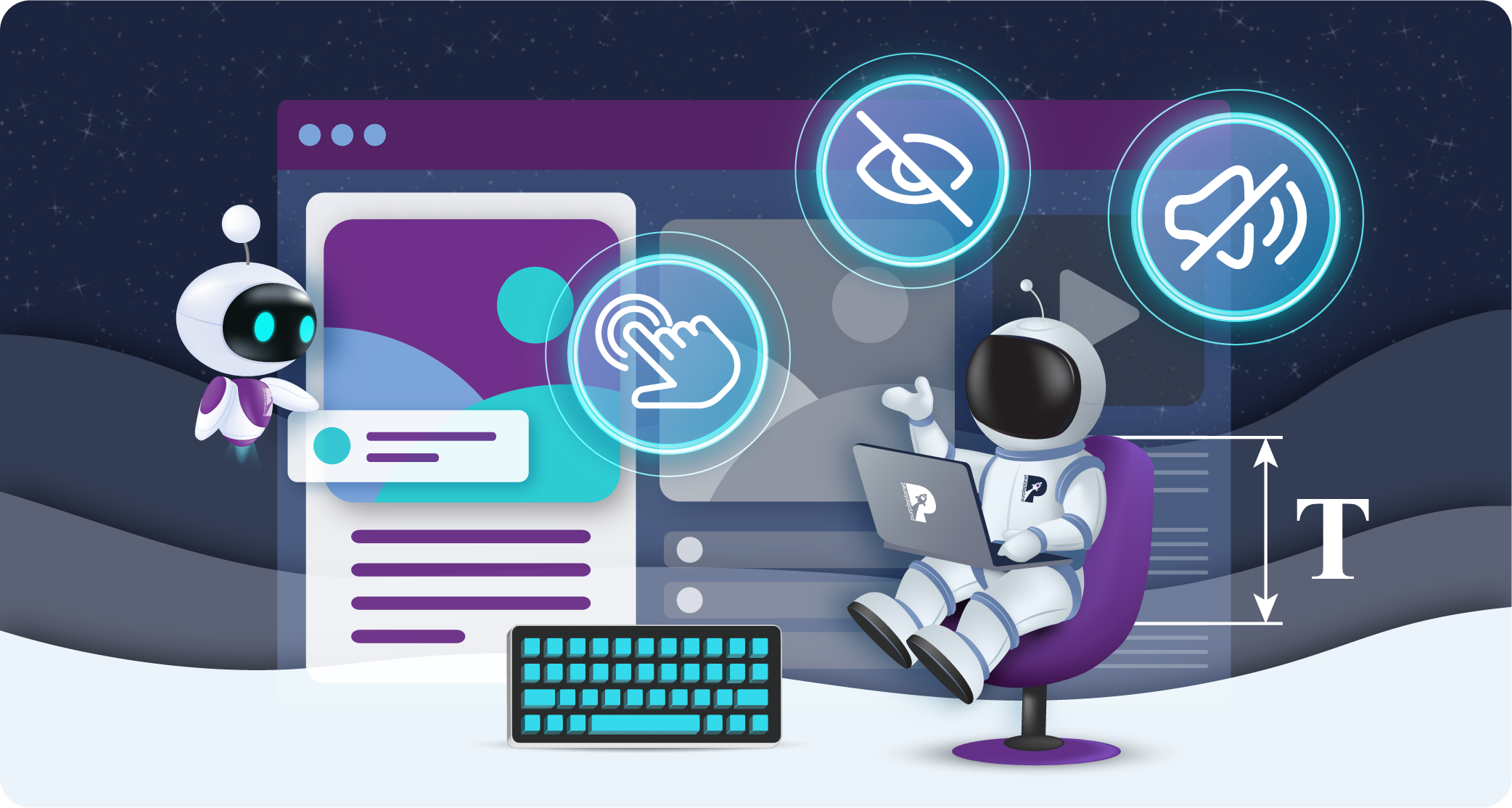
Designing for Accessibility: 7 Essential Principles for Inclusive Web Design
We take web accessibility very seriously here at purpleplanet, as you might remember from our previous guides to accessibility audits and general website accessibility. (Or you’ll know it from our extensive accessibility options!)
The importance of inclusive web design can’t be overstated, as creating digital experiences that cater to everyone isn’t just a matter of compliance. It’s also a reflection of a brand’s values. Web inclusivity demonstrates a business’s commitment to corporate social responsibility (CSR), ensuring that no user is excluded based on their abilities. It’s a moral obligation that reflects a company’s ethics and commitment to equality.
However, the benefits of inclusive design go beyond social responsibility. From a business perspective, designing for accessibility widens your potential audience, opening your website to millions of users who rely on assistive technologies. Inclusivity isn’t just about doing the right thing; it’s also a smart growth strategy that improves user satisfaction and boosts brand loyalty.
In this article, we’ll go beyond the basics and explore 7 essential principles of inclusive web design, providing handy tips along the way. Whether you’re new to accessibility or looking to refine your design practices, these principles will help you create a website that’s not only functional for everyone but also future-proof and welcoming to all.
Let’s dive into the core principles of inclusive design that will elevate your digital presence:
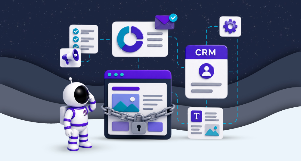
1. Research and testing should be thorough and diverse
In inclusive design, early and diverse research is non-negotiable. By involving users with a variety of disabilities in the initial research and testing phases, designers can address accessibility challenges before they become ingrained in the final product.
This proactive approach prevents costly, time-consuming fixes later in the development process and ensures a more seamless experience for users from the outset. Instead of waiting until the final audit to test accessibility, conducting early user research with people who have different needs (such as those with visual, auditory, or motor impairments) helps uncover issues that might be missed by standard testing tools.
Beyond that, continuous feedback from diverse users at multiple stages is key to refining the design in a way that truly meets the needs of all users. Often, accessibility problems are only revealed when real people interact with a website or app. Gathering feedback early ensures that adjustments can be made incrementally rather than trying to retrofit an inclusive design into a nearly finished product.
By testing with users of different abilities and backgrounds, designers can develop a more robust understanding of the diverse ways people navigate content, which may differ greatly from assumptions. This not only improves accessibility but also creates a more intuitive experience for everyone.
In short, embedding inclusivity into the design from the start, through comprehensive and diverse testing, ensures that accessibility isn’t an afterthought but an essential part of the entire process.
2. Design for everyone
Inclusive design means creating digital experiences that work for all users. Of course, catering to ‘all’ users is a mighty task and it’s easy for us to forget some groups that aren’t normally represented. That’s why designers should take time to consider who will be using their products and try their best to be inclusive.
For example, in much of the Western world, high-speed broadband and 5G networks are common. So, it’s understandable if we forget that a significant portion of the world still struggles with slow or unreliable internet. For these users, a website heavy with high-resolution images, videos, and complex animations may take too long to load or not function at all.
So, inclusive design might not be just for those with the latest technology or fast internet connections. Consider if your product will be used by people in the world without access to fast or stable internet.
Mobile-first and low-bandwidth design strategies are essential for addressing this issue. By optimising content for mobile devices and ensuring that websites load quickly on slower connections, designers create a more accessible experience for everyone, including those in rural areas, developing countries, or even people in urban areas where bandwidth may be limited due to overcrowded networks. Techniques like image compression, caching, and reducing the use of large files can significantly improve loading times and ensure content is accessible.
Additionally, energy-efficient web design benefits users with older devices or limited battery life. Lighter, faster-loading websites with fewer resource-heavy elements not only reduce energy consumption but also improve performance across all devices. This approach, sometimes overlooked, ensures that websites are inclusive to users with older technology or those in areas where resources are scarce.
When designing for everyone, it’s important to consider often-overlooked populations, but we appreciate that this list could go on and on, so we’ve only gone into detail about one example here. You might consider older adults who may not be familiar with digital trends, users with cognitive disabilities, or people from different cultural backgrounds who may interpret visual and language cues differently.
Ultimately, web designers can make truly special digital experiences for users if they go the extra mile to consider who they could include.
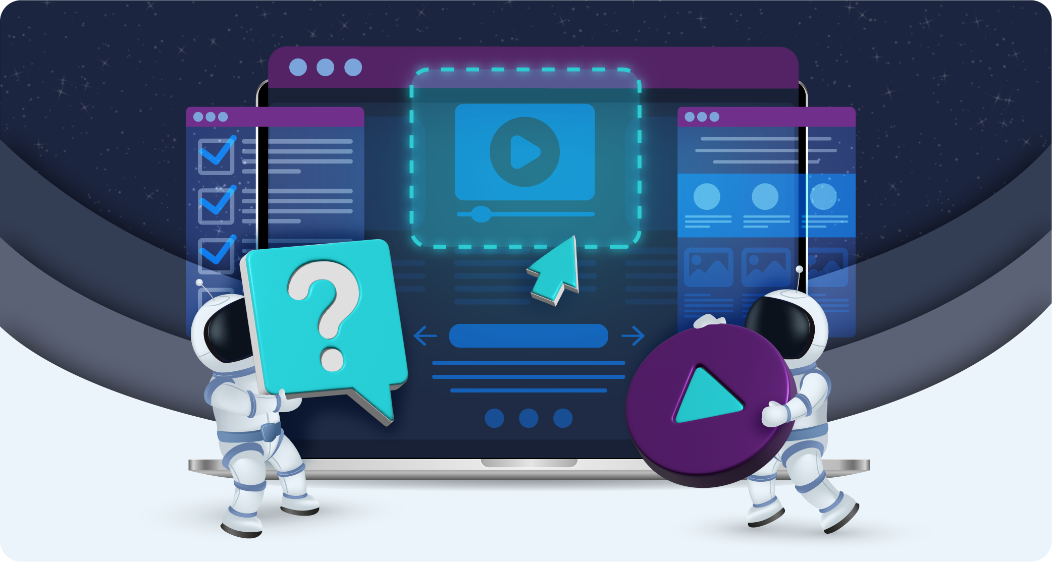
3. Inclusivity through text
Textual elements are a huge aspect of web design work, so let’s go over the ways in which text can be made accessible.
Adding descriptive text for non-text elements is crucial for ensuring that all users, including those who are blind or visually impaired, can access your content. By providing alternative text for images, videos, and audio, you allow assistive technologies like screen readers to describe what’s being displayed, offering a more complete experience for users who cannot engage with visual or auditory elements.
This might also include adding audio descriptions to instructional videos, so that users can follow along through voice guidance, or adding closed captions for users with hearing impairments.
Captions, in particular, are essential for multimedia content. They not only help users with hearing difficulties, but they also make content more accessible in environments where sound may not be available or practical, such as public spaces. Ensuring that all videos include captions or transcripts opens up the content to a wider audience.
Another critical point is the proper labelling of form fields. If form fields lack clear labels, users relying on assistive technology may struggle to understand what information is required. Clear, descriptive labels allow screen readers to relay the necessary instructions to the user, making the form submission process much more inclusive and reducing frustration for users with disabilities.
We mentioned this in our general guide but feel it must be reiterated: using anchor text that accurately describes the destination of a link ensures users can navigate the site easily. For example, naming your careers page ‘www.example.co.uk/join-us’ is less clear than using something like ‘www.example.co.uk/work-for-us,’ which more clearly conveys the link’s purpose.
When adapting your website with inclusivity in mind, thoughtful and descriptive text is key since it constitutes such a large part of the user’s experience.
4. Inclusivity through colour
Another huge aspect of web design is colour, and colour can be inclusive in a few ways.
Make sure that your colour choices support readability for all users, including those with visual impairments or colour blindness. It’s crucial to maintain a strong contrast between text and background colours to make content easy to read. When the contrast is too low, users with limited vision or colour perception may struggle to distinguish between elements on the page.
Additionally, thin or light fonts can make text even harder to read. Instead, opt for thicker, more substantial fonts paired with deeper, richer colours to enhance legibility. This ensures that your text is clear and accessible, even for users with visual differences.
It’s also worth considering how colour is used to convey meaning. Relying solely on colour to indicate interactive elements (like links or buttons) can exclude users who are colour-blind or those using screen readers. Pair colour cues with text labels, icons, or underlines to ensure that the function of these elements is obvious to all users.
Lastly, consider providing customisable colour schemes or a dark mode option, which allows users to adjust the interface to their personal preferences and needs. Here at purpleplanet, we’ve got several colour scheme options that might inspire you – dark, light, and high contrasts, high and low saturations, monochrome and an option to exclusively adjust text, titles, and background colours.
5. Consider new technologies and always improve
Inclusive design is not a one-time effort but an ongoing process that requires continuous updates and improvements. As technology evolves, so do the opportunities to make digital experiences more accessible. It’s essential to stay informed about emerging technologies and advancements that can enhance accessibility, while also being mindful of how new tools can create barriers for some users if not implemented inclusively.
One area where this is particularly important is in the growing use of Voice User Interfaces (VUIs). With the increasing popularity of voice-activated devices like smart speakers and virtual assistants, designing accessible voice interfaces is becoming critical. VUIs offer hands-free navigation and can be extremely useful for users with mobility impairments. However, designers must consider the diverse needs of users, including those with speech impairments or non-native language speakers. Ensuring that voice commands are flexible, adaptable to different accents or speech patterns, and don’t require perfect pronunciation is key to making VUIs more inclusive.
Beyond VUIs, new tools like AI-driven content customisation, augmented and virtual reality, and even advanced automation for screen readers can all contribute to a more inclusive web experience.
However, these technologies need to be implemented thoughtfully, considering a wide range of users and their unique requirements. For instance, users with visual impairments might struggle with purely visual experiences, while those with mobility impairments could have difficulty navigating virtual spaces. Additionally, VR environments that require fast reflexes or specific physical gestures could exclude people with motor impairments. Without alternatives like audio descriptions or alternative navigation methods, these experiences can become inaccessible to a significant portion of users.
While new technologies might enhance user experiences, failing to consider accessibility can lead to exclusion. Thoughtful implementation ensures that these tools enhance usability for all users, rather than inadvertently creating new barriers.
6. Intuition, ease of use, and peacefulness
While bold, loud, and maximalist design choices can have their place in the creative world, they often clash with the principles of inclusivity. When it comes to accessible web design, peacefulness, clarity, and ease of use are far more critical. These values allow a wider range of users to engage with content in a way that feels intuitive and welcoming, without overwhelming their senses or causing confusion.
Cognitive accessibility plays a big role here. Clear visual hierarchies, simple navigation structures, and a well-organised layout can help reduce cognitive load for users, making it easier for them to find information and complete tasks. When interfaces are cluttered or chaotic, users (especially those with cognitive disabilities) may struggle to process information or navigate your site effectively. Ensuring a clean and intuitive design allows everyone to engage with the content in a calm, stress-free manner.
Animations, while visually engaging, should be used carefully. Overuse of motion or sudden, unexpected animations can overwhelm users, particularly those with sensory sensitivities, ADHD, or autism. Offering users the option to reduce or turn off animations entirely can create a more comfortable experience, allowing them to focus on the content without distractions.
Responsive design is another key element of peaceful and intuitive web experiences. Content that scales dynamically, adapting to different devices and user preferences, allows for smoother interactions and a more personalised experience. This flexibility means users can engage with your site in the way that works best for them, whether they’re on a desktop, tablet, or mobile phone.
Finally, avoiding sudden elements like flashing images or unexpected interactions is vital for neurodiverse users or those with sensory processing disorders.
7. Continuously support users
The final principle of inclusive web design goes beyond the creation phase.
We believe inclusive design ensures users feel supported throughout their entire journey on your website. Offering continuous, accessible assistance is essential for making sure users can overcome any challenges they encounter, no matter their specific needs.
One key element is providing clear and accessible help documentation. This includes user guides, tutorials, and troubleshooting content that is easy to find and navigate. These resources should be designed with inclusivity in mind (using plain language, offering alternative formats such as audio or video with captions, and ensuring compatibility with screen readers and other assistive technologies).
Live chat support can also be helpful for users needing immediate assistance (and it, of course, should be made accessible to users with disabilities, such as those who rely on keyboard navigation or assistive technologies).
An intuitive FAQ section can provide quick answers to common questions, reducing frustration for users who may struggle with navigating traditional help channels. FAQs should be well-organised, searchable, and written in a way that accommodates a range of literacy levels.
By offering multiple, accessible ways for users to seek help, whether through live support, FAQs, or documentation, you provide them with ongoing support. This makes your website more welcoming, helping all users feel empowered and confident as they interact with it.
Final thoughts
Inclusive design ensures that everyone, regardless of ability, can fully engage with your digital presence. By incorporating the 7 principles outlined in this blog, you can create a website that is not only functional and accessible but also welcoming and empowering to all users.
As you apply these principles, keep in mind that accessibility is never a one-size-fits-all solution. Continuously learning, improving, and supporting visitors will ensure your website remains inclusive for everyone.
Get help with improving your website’s inclusiveness by reaching out to us here at purpleplanet.