Why User Experience is Fundamental in Driving Website Conversions
Key takeaways
First, let’s cover the essentials:
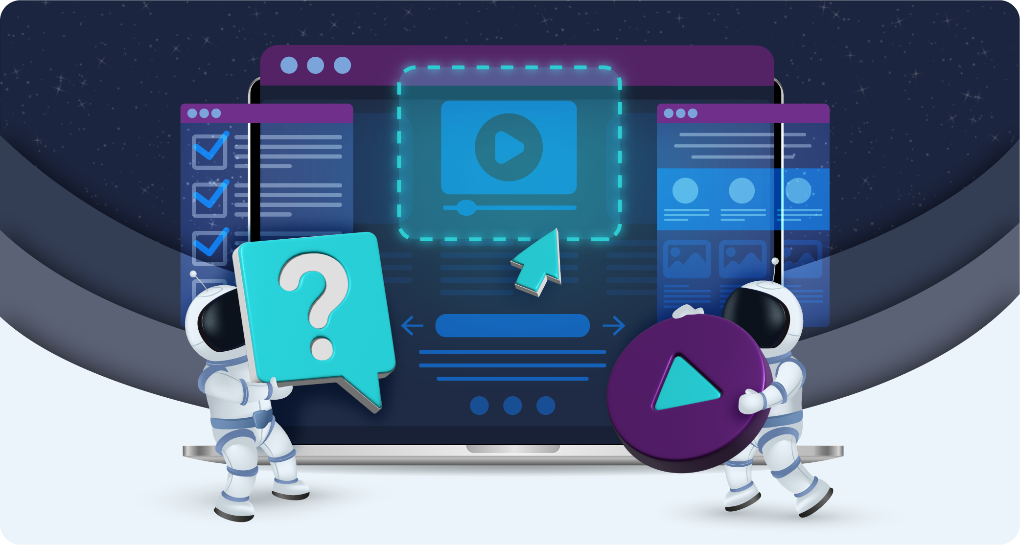
What is user experience?
User experience (UX) design is the process of designing websites, apps, and other interfaces so that they appeal to human behaviours, perceptions, and preferences.
UX design does this by anticipating users’ needs and seeking, wherever possible, to make their experiences frictionless, helpful, and meaningful. Rather than focusing wholly on beautiful appearances, UX values the need for usability and functionality above anything else.
Once these values are achieved, UX designers can move on to making their products fun and pleasurable to use – elements called “delight”.
UX is extremely valuable to website owners, as it strongly links to website conversions.
How does UX help website conversions?
Improved UX design can raise conversion rates by up to 400%! But how exactly does it achieve these kinds of results?
Here are 5 main ways UX improves website conversions:
1. UX helps guide website visitors towards their goals
By making it super simple for users to do what they came to do, UX design can contribute to an increase in completed tasks, e.g., sign-ups and purchases. This improvement relates to things such as navigation, icons, and information.
2. UX improves your first impression
Since users are more likely to remain on a website if they feel it’s trustworthy, UX design can help lengthen the average time spent on your website. Trustworthy web design will
protect your first impression and therefore increase conversions and reduce bounce rates.
3. Fewer users leave out of frustration
When users are faced with slow site loading speed, confusing navigation, or untrustworthy design, they’re likely to bounce right away. So, when these issues are resolved, websites will see an improvement in their bounce and conversion rate.
4. More users understand your products or services
Part of UX is expressing the value of your products or services more clearly and persuasively through high-quality photos and copywriting. With these elements optimised, more leads will understand what you’re offering and be in a more qualified position to complete sales with you.
5. Happy or impressed users are more likely to share your brand
Website visitors are more likely to refer your brand to a friend or share it on social media if they’ve enjoyed, or been impressed by, their experience of your site. As a result, you can see increased leads and purchases.
What makes a positive user experience?
So, what exactly constitutes a positive experience for website users? Well, it’s things like:
- Simple and efficient navigation
- Quickly loading pages
- Clear and obvious webpage functions and purposes
- No distractions, e.g., minimal pop-ups
- Uncomplicated checkout process
- Helpful information is easily accessed or displayed outright
- Moments of delight (fun!)
- Personalised elements and suggestions
- Moments of gamification
- Previous user reviews and testimonials
- Memorable website experience
- Moments of humanness, emotion, humour, and charisma
Of course, things like gamification and delight are secondary priorities – perhaps you could implement these once things like navigation and accessibility have been fixed.
3 reasons why UX is so important
1. UX influences the emotions of website visitors
The main reason why a website’s UX has so much power over its conversions is that UX influences the emotions of site visitors. For instance, poor web design can result in visitors feeling annoyance, frustration, caution, mistrust, anger, etc.
If a website’s navigation or checkout process is so difficult that it induces one of the above feelings, users are way more likely to abandon their task. Thus, poor UX can reduce your conversion rate.
It doesn’t seem like a stretch, then, to say that the emotions of website visitors are key to whether e-commerce businesses succeed or fail. So much so that user-centred design should form a foundational component of website development.
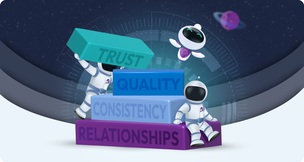
2. Trust and credibility are key to conversions
Trust and credibility play a big role in conversion rate, and there are several ways websites can fail to inspire that trust:
Firstly, be mindful of website design. Since older-looking websites aren’t trusted by 94% of users, this is a crucial issue to address first. Poor design indicates that businesses don’t have that much experience or that they’re unprofessional. Either way, they’re not going to seem like they’re worth doing business with.
Secondly, it’s contact information. Keeping key information hidden, such as company details or pricing, appears suspicious. In fact, 44% of visitors will leave a vendor’s website if there are no contact details.
Next, be mindful of your checkout process. If website visitors feel your site’s checkout process is suspicious or unreliable, they may abandon their cart rather than input their card details.
Users who feel intruded upon or overwhelmed aren’t likely to trust your site. So, it would help if you reduced the amount of interruption marketing on your site. Increasing numbers of studies are showing that permission marketing is not only much more effective but much less jarring.
Lastly, ensure there are no spelling or grammar mistakes and that you have an SSL certificate. These seemingly minor issues are actually extremely significant and could be what’s dragging your conversion rate down so much.
3. Users want seamless journeys
Easy navigation is key for conversions; in fact, improving it can raise conversion rate by 18.5%
This is because users want their journey to be as easy as possible. Hiccups, distractions, and complications just slow things down. Unfortunately, users will just go to another website if yours is difficult to use.
With UX and modern web design practices so readily available, internet users have become accustomed to a high level of usability. So, it’s extra disappointing when they encounter a poorly designed website.
With 37% of visitors leaving sites because of it, business owners should be taking navigation seriously and investing in projects that will create seamless journeys for users.
Implementing better UX for better conversions
Best practices and principals for creating user-centred website design
If you’re to embark on a UX project for your website, you’ll need to know the principles and practices that will make it successful:
- Firstly, always use data to support design decisions. Whether you’re in the initial research stages or the subsequent testing phases, statistical proof will steer your project in the right direction.
- Similarly to data, user feedback is extremely important. Since a key UX principle is empathising with user needs, considering their feedback will be highly enlightening.
- UX is a continuous process. So, don’t make the mistake of completing a one-off UX project. Instead, monitor your KPIs regularly, and A/B test new variations of CTAs, pop-ups, and emails for best results.
- Buyer personas and journey mapping help keep design choices user-focused. The best UX designers will use both of these tools to form their approach.
- UX designers should always consider the context of the user. This idea consists of 3 elements: the user’s environment (e.g., a busy street or quiet office), their medium (i.e., digital device), and their mood.
- Never forget that the personal opinions of designers or website owners are not helpful to the UX design process. Though the CEO might have a favourite colour, colour theory is your best bet for determining the ideal colour scheme for your website.
Top 10 UX tips to simplify the user journey
If you want to reduce friction points across your website, you might like to implement some of the following changes:
- Assign a clear purpose to each webpage, each with a single CTA – especially the pages that have a muddled (or no) purpose.
- Change your checkout settings to allow users to complete purchases as guests.
- Optimise your website for mobile and tablet usage as well as desktop.
- Replace moments of interruptive marketing with permission marketing.
- Implement data-supported colour theory across your site.
- Create a walkthrough guide for the checkout process for new users.
- Minimise and simplify fields on forms or make them multi-step.
- Use commonly recognised icons (such as the hamburger icon for navigation) instead of abstract ones.
- Remove unexpected costs.
- Display the different steps of the checkout process in a banner or side panel.
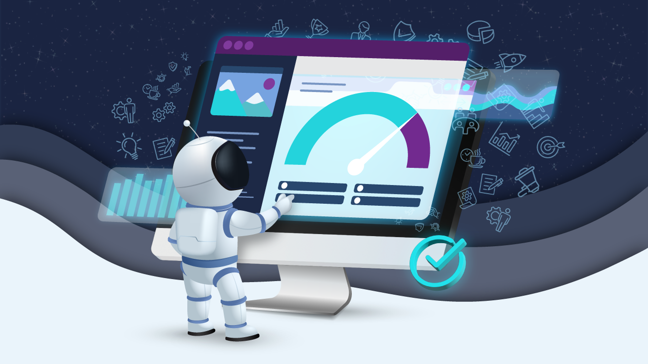
How do I know if my UX efforts are working?
Ask your staff
One of the easiest ways to pilot a new website design is to ask your staff to help. Once your draft is complete, send it to several team members to test and give feedback. According to some research, you only need to ask five people to help because just five people are enough to spot 85% of your site’s issues!
A/B testing
A/B testing (also known as split testing) is the main way to test the efficacy of your changes.
Example:
If your UX designer has changed the colours of your CTA buttons from purple to red, you would create two web pages – the “control” (purple) and the “challenger” (red). You would show 50% of visitors the control page and 50% of visitors the challenger. The click rates for each of these variants will indicate which colour is most effective.
Why you should continuously monitor and improve your conversion rate
Rather than checking in with your conversion rate once a year, check it once a week. Keep an eye on it when you log into your website analytics tools, and take action quickly if you notice a change.
Continuous monitoring is best because you can be sure that the website is always meeting the goals of the business and catch problems as soon as they arise. Problems such as:
Sometimes your conversion rate will appear to drop if your tracking code hasn’t been updated alongside a change. Or it will drop because users aren’t responding well to a new change on your website.
Continuous monitoring means that you don’t have to exhaust your resources on large projects. For instance, if you checked your conversion rate after six months and realised it was extremely low, you might decide to relaunch your website – which will take months and is quite expensive.
On the other hand, someone who checks their conversions regularly might take on one small CRO project per month – which will cost less and be a more manageable strain on resources.
As you’ll read about below, continuous A/B testing can be an extremely valuable part of CRO, so this might be something you take on too.
How Diabetes UK raised conversions by 61% through usability testing
The challenge:
Diabetes UK wanted to increase the number of donations they received through their website and improve user journeys.
The solutions:
The action plan for this case study was to conduct search intent research, usability testing, and A/B tests, as well as mapping and analysing existing user journeys.
The results:
Not only did test users report greater website usability (especially on mobile), but the charity also saw a 61% increase in donations.
Read the full case study here.
How Venture Harbour increased web form conversions by 743%
The challenge:
Before Venture Harbour began its CRO journey, the conversion rate on its web forms was 0.96%. Their goal was to increase this – as much as possible!
The solution:
Venture Harbour changed its single-paged long forms to multi-step (which are proven to be more user-friendly). This resulted in a 300% increase in conversions – but they didn’t stop there.
Through continual A/B testing, Venture Harbour forms underwent numerous variations and adaptations.
The results:
Before running A/B testing, Venture Harbour raised its web form conversion rate by 300%. After conducting tests continually, conversion rate increased by 743%!
Read the full case study here.
Final thoughts
If you’re worried about your website’s conversion rate, there are many simple ways to improve it. You can absolutely see significant results with small changes, as is evident from Venture Harbour’s case study.
The key to these kinds of results is looking at your website’s performance data. Are you losing more leads at the checkout? Or at the sign-up forms?
These signals will indicate the best approach to your site’s UX. Remember that you probably won’t need to tackle everything!
Optimising your website’s conversion rate could be as simple as streamlining its CTAs or changing the colours of certain buttons.
If you’d like to get in touch about improving your site’s UX design, please contact the purpleplanet team, and we’d love to help.