SoulSpice

SoulSpice

SoulSpice

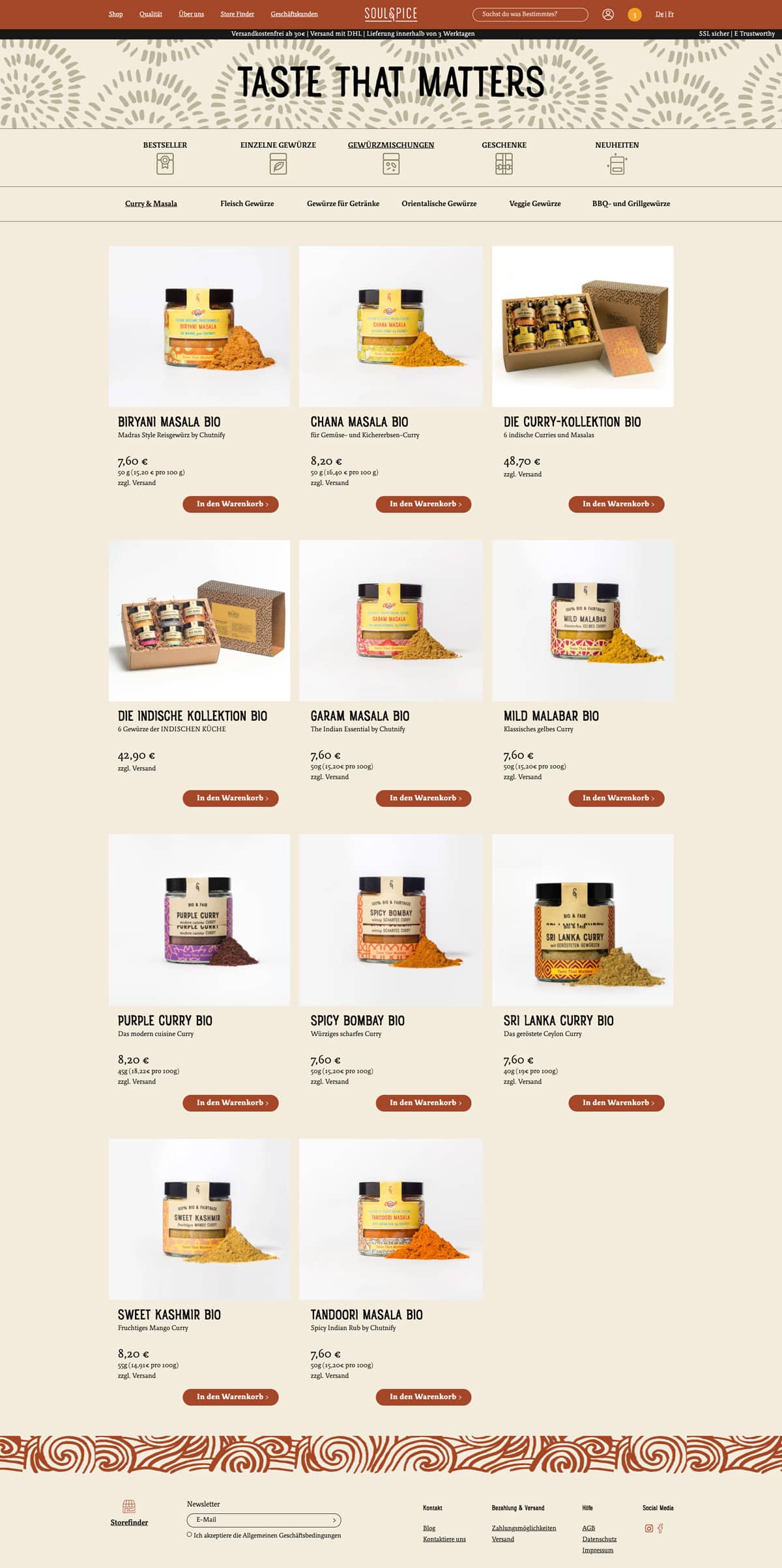
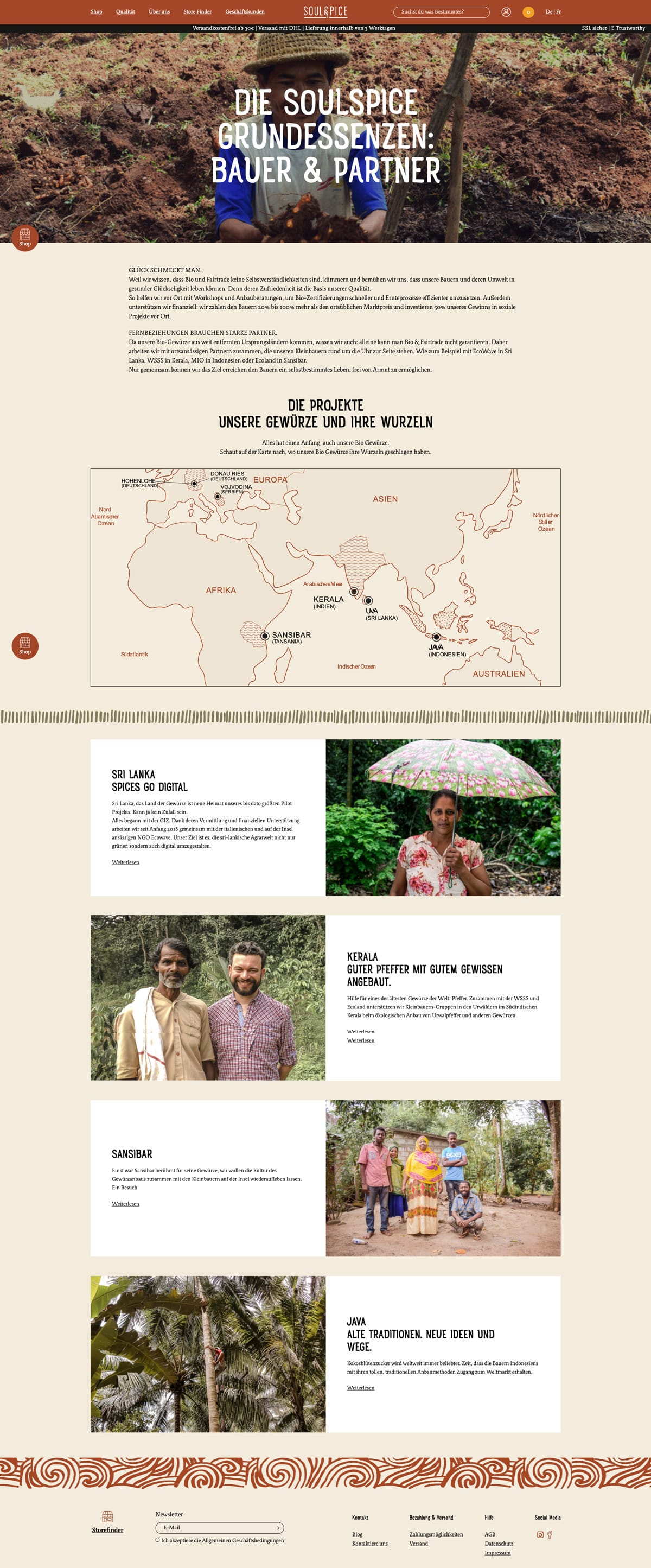
Breathe in the incomparable fragrance of spices and experience the connection to nature and the land by visiting a cosy online shop. SoulSpice - authentic and one of the kind in innovation and design.
Challenge

The main chal­lenge for any devel­op­er is to bring the ideas of a design­er into life, and keep the bal­ance between a func­tion­al prod­uct that works with no hitch­es and all the beau­ty and soul that were put in the mock­ups of the project.

We were cho­sen as the devel­op­ers for this project, work­ing with a ready-to-imple­ment design. The main request from the cus­tomer’s side was to make the web­site look strict­ly as it is in the mock­ups pre­pared by the designer. 

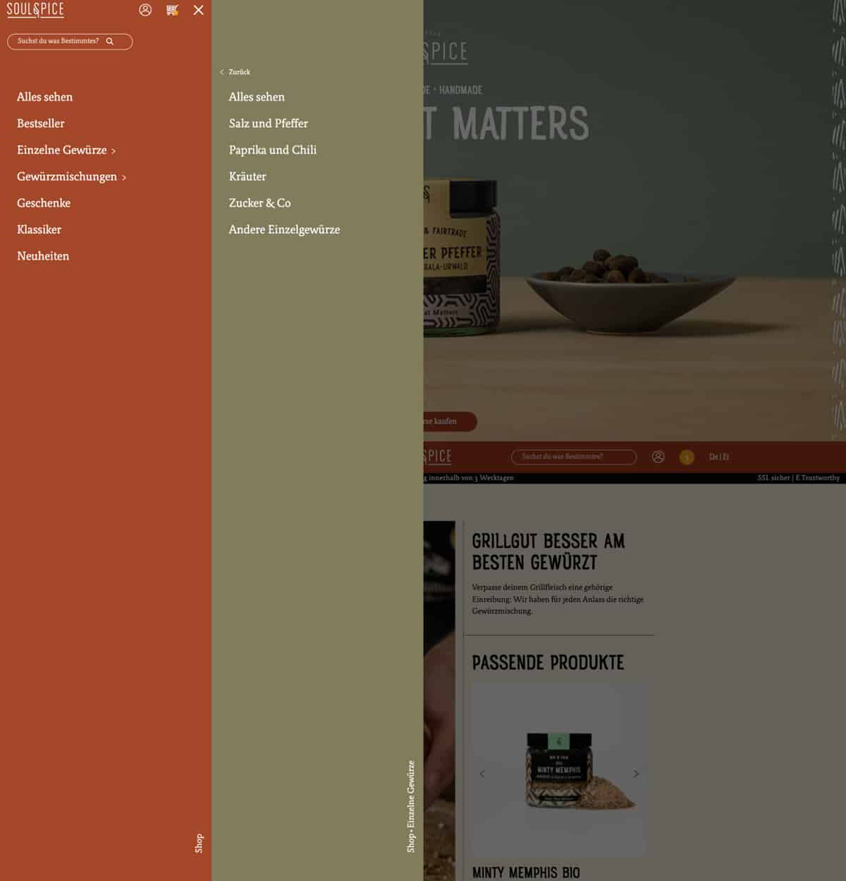
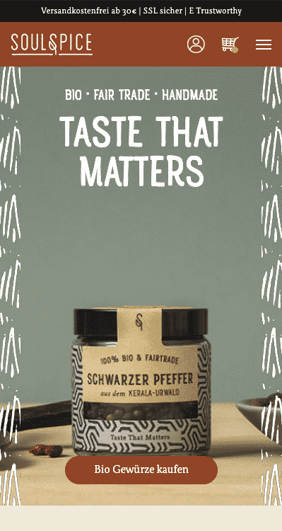
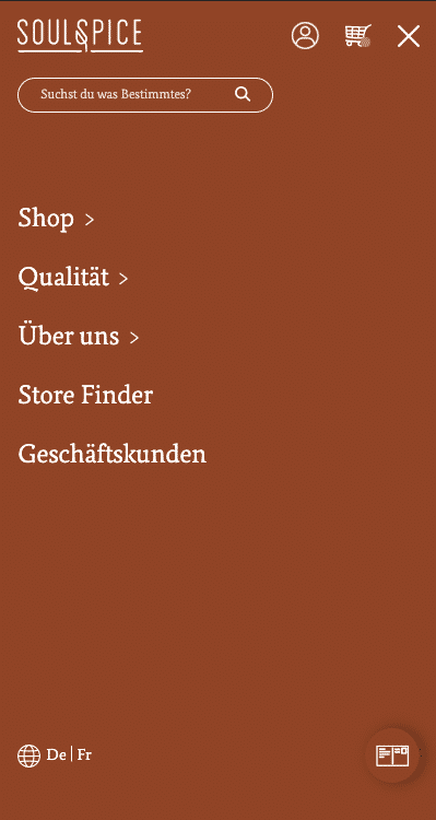
Apart from that, the refreshed ver­sion of the web­site should cor­re­spond to the lat­est require­ments for a mod­ern web­site: fast-load­ing speed, easy-to-under­stand nav­i­ga­tion across the web­site, and respon­sive­ness on mul­ti­ple screen sizes.

Solution

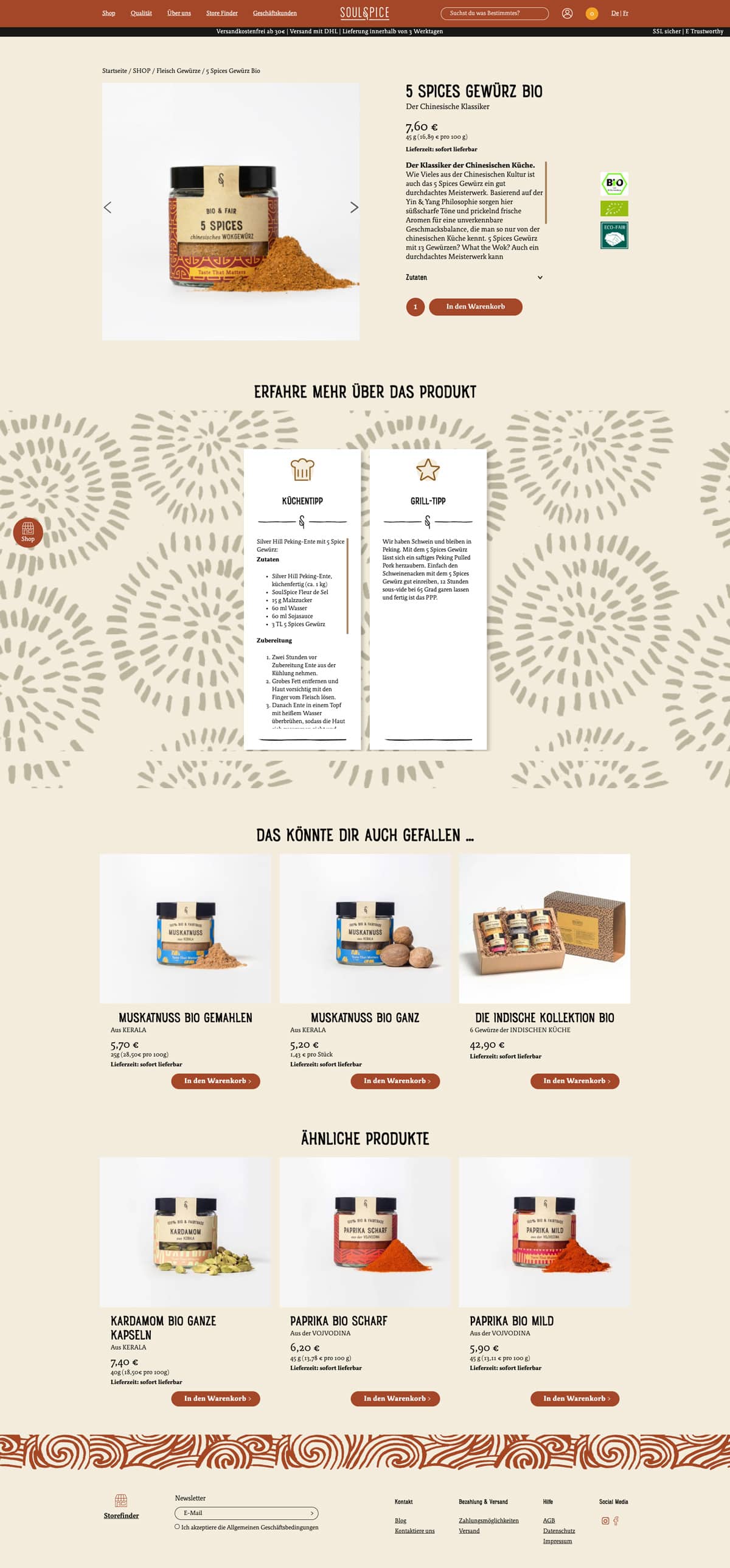
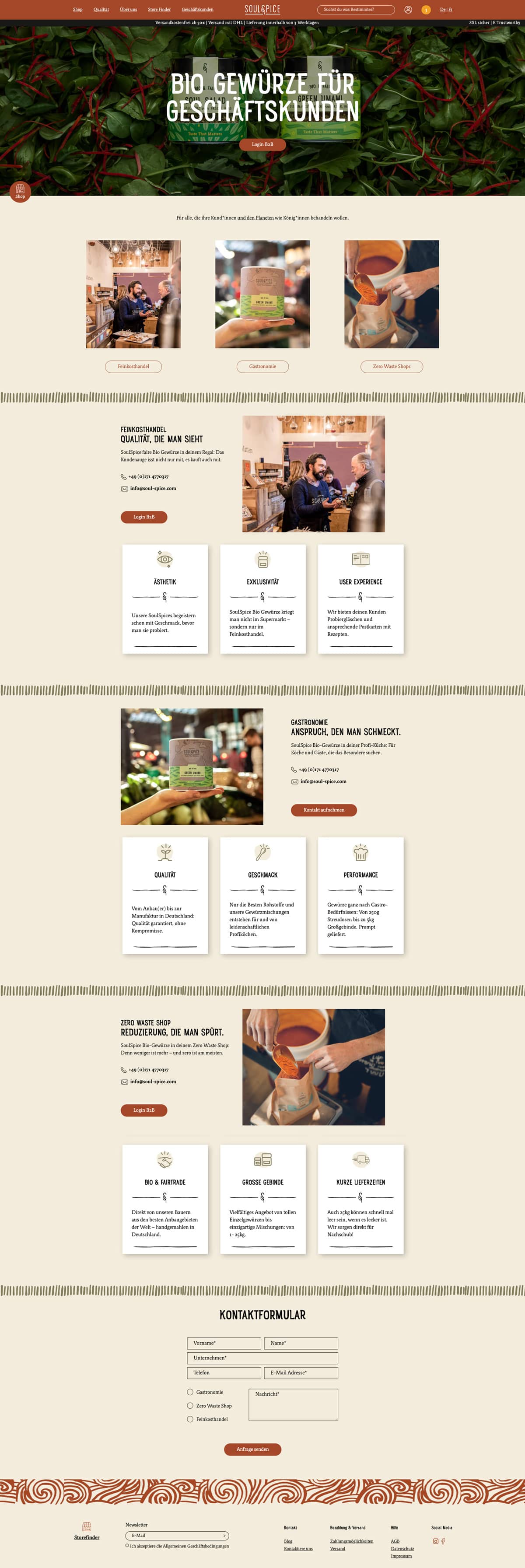
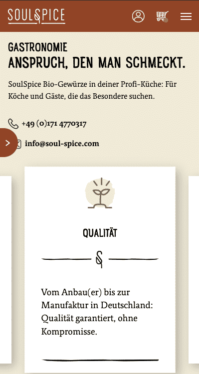
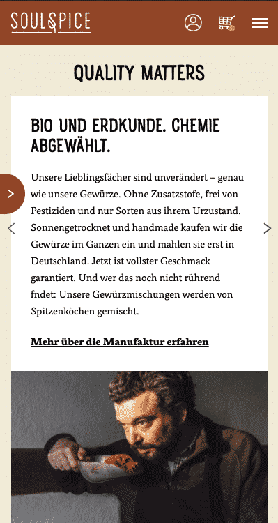
The web­site is cus­tom-devel­oped and opti­mised to cor­re­spond to the ini­tial lay­out. We worked side by side with the design­er to make it look and work per­fect­ly on all screen sizes. 

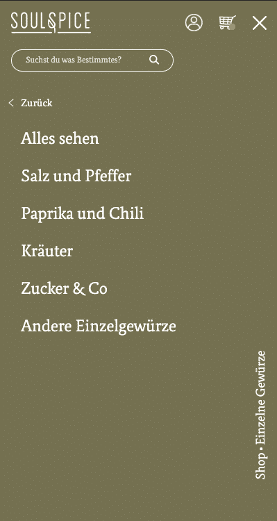
The well thought out nav­i­ga­tion makes it sim­ple to find what you’re look­ing for in just a few steps. 

The “Best Sell­ers” and “New Arrivals” sec­tions were cre­at­ed to give an idea on the spices and herbs beloved by many and those that have just arrived to etch into the heart of the exact­ing buyer.

Brand Style Guide

Logotype
Colours
The design was provided to us in its entirety, but some font and layout changes were made as we developed the website. A palette of colours is used in each section to pick out the various categories.

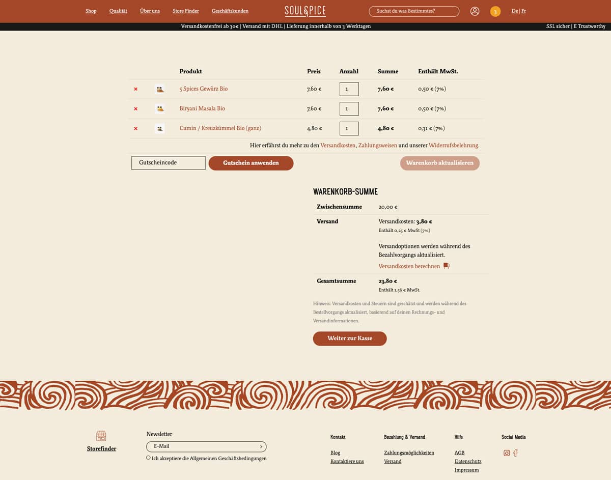
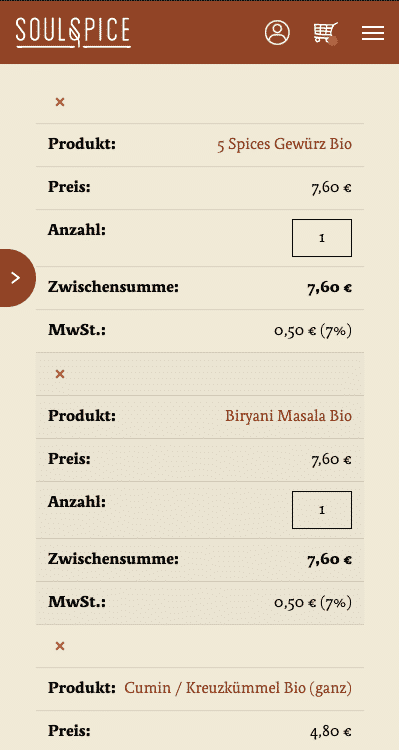
The overall design layout is authentic and one-of-a-kind, that's exactly why we custom-developed each page and took care on the functional side of the project: easy and fast purchasing process, diversity of payment methods available, and security.
Fonts
Rainier North
The inspiration to create the Rainier type family came during a summer in the Pacific Northwest. The concept behind it may be simple - a hand crafter font family - but what it delivers is quite complex!
Relato
Relato has a low contrast and a "muscular" structure that makes it useful for setting longer text. In display sizes it has a variety of details that lends it a unique and personal expression. The formal principle of the serif, the variety of terminal strokes and the combination of curves and semi-straight lines gives the Relato a more "human" flavour.
SoulSpice
SoulSpice
SoulSpice
SoulSpice
SoulSpice
SoulSpice
We approached purpleplanet to accompany our long-term design partner, to develop the redesigned version of our e-commerce store. Our wish was to make the finished website look just as it is in the design prototypes.

We really love working with Matt and the purpleplanet team - they are quick to respond to every request we have, and apply changes efficiently and effectively. That was the main reason we also hired purpleplanet for our ongoing website maintenance. We are sure that everything works perfectly well, and even if something becomes broken, the purpleplanet team will get it fixed in no time.
Boris Rafalski Founder & Managing Partner
Free Consultation
Please let us know your project requirements, and we’ll get in touch as soon as we can.

    We are pleased to welcome you on the purpleplanet!
    To order the service package you’ve chosen, please fill in the form and we’ll get in touch with you soon.

      We are pleased to welcome you on the purpleplanet!
      To order the service package you’ve chosen, please fill in the form and we’ll get in touch with you soon.