Fall Off The Wall
Fall off the Wall are socially and environmentally aware. The company philosophy is built around caring and sharing, and reducing carbon footprints.
Challenge
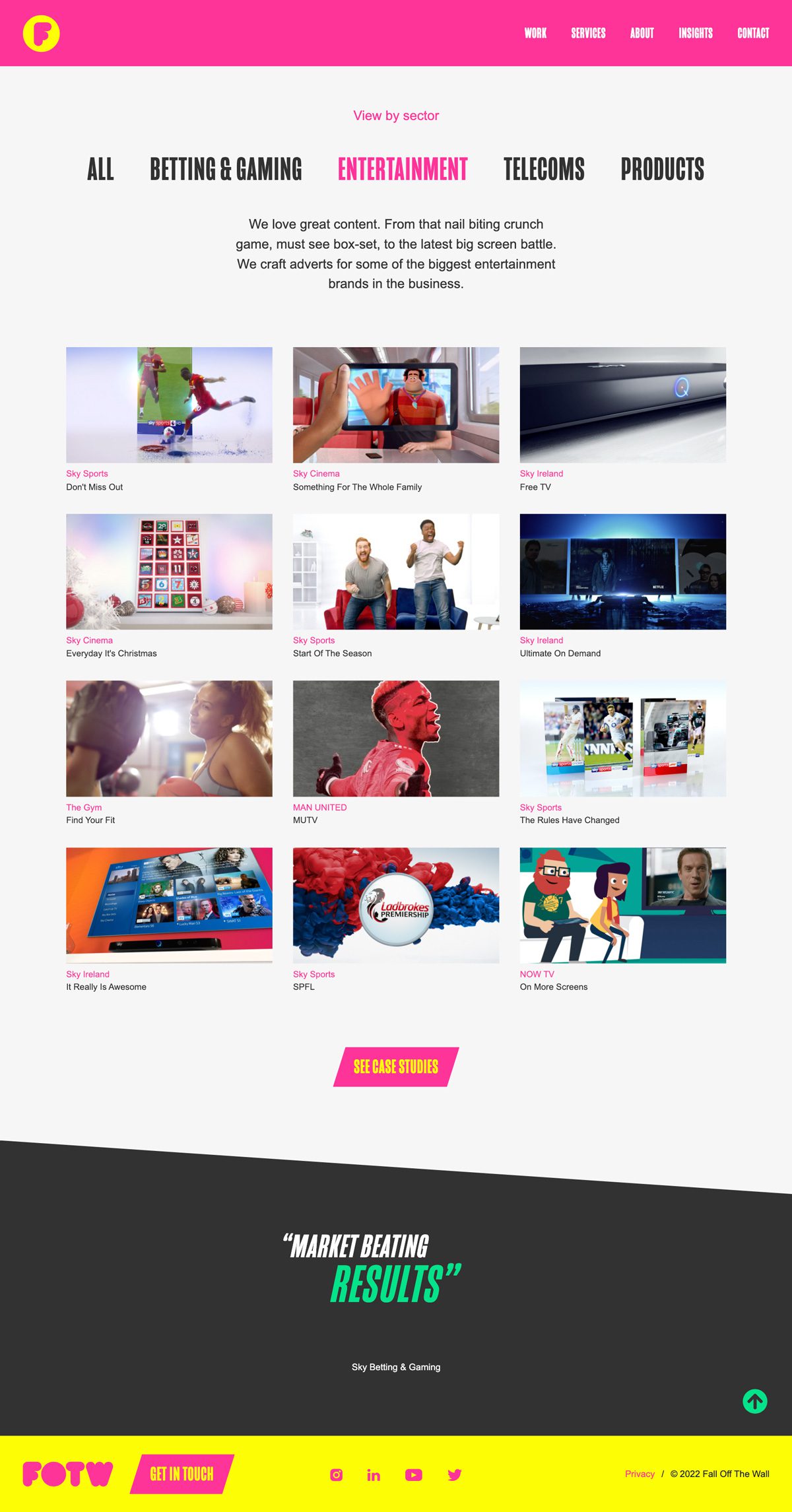
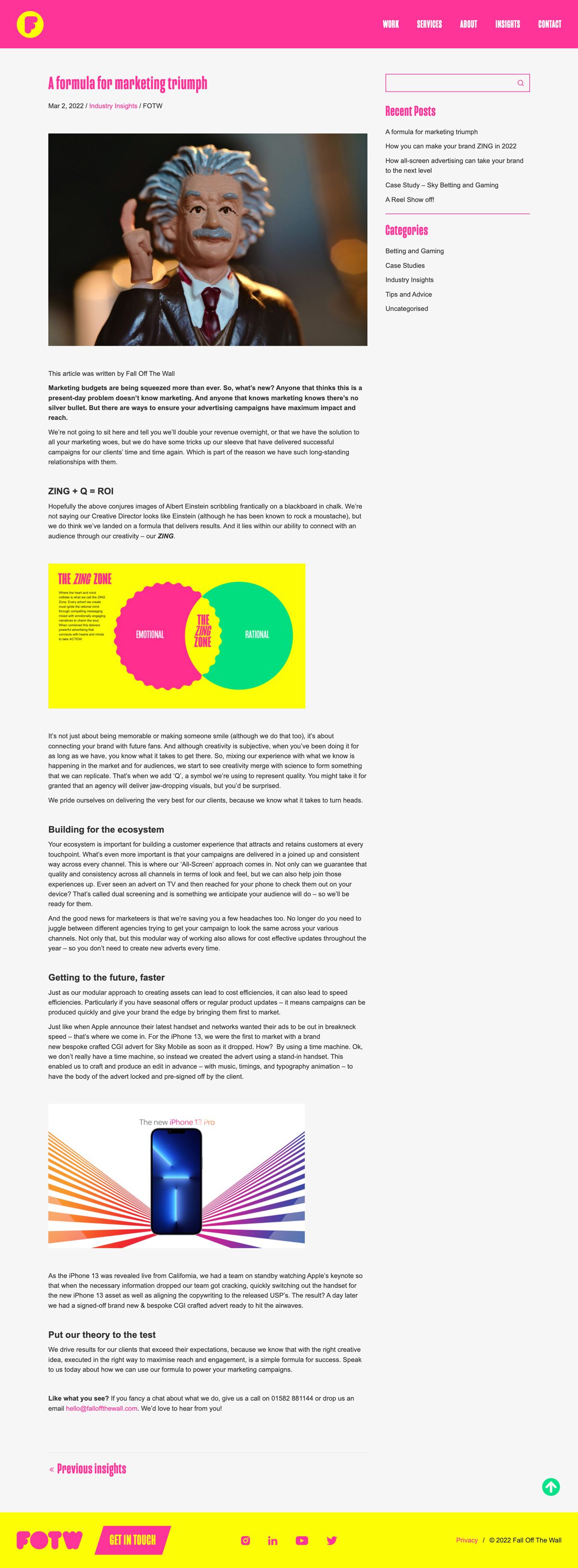
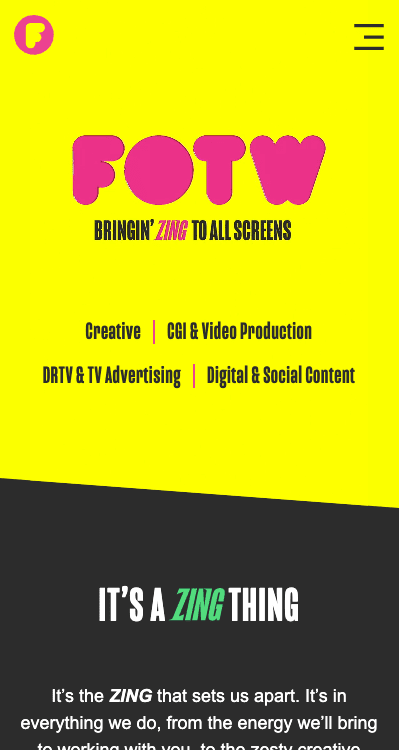
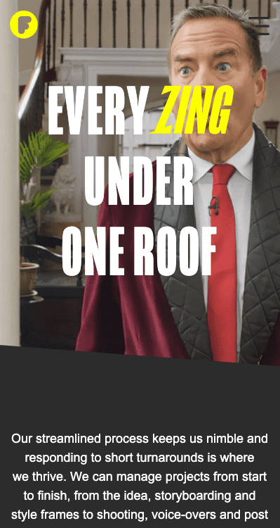
The client provided us with their new logo and colour palette, which is bold, bright, and full of “zing”! They wanted a solution which highlighted their work in an interactive and engaging way. Subtle animations were requested, which were meant to draw the eye without being irritating, or distracting from the showreel presentations.
Solution
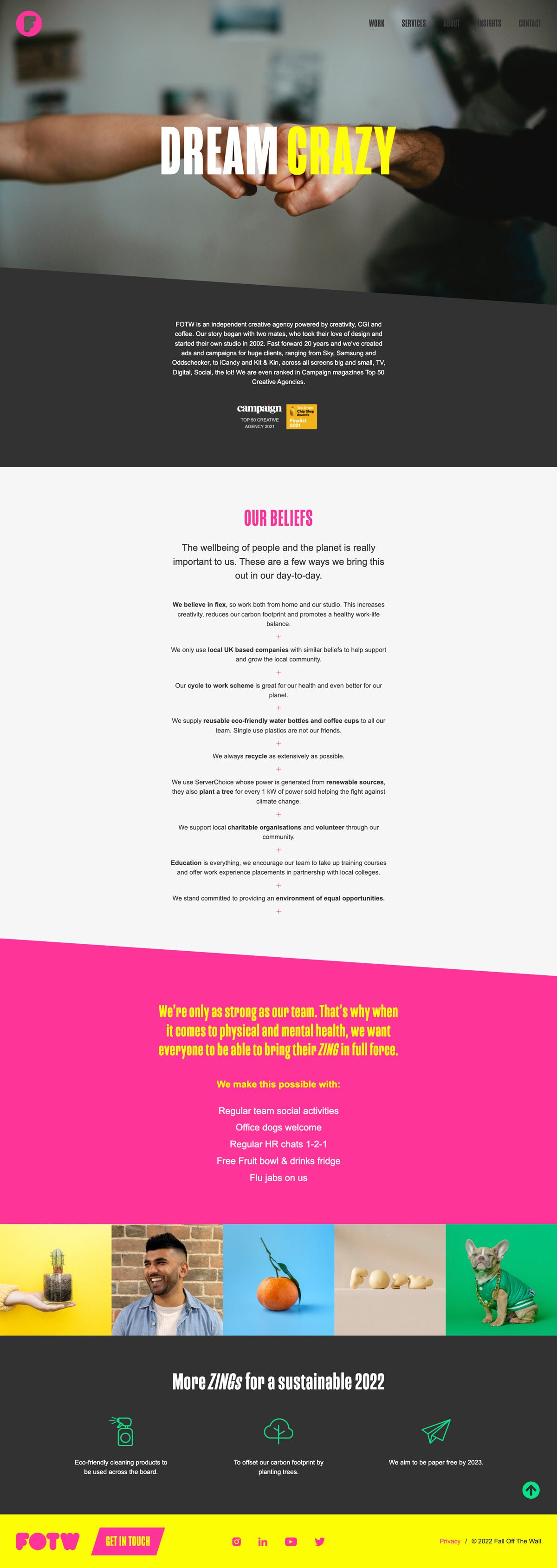
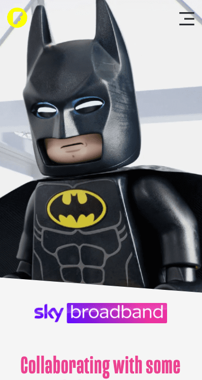
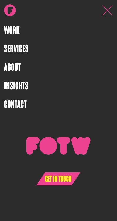
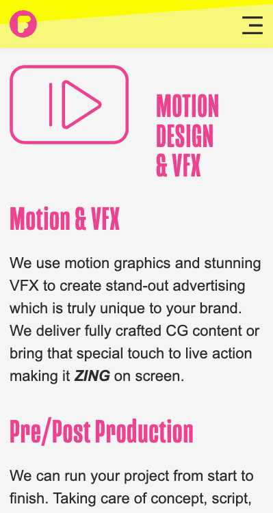
We worked closely with the FOTW design team, taking their ideas for layout, use of their new colour scheme, and potential calls-to-action, to create a final solution with which the client is extremely happy. Our biggest challenge was to use animated web elements to keep visitors interested without taking focus away from the important video work examples.




Brand Style Guide
Logotype


Colours
The previous Fall off the Wall website was fairly dark and static. That all changed with the introduction of a new, vibrant colour palette. The challenge was to use these colours effectively, to create the required "zing", without being all about the colour.


Fonts
Mongoose
Mongoose is a condensed sans serif, made for posters, headlines and logotypes.
Arial
A contemporary sans serif design, Arial contains more humanist characteristics than many of its predecessors and as such is more in tune with the mood of the last decades of the twentieth century. The overall treatment of curves is softer and fuller than in most industrial style sans serif faces. Terminal strokes are cut on the diagonal which helps to give the face a less mechanical appearance.
We had a fantastic experience working with purpleplanet from start to finish.
Great communication, fast turn around and always with a positive attitude, despite our constant feedback and amends.
Great communication, fast turn around and always with a positive attitude, despite our constant feedback and amends.
Alex Campkin
IT & Operations Manager