Healthalytica
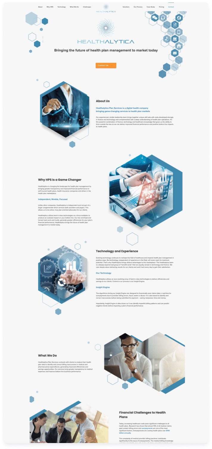
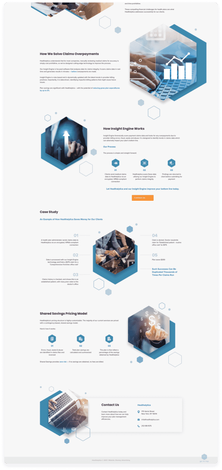
The client had clear ideas about what they wanted, in terms of a clean, modern layout, with plenty of white space. The hexagons in the design were also important, so we had to make sure that was in integral part of whatever we created. We had the shades of blue from the newly-redesigned company logo, so that would be our basis for the website’s colours.
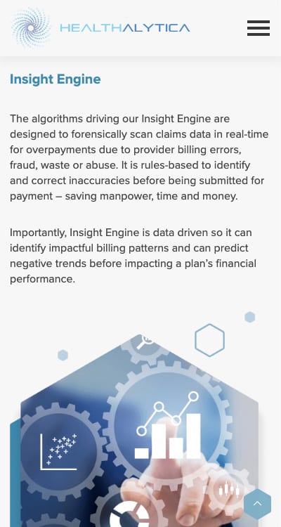
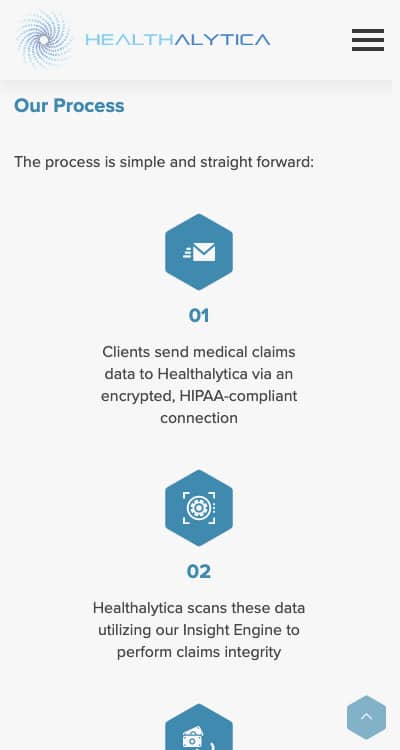
Working with our partner company, Sharkey Advertising, we were hired to utilise the client’s new brand identity to develop a single-page website for this start-up company. We have launched a responsive website featuring a unique modern design. The new website flows vertically, with the hexagon-branded element throughout this clean, organised, and easy to navigate user-friendly page. This provides visitors with an easy way to learn about Healthalytica, and the products and services they provide.
Brand Style Guide
