MulberryMC
MulberryMC treat B2B decision makers as people, not leads. As people who respond to stories that connect, inspire, educate and entertain. By making business-to-business personal, they help their clients win business and create lifelong customers.
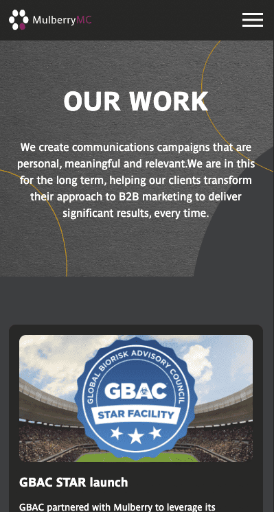
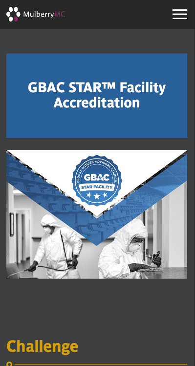
Challenge
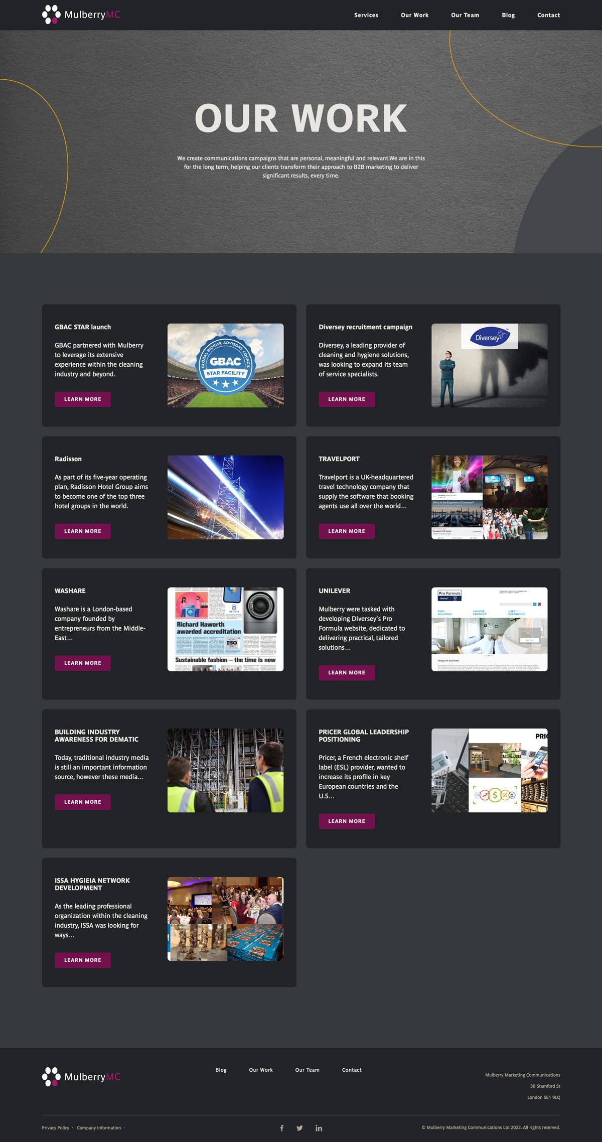
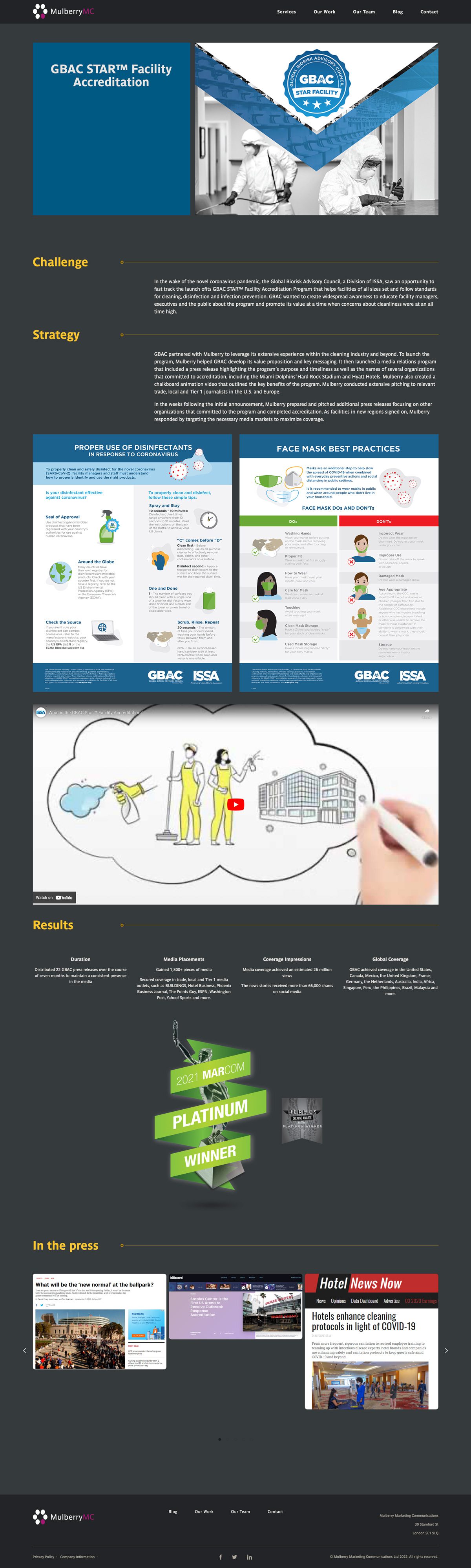
One of our long-term marketing partners, Mulberry Marketing Communications, came to us with a request to redesign their online presence. They wanted to retain the bulk of their brand guidelines, but needed the website to be more open and obvious, with the ability for visitors to quickly navigate to previous case studies, and quickly see the services MulberryMC offer.
Solution
When designing this site, it was unanimously decided to use a dark base, so the vivid colours in the client’s branding palette really stand out. We’ve simplified the navigation from the previous website, allowing visitors to quickly reach the important parts of the site.
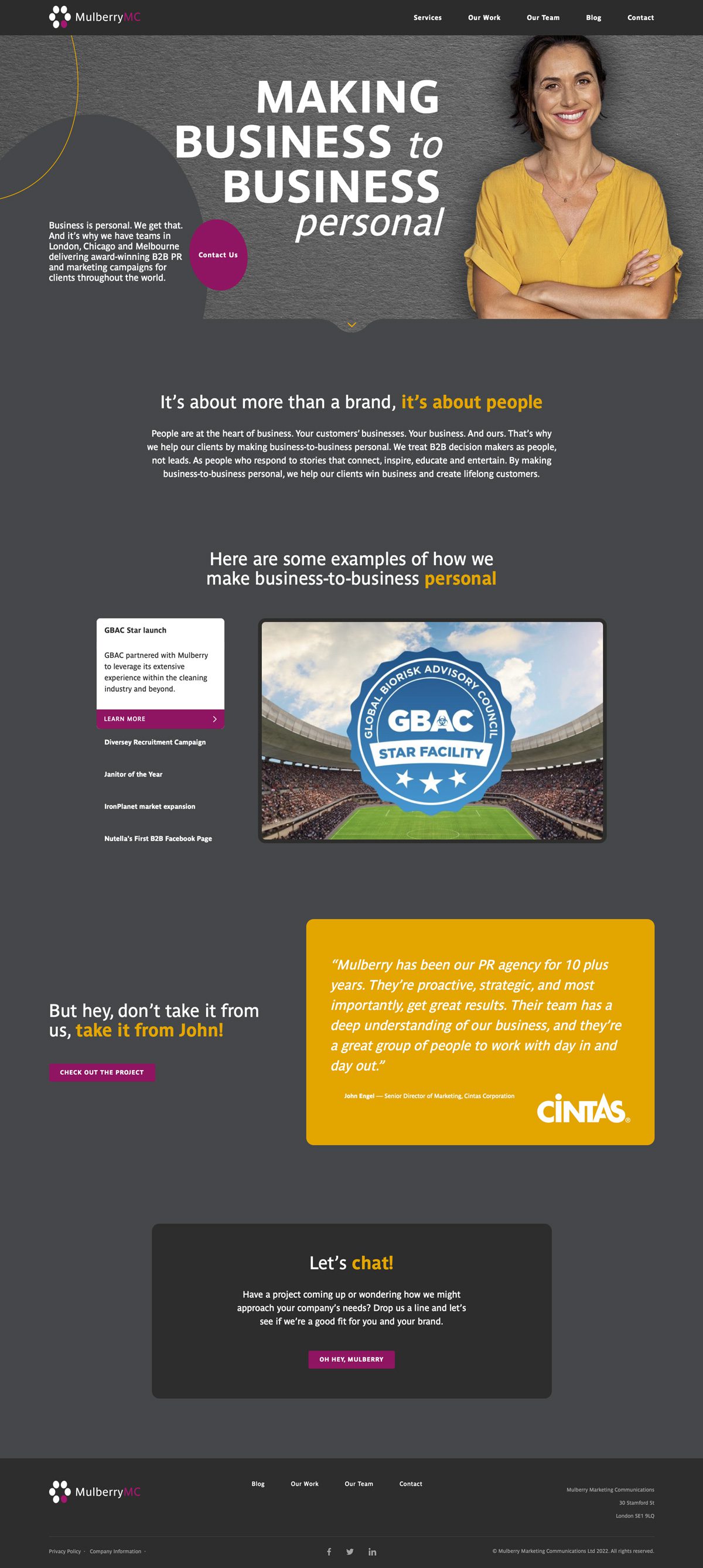
Brand Style Guide
Logotype


Colours
MulberryMC needed a clean, readable font, to use on digital and print media, and to continue using their existing colour palette for ongoing brand recognition.


Fonts
Parisine
Parisine, a design by Jean François Porchez was born as official Parisian Métro signage typeface. Parisine was created to accompany travellers in their daily use: ultra-readable, and friendly.
Born as signage typeface family, the various widths and weights permit a wider range of applications.