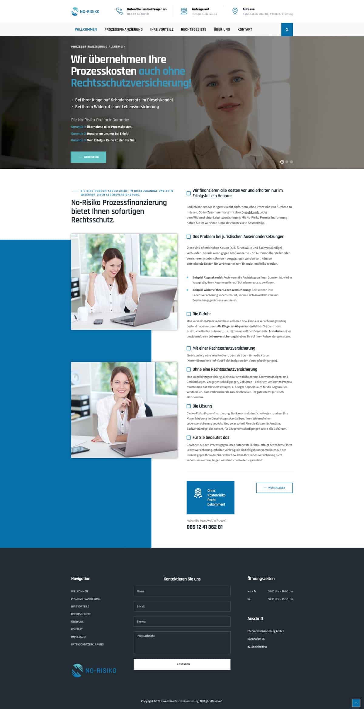
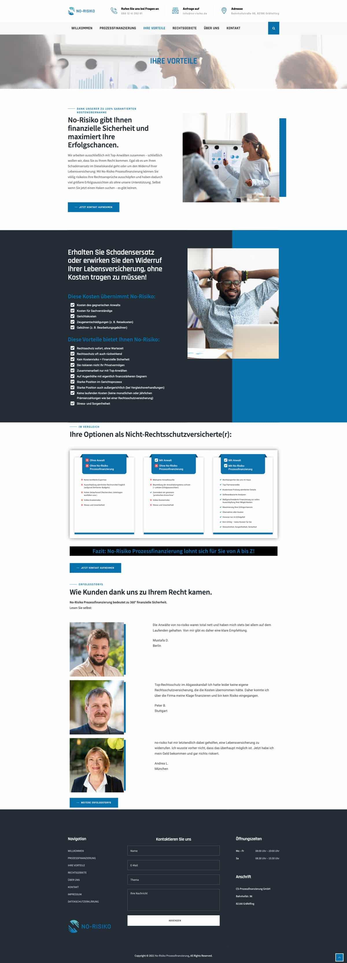
No-Risiko
The client provided us with an already built website, and our job was to tailor the chosen theme to their brand guidelines.
Challenge
Our challenge on this project was to take a purchased theme and make it work for the client’s business and branding requirements. This isn’t always easy, as many themes don’t allow for a lot of customisation without significant work.
Solution
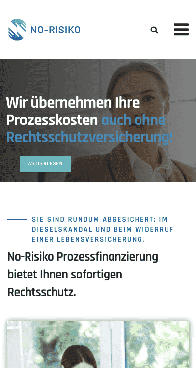
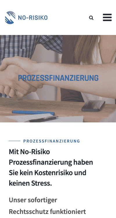
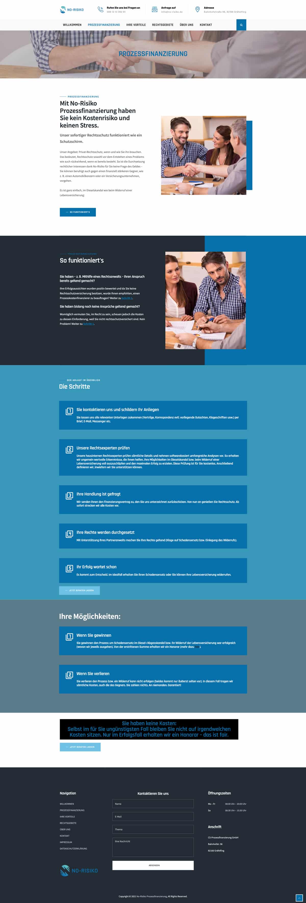
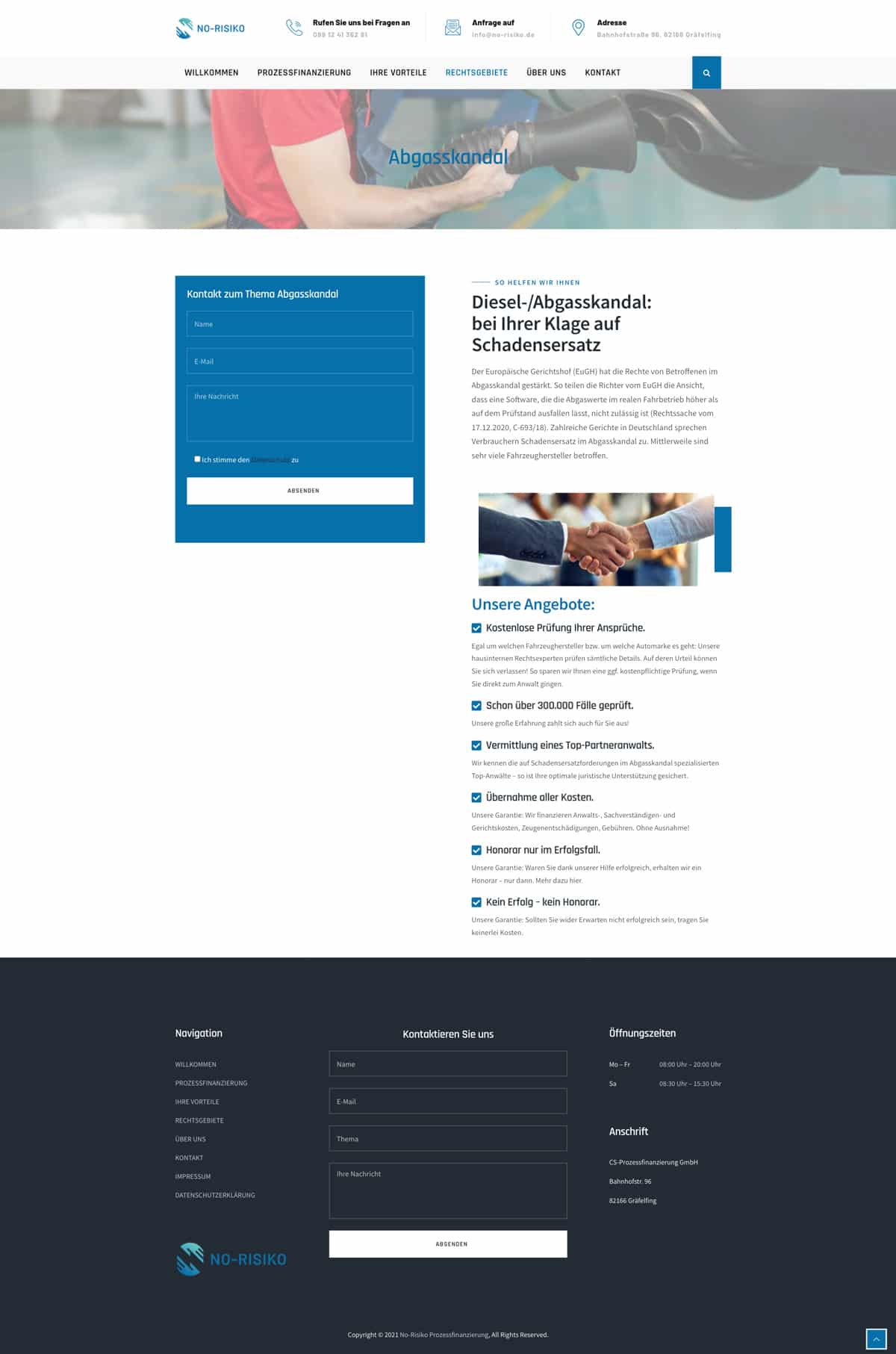
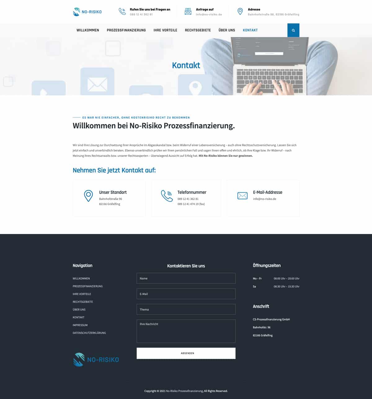
We were able to bend and shape the installed theme, to utilise the client’s chosen font, colours, and layout styling, giving the website visitor a more harmonious journey from page to page.
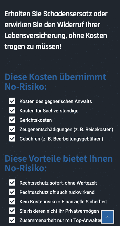
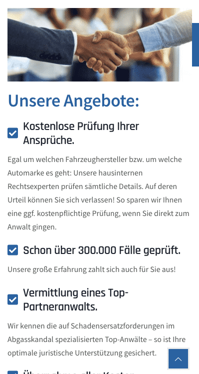
It was important to implement recognisable elements on each page, so a button should always be the same, or a link to a download. This builds client trust.
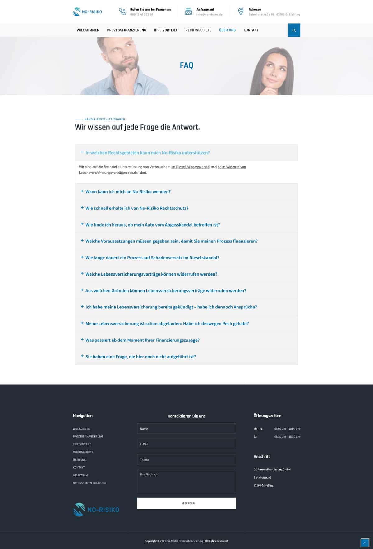
Brand Style Guide
Colours
Blue is known as a "trust" colour, particularly for websites and online organisations. The client provided us with their chosen colours, and we were able to use these effectively in our reimagining of the pre-installed theme.


Fonts
Rajdhani
The squared and condensed appearance of Rajdhani may be interpreted as technical or even futuristic. Round bowls and other letterform elements have straight sides, and the stroke terminals typically end in flat line segments that are horizontal or vertical, rather than diagonal. Their corners are slightly rounded, giving stroke-endings a softer feeling, rather than a pointy one.